Table of Contents
- Context
- Design Solution
- Key Metrics
- Design process
Context
Revitalized a legacy 12-year-old user interface to address persistent challenges faced by the Sales team. Tasked by Product Management, I spearheaded the UI renovation, ensuring our desktop app now boasts a modern and up-to-date aesthetic, enhancing user experience and aligning with contemporary design standards.
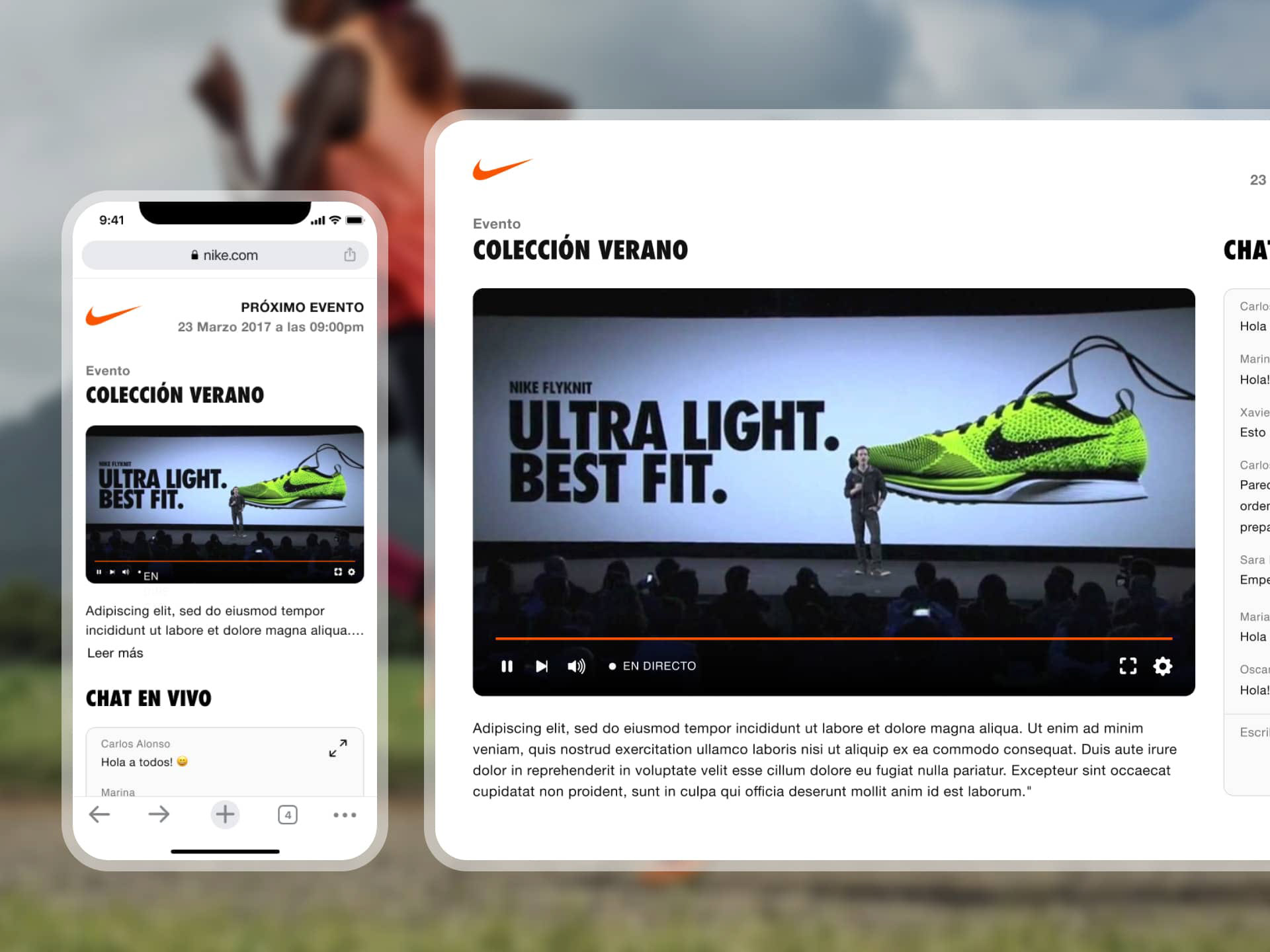
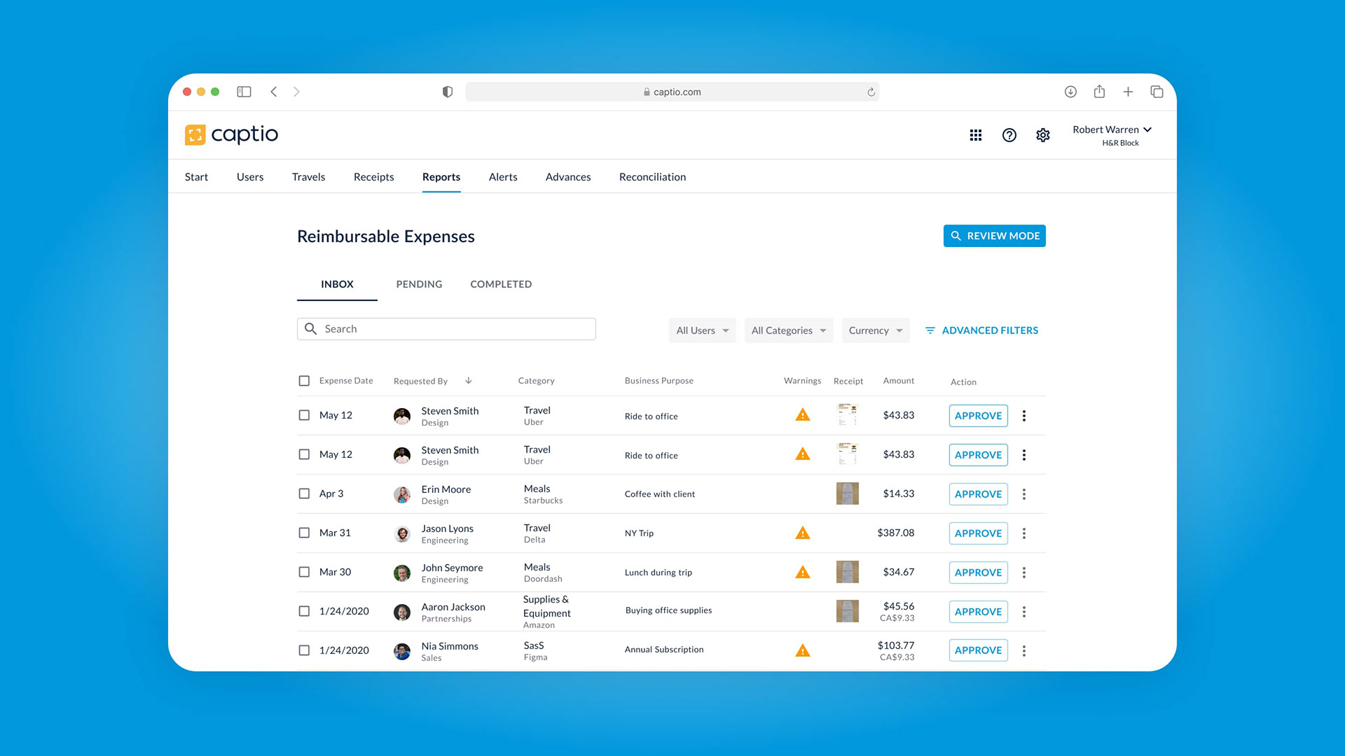
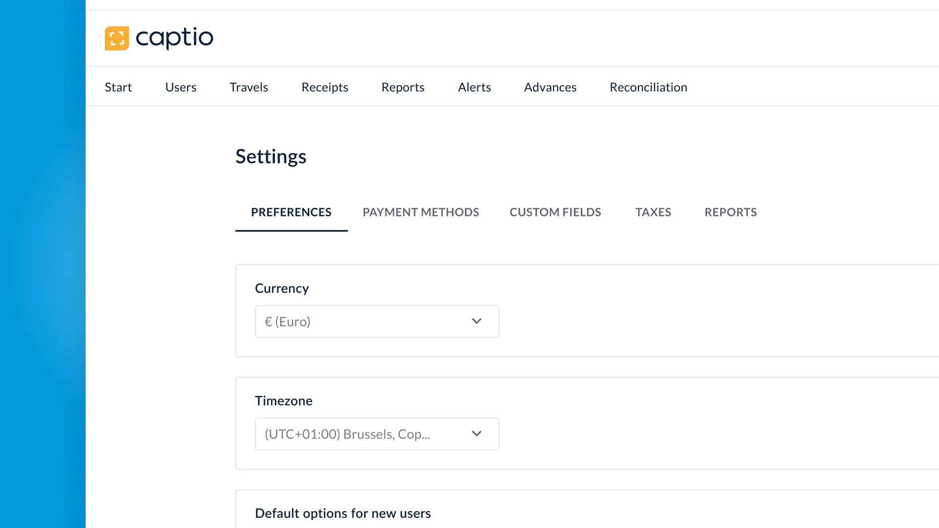
Design solution


Key Metrics
Delivered impactful results with a 90% user adoption rate for the new UI. Users rated the revamped interface at 4.1 out of 5, affirming the success of the design overhaul.
Process
Adopting Material Design as the foundation, I seamlessly integrated brand elements—typography, color scheme, and iconography—to revamp the 12-year-old UI. Despite the scope limitations preventing the use of a UI framework like MUI, I meticulously implemented the redesign atop existing components. To ensure clarity and organization for developers, a comprehensive UI specification was meticulously crafted. The launch not only introduced a modernized interface but also featured UX enhancements, accompanied by a user-friendly system enabling seamless transitions between the new and old versions.
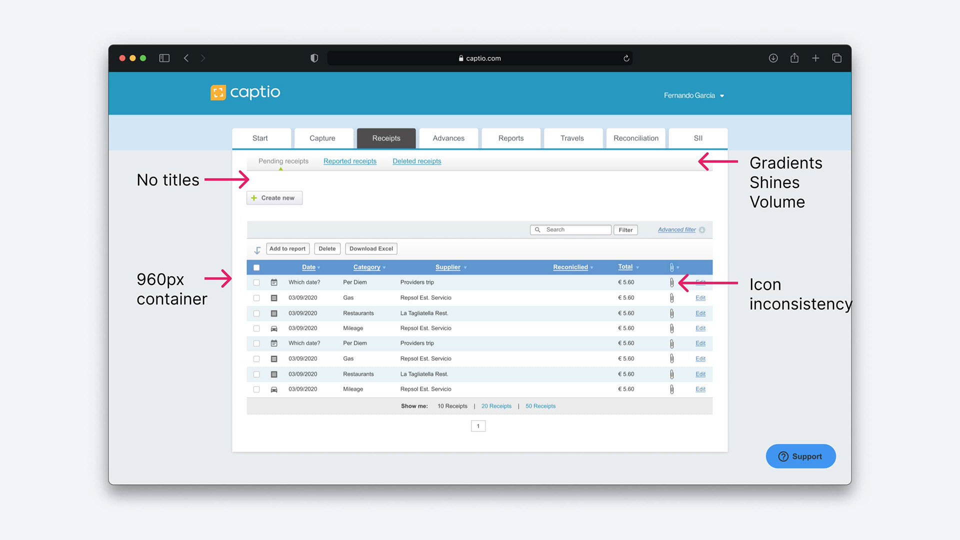
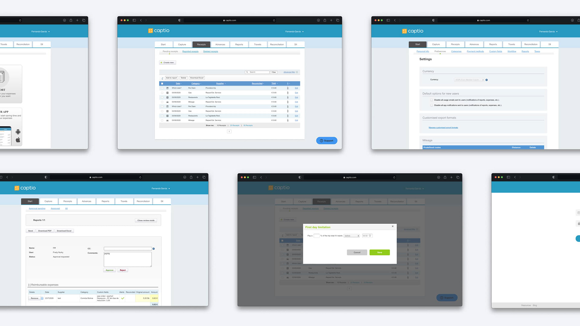
Inventory of pages with the old UI
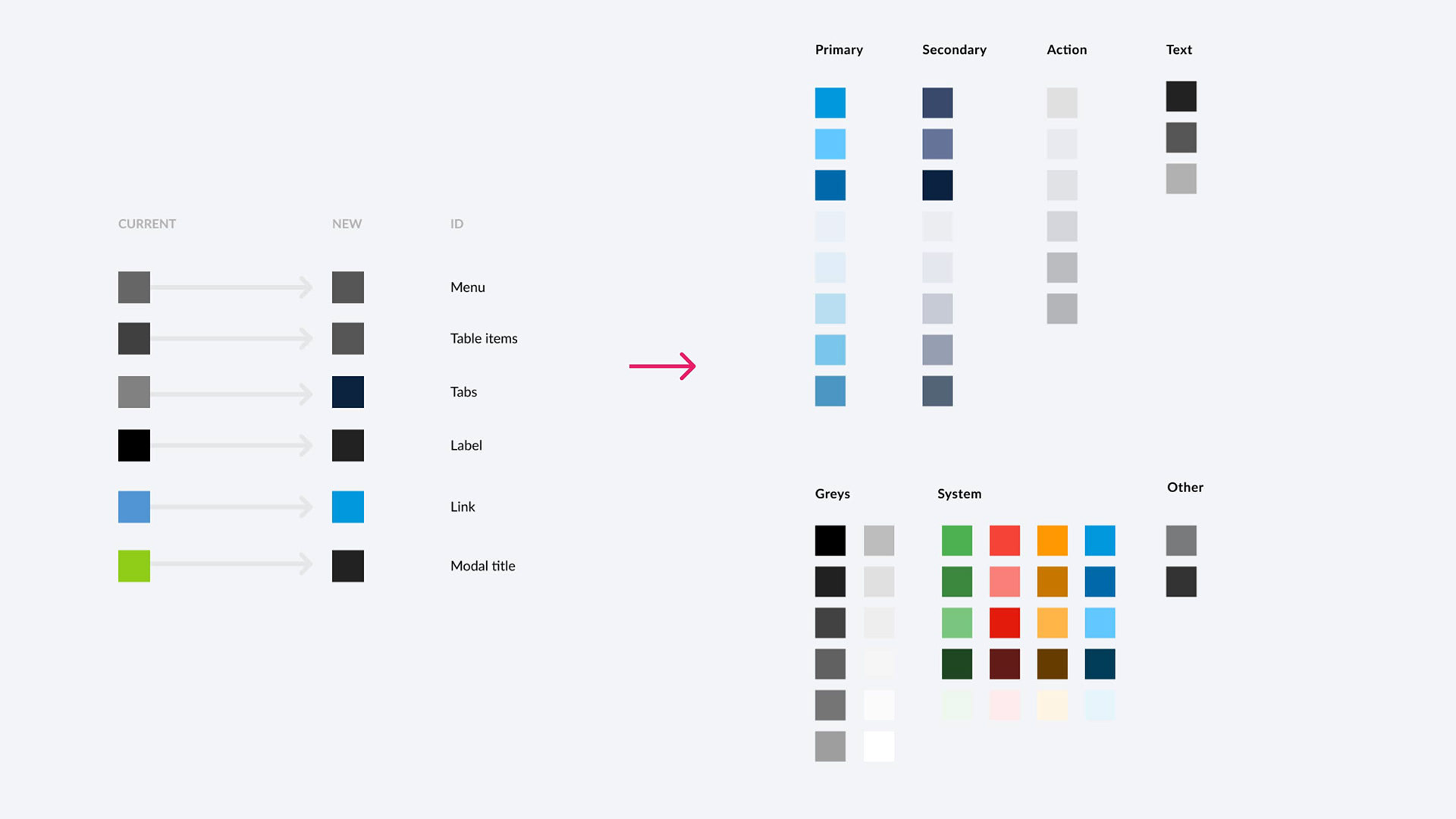
Inventory of colors and new color logic
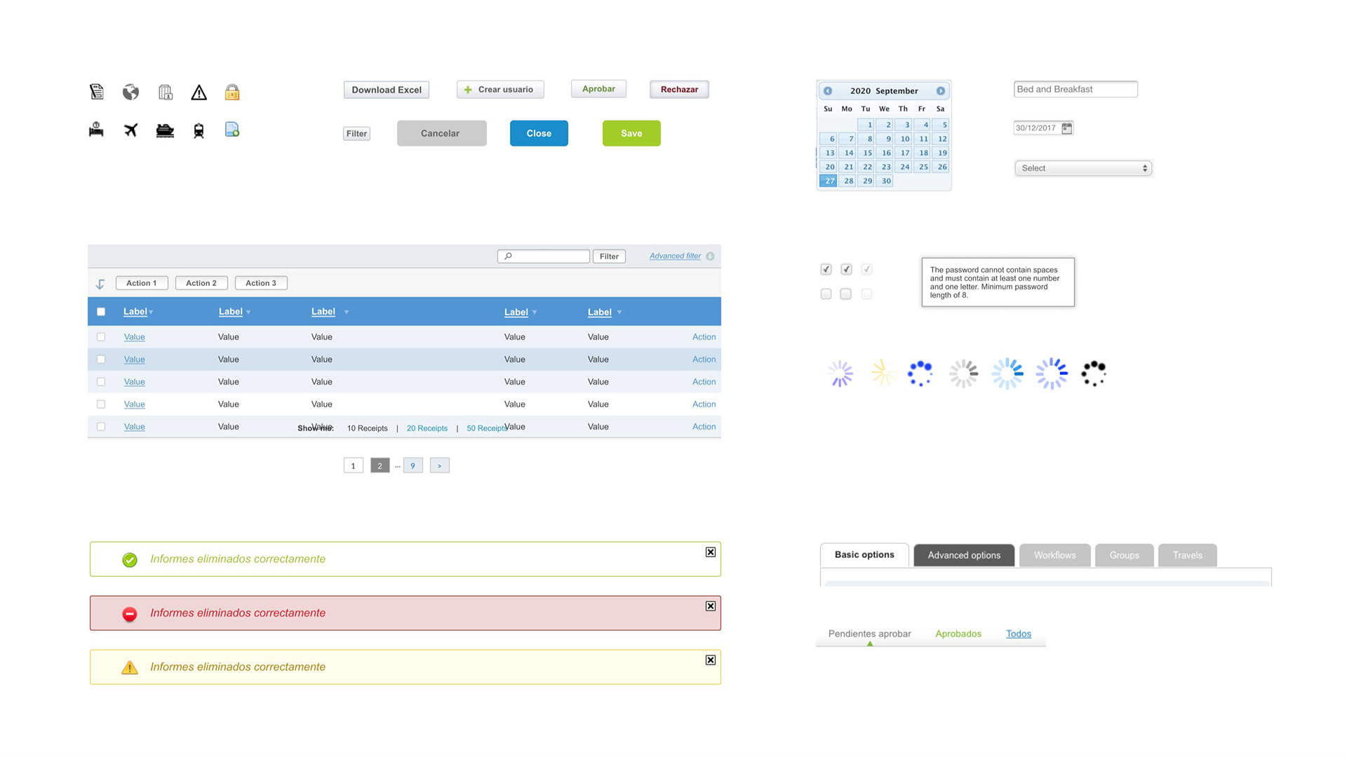
Inventory of old UI components

Heatmap tests with different hero images
Thank you for reading! 💙