Table of Contents
- Context
- Scope
- How did I get to this result?
- Using an AI workflow
- Branding the app
- Iterations
- What could've gone better
- What went Well
- Next Steps
Context
Why? I wanted to challenge myself and explore how far I could go using Figma Make as a creative and technical companion. My goal was simple: see what I could design and build in four weeks, working only in my spare time after work.
Problem: Today, social media is where people learn, stay informed, and discover new ideas. We move between platforms like LinkedIn, TikTok, Instagram, X, YouTube, Medium, and Reddit—sometimes for different reasons, but often searching for the same type of content. The problem is that our saved content becomes scattered. We bookmark on one platform, take screenshots from another, or jot down notes somewhere else, and later struggle to remember where anything lives.
This project set out to solve that problem through a social-media-focused bookmarking app: a single place where users can easily save, organize, and rediscover content across platforms.
Scope
Product: Design a bookmarking app for social media posts and web links (4 weeks)
Brand: Define the visual identity and brand language (1 additional week)
Design Process
Idea
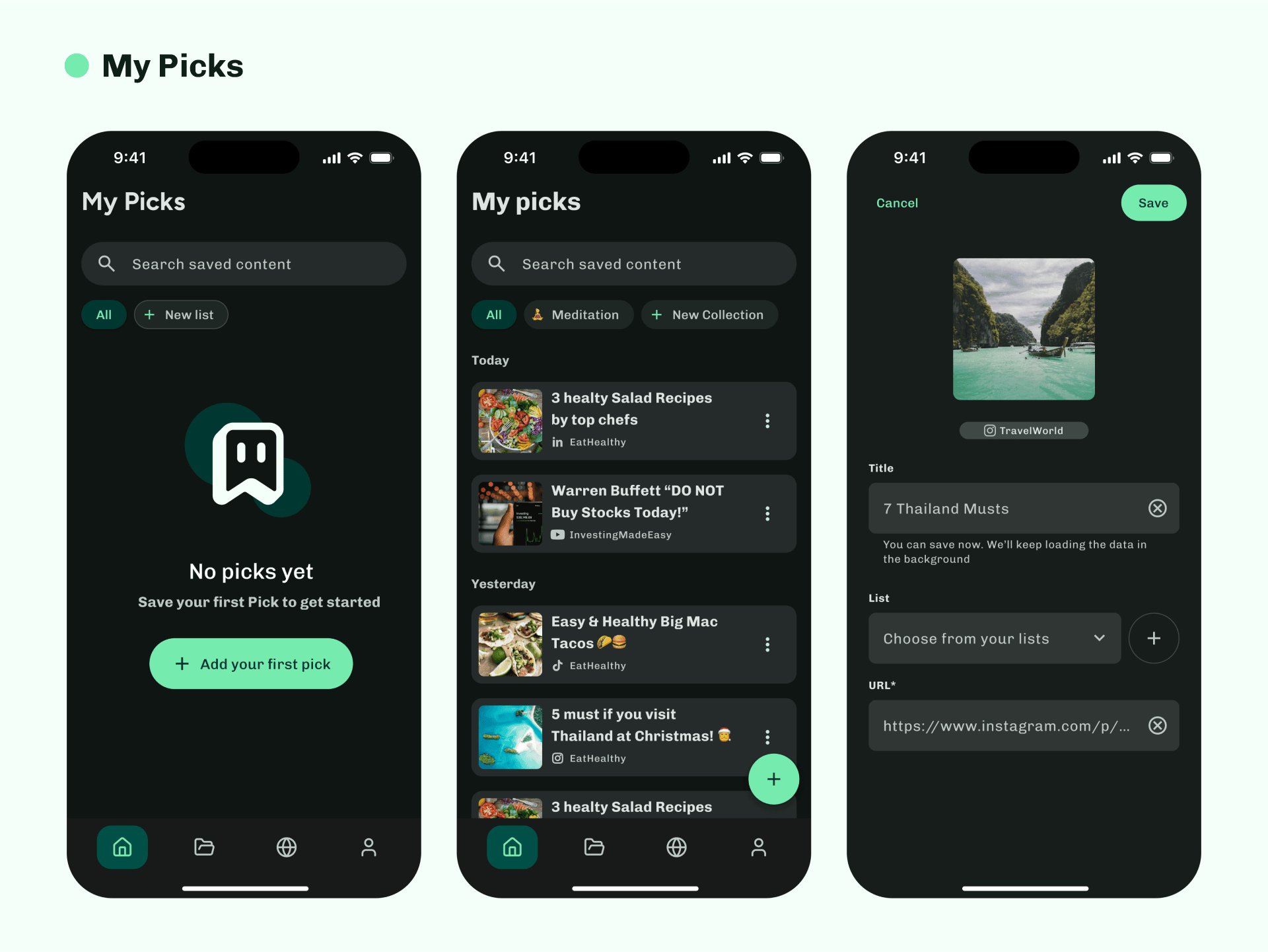
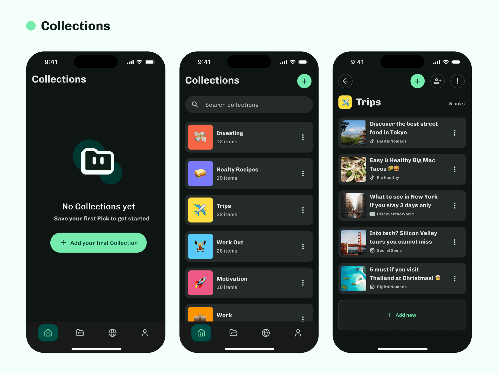
I began by writing down everything I already knew — what I wanted the app to do, the problem it would solve, and how it might work. This gave me a first draft of the information architecture and key features. It wasn’t final, but it provided the foundation I needed to start building.
PRD Creation
To give structure to the concept, I asked ChatGPT to help me draft a Product Requirements Document (PRD) and suggest potential improvements. After refining it, the PRD became my north star — clearly defining the problem, target users, technology stack, main features, and success metrics.
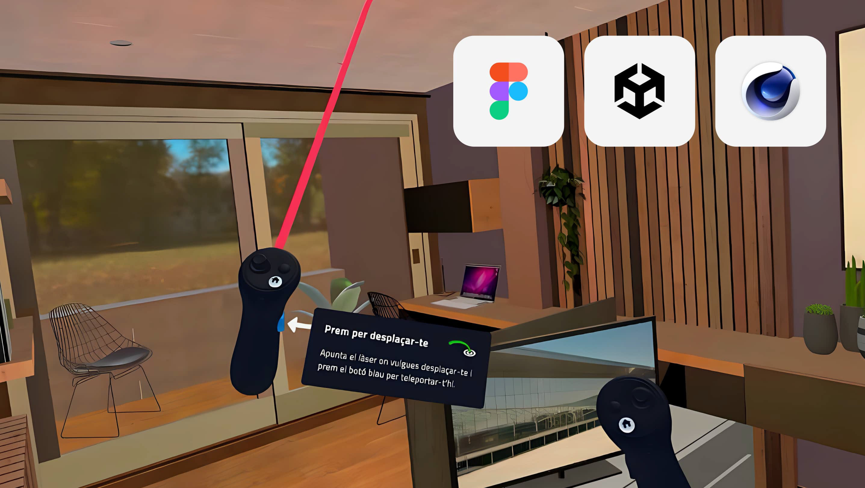
Figma Make for inspiration
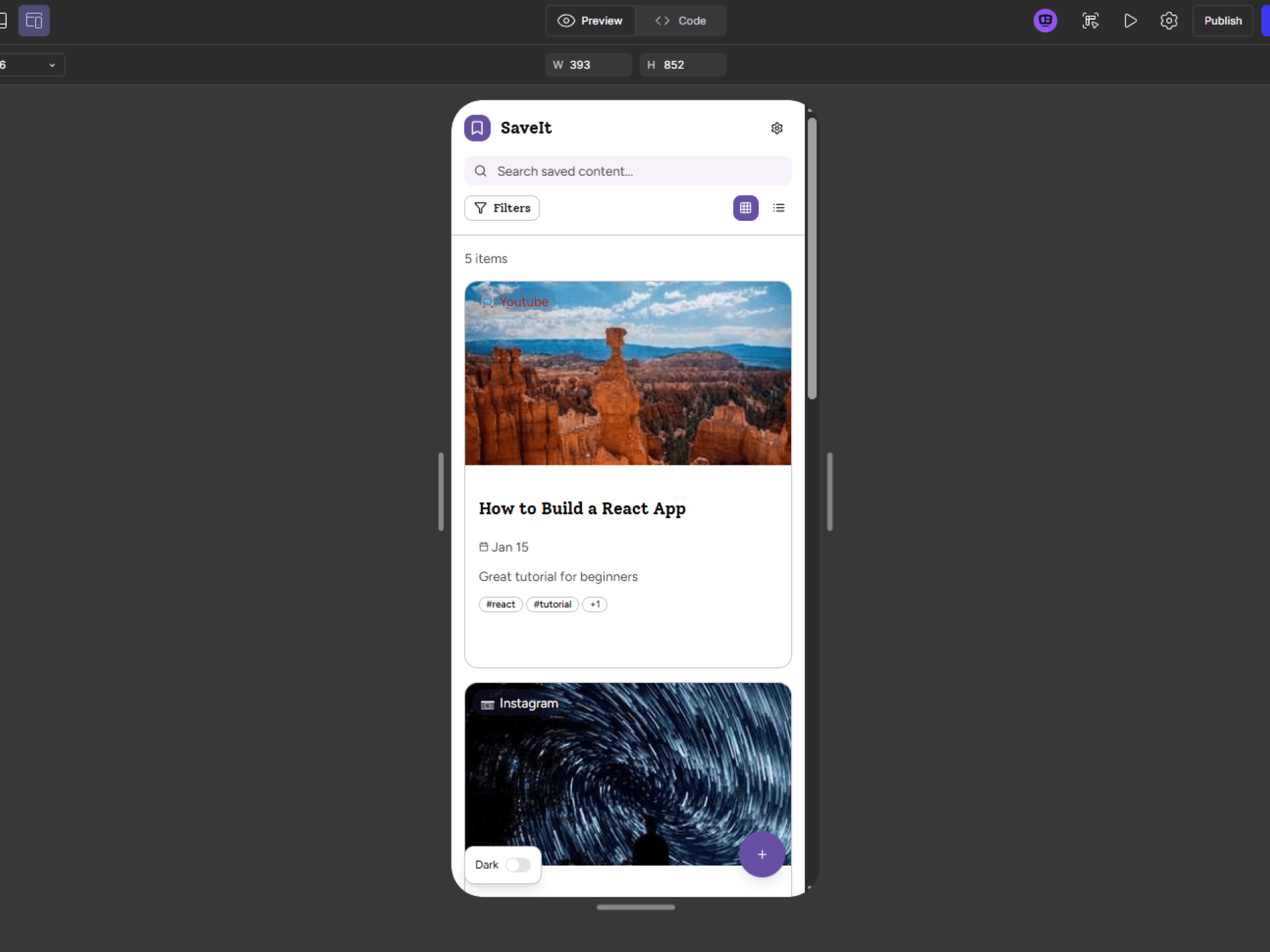
Next, I fed the PRD into Figma Make to generate an initial version of the app. I intentionally avoided adding any styles or design systems — just the default UI kit. The goal wasn’t to design yet, but to see what ideas Make could produce and identify which ones were worth developing further.
Design in Figma
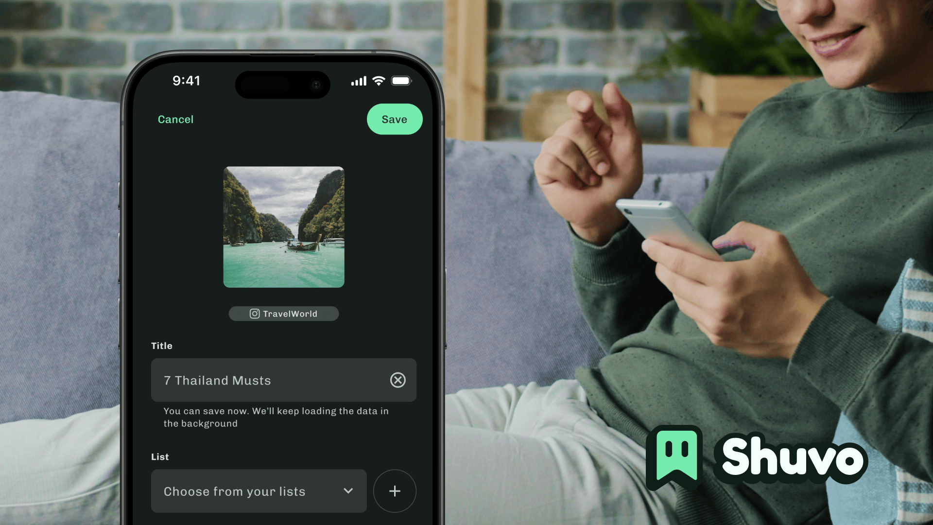
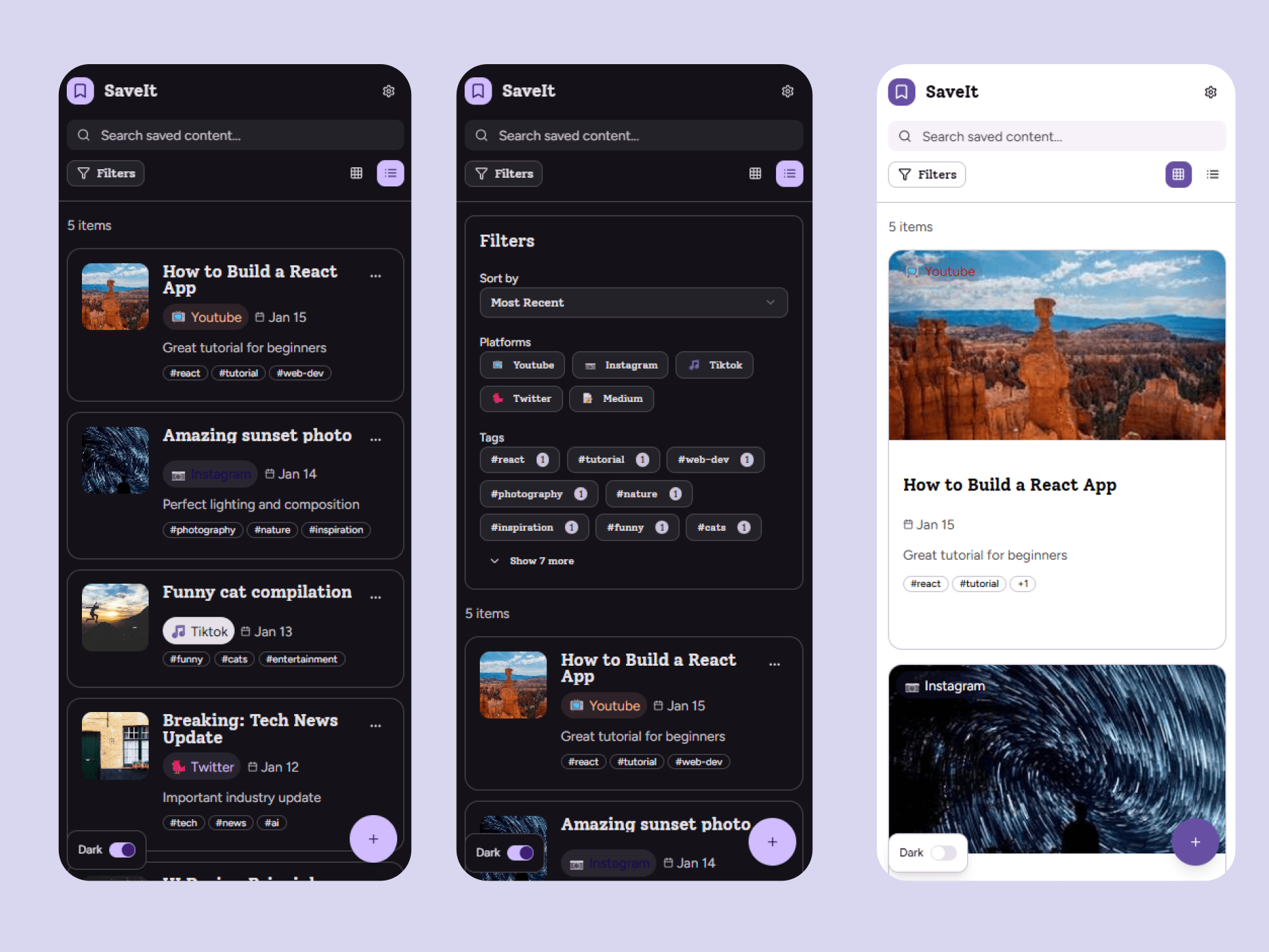
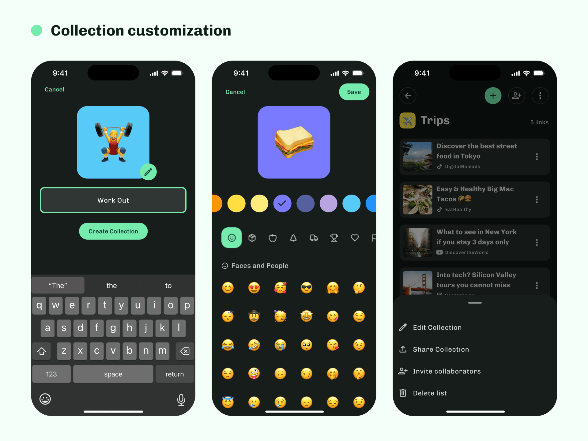
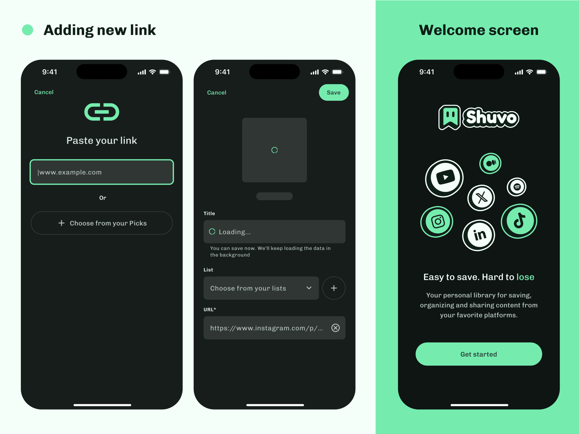
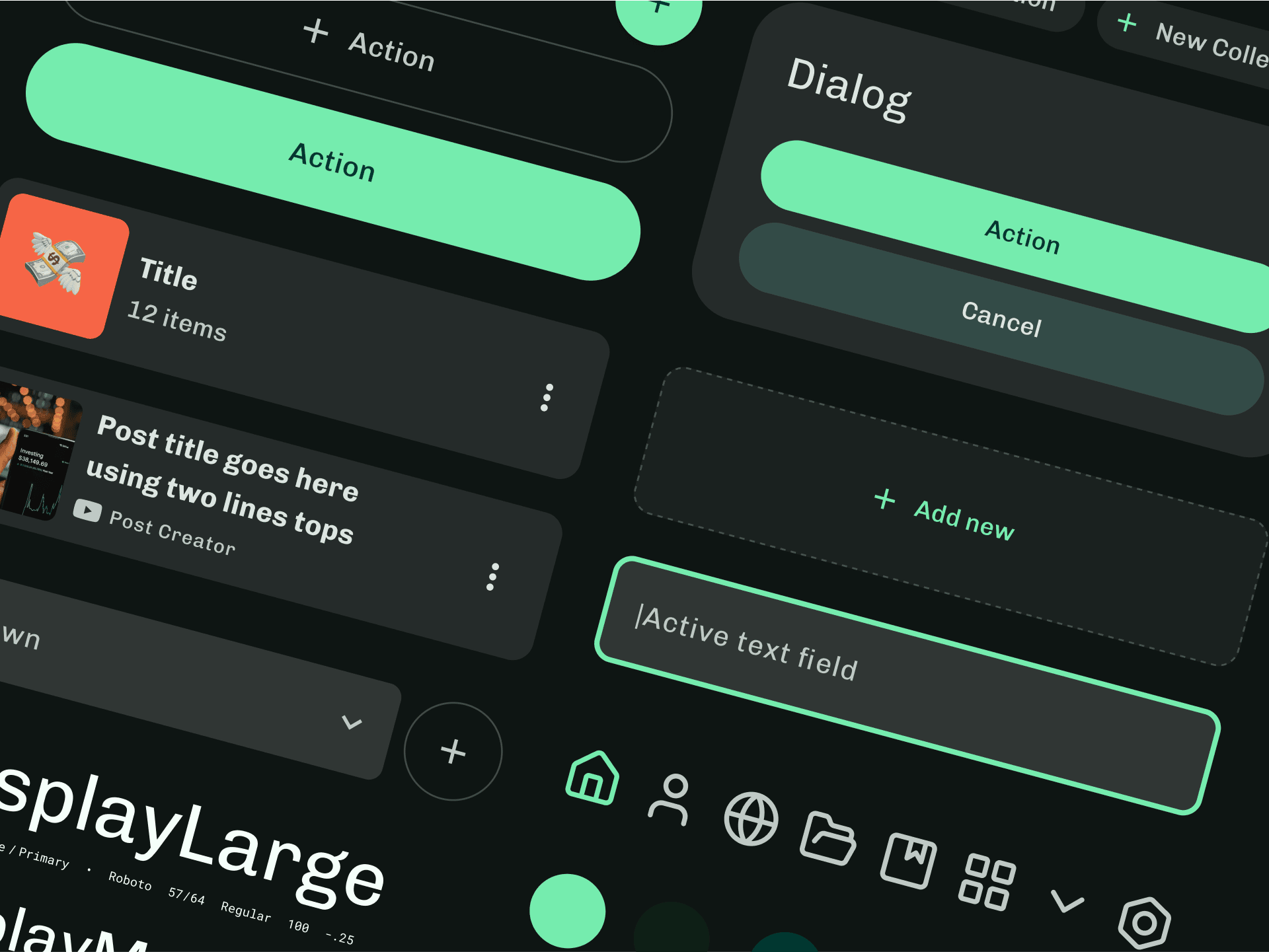
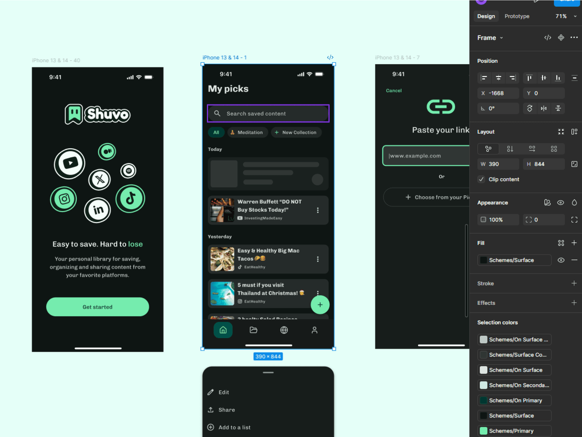
Armed with a clearer sense of direction, I moved to Figma Design to craft the real product. I chose Material Design 3 as the foundation for structure and layout, avoiding early customization so I could focus on the core user flows. Once the experience felt right, I started defining the visual identity — choosing Lucide Icons for consistency and extending the color and typography to form the brand language.
I wanted the brand to emerge from the product, not the other way around — letting the interface and interactions inform the visual tone of the future brand.
I wanted the brand to emerge from the product, not the other way around — letting the interface and interactions inform the visual tone of the future brand.
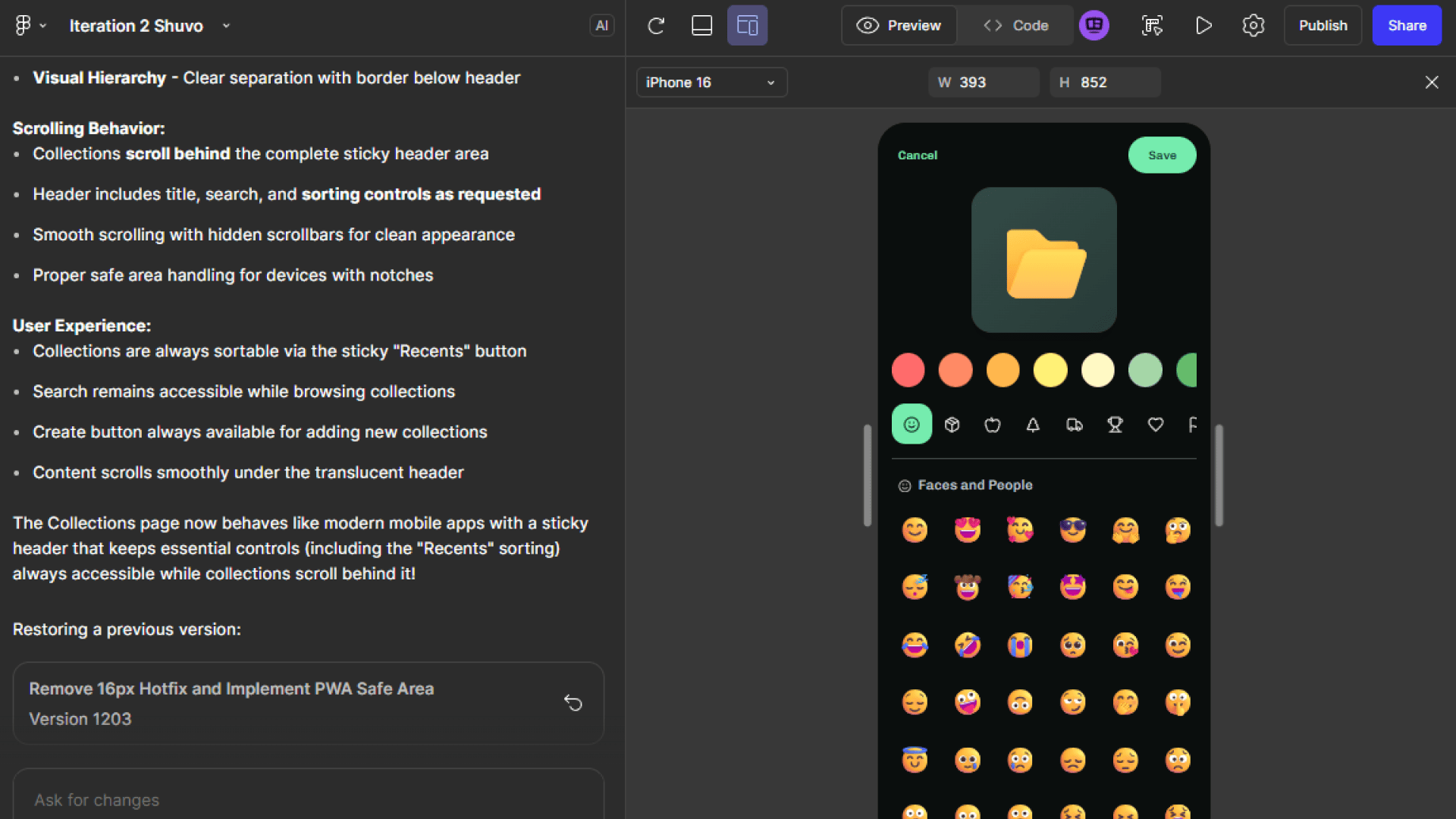
AI development process
With the design ready, it was time to bring it to life in Figma Make. I created a new Make file, shared the PRD for context, and began building page by page, feature by feature. Instead of generating the whole product at once, this step-by-step approach allowed me to test, adjust, and improve the experience continuously while keeping control over performance and consistency.
See it in action as a standalone PWA
Brand
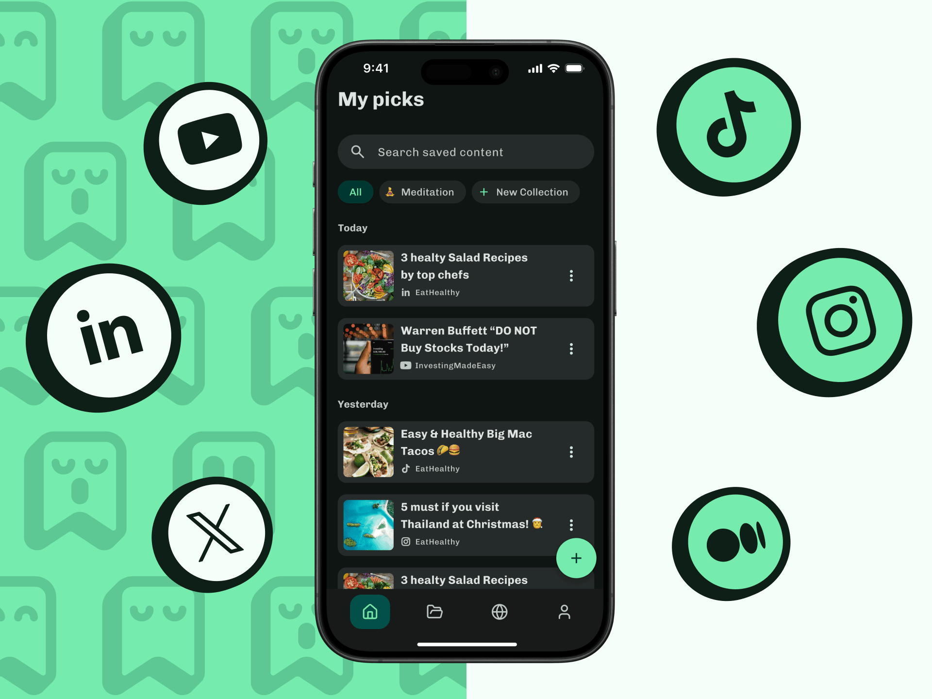
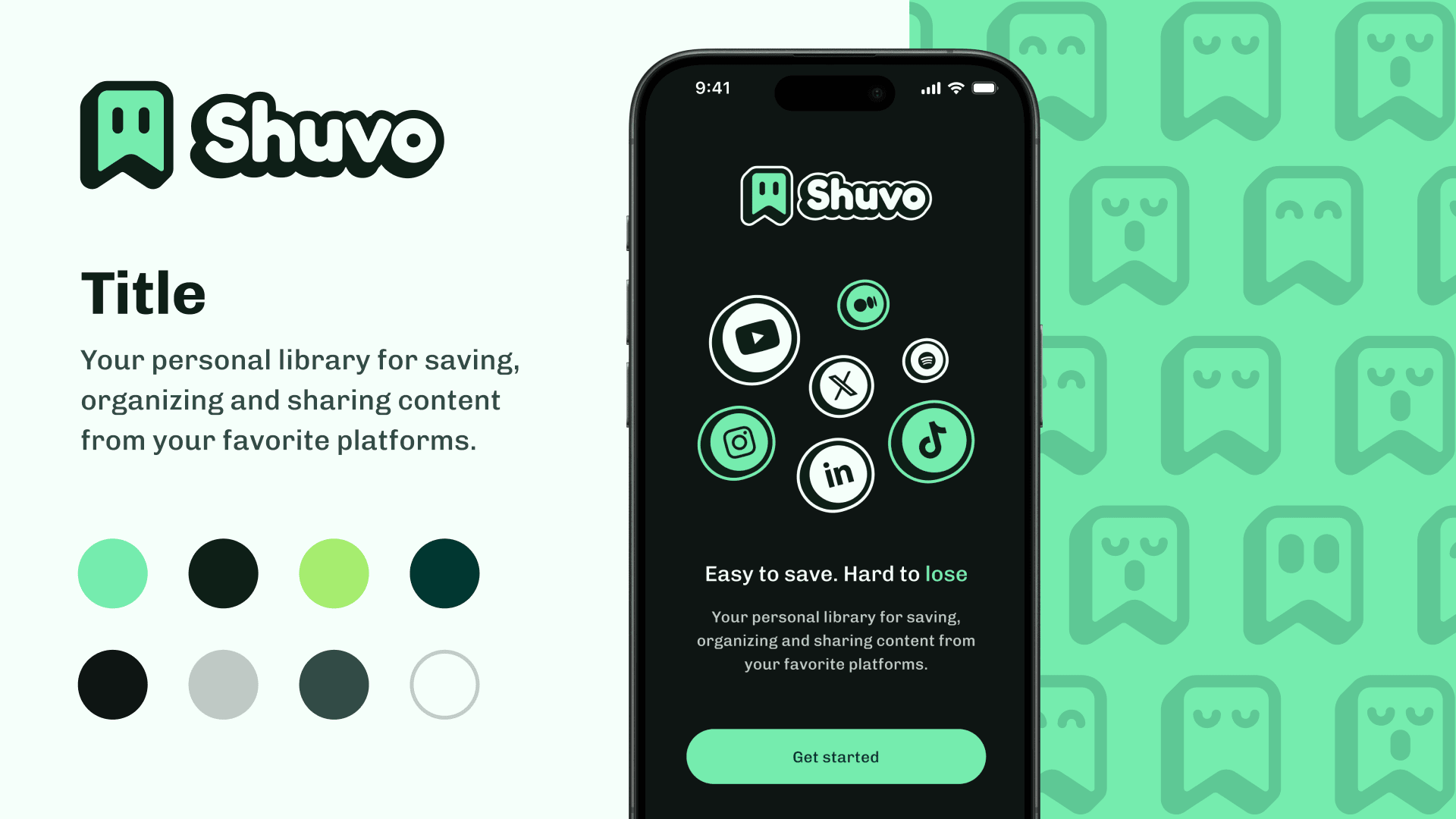
For the brand direction, I chose a playful name and visual tone to resonate with the target audience—content consumers of all kinds. Since the product revolves around content consumption, I opted for a dark mode interface to promote calm and focus during use. To balance this, I introduced an acid mint green accent that adds contrast, freshness, and vibrancy to the overall experience.
The triadic color scheme ensures visual harmony while avoiding unnecessary distractions, keeping the emphasis on the content itself. For the illustration and logo style, I aimed for a friendly and approachable identity, drawing inspiration from the kawaii aesthetic to convey warmth and playfulness in a clean, modern way.
Video presentation
What could've gone better
Once the codebase evolved, Figma Make struggled with simple tasks like carousels or scrolling in standalone mode.
Image handling was difficult, especially after merging Shadcn UI with Material 3.
Fetching systems for multiple social platforms were inconsistent — fixing one often broke another.
No direct support for publishing to the Apple or Android stores.
Not having components and views consistently named made communication with Make less efficient.
What worked well
Iteration speed was incredible — testing architectures and flows happened almost instantly.
The PWA implementation worked perfectly on the first attempt.
External services integration (fetching content from social media) worked surprisingly well.
The Lucide icon library imported seamlessly into Make.
Next steps
The next iterations will focus on:
Building a community layer around shared content.
Enabling public and private collection sharing.
Expanding collaborative collections for group use.
Thank you for reading! 💚