Table of Contents
- Context
- The final product
- Outcomes
- The how we got to this result
Context
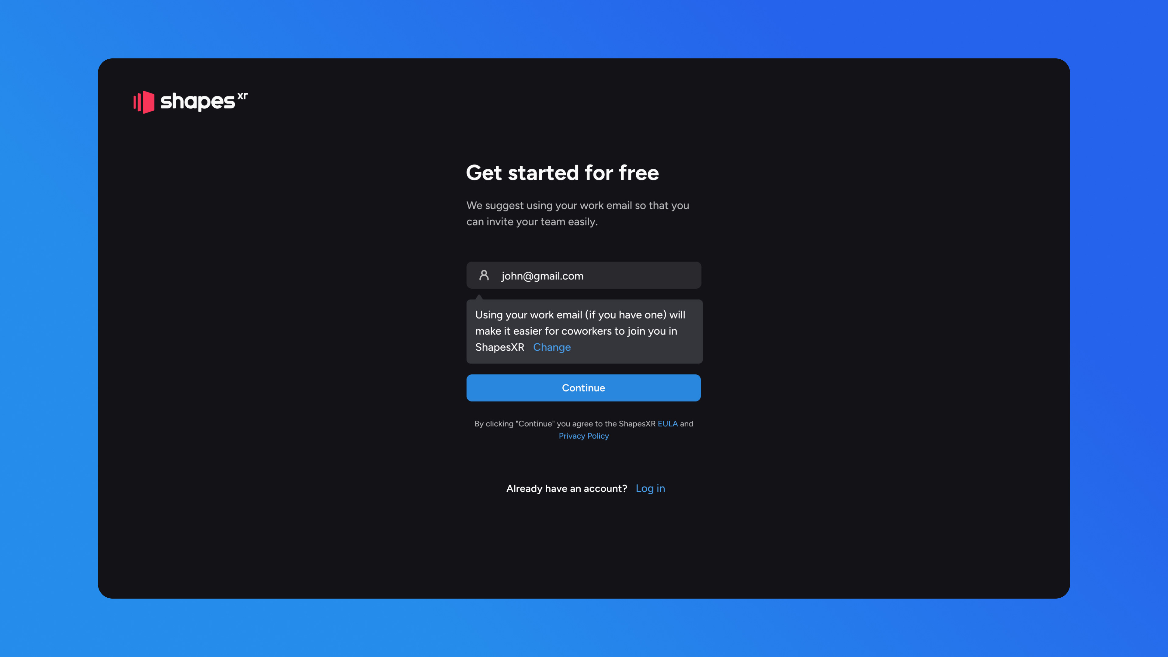
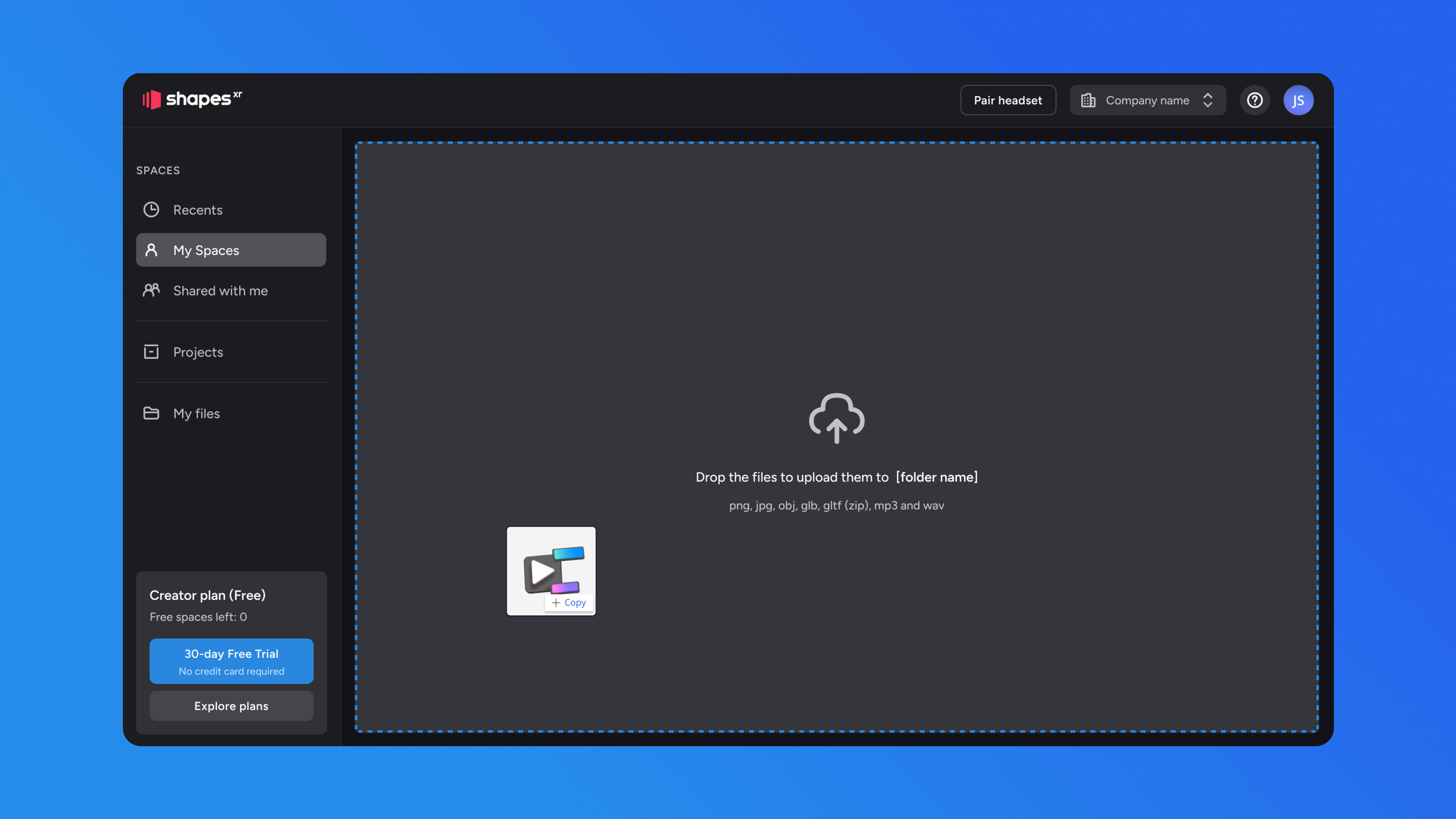
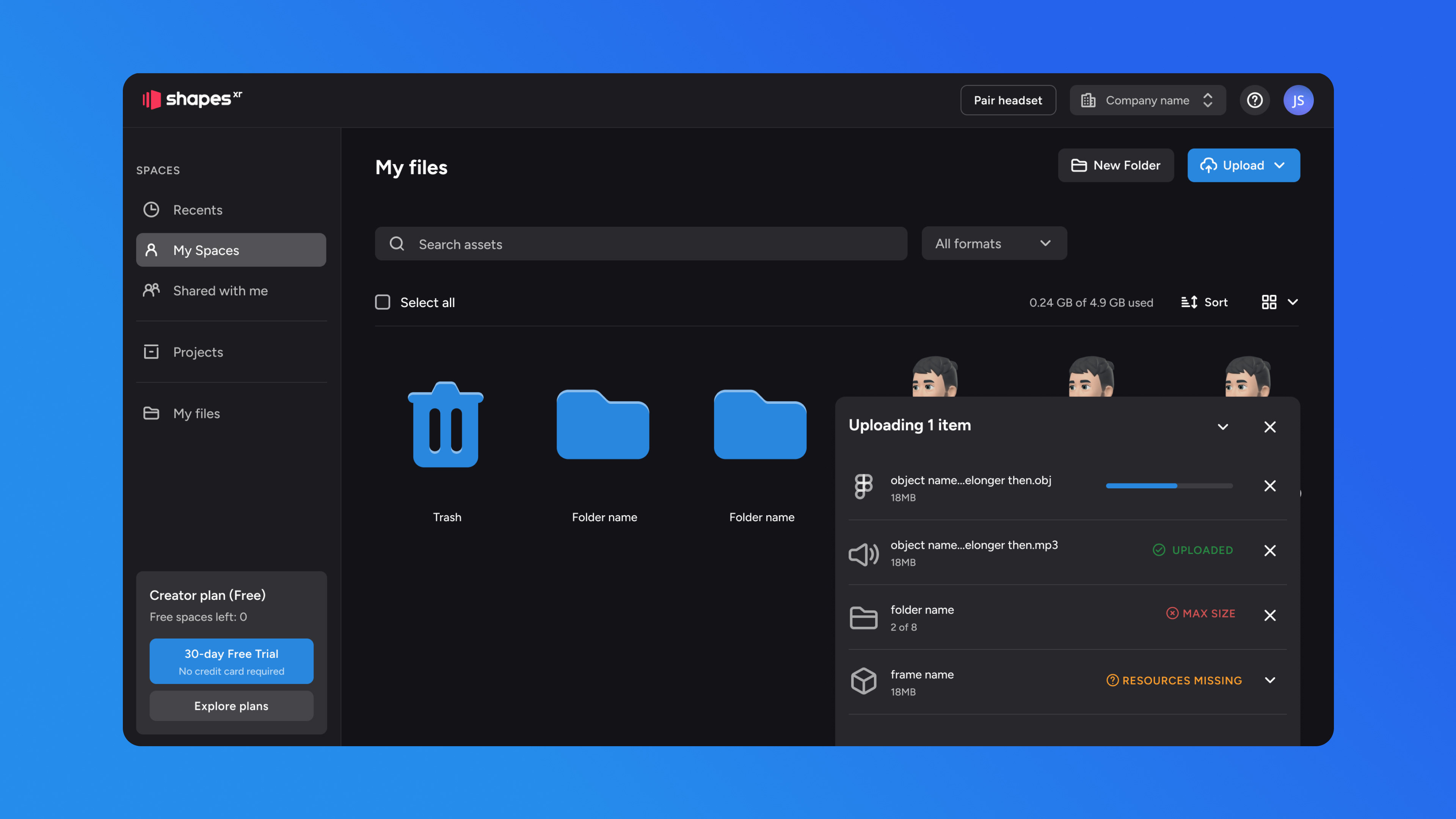
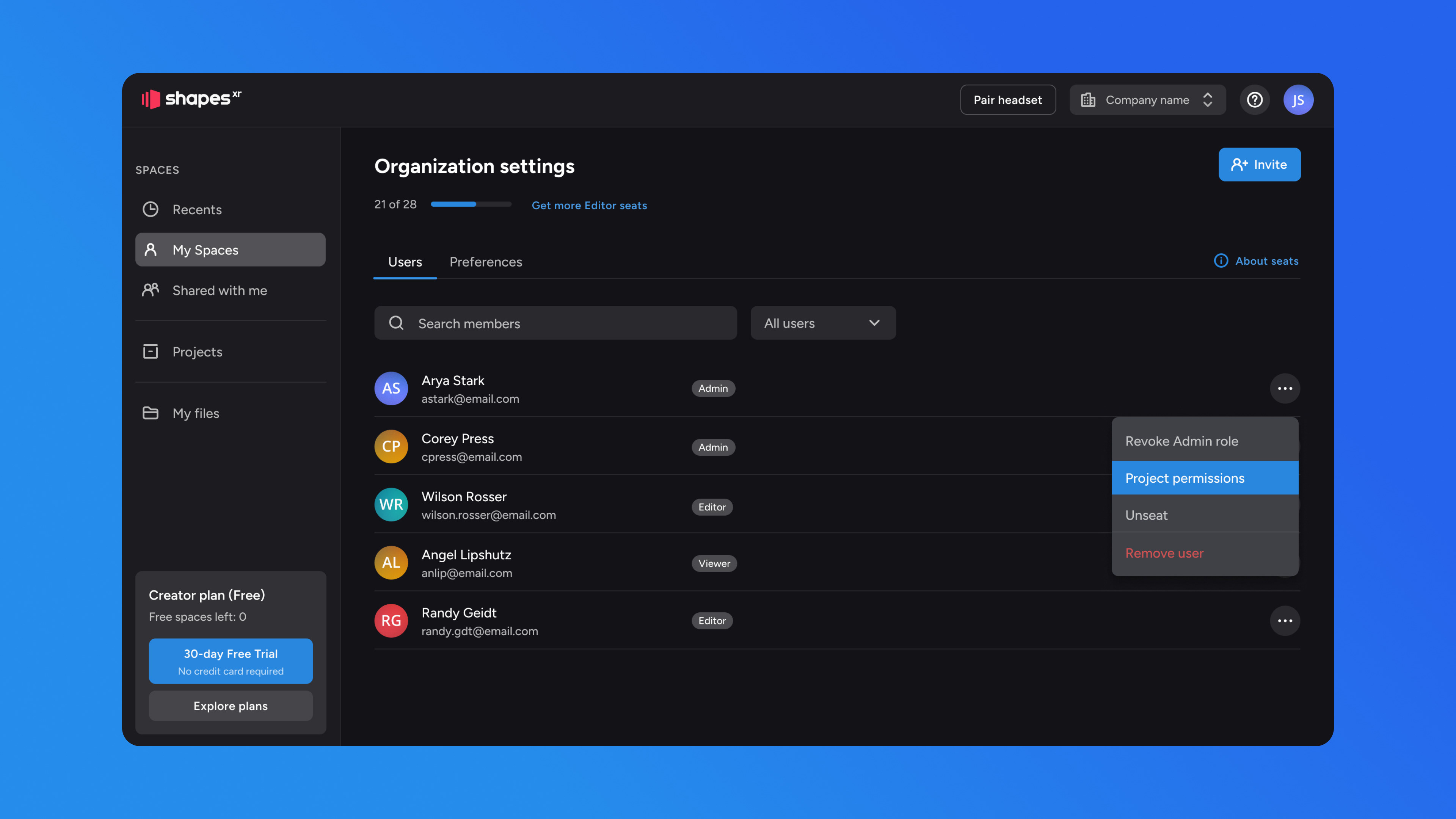
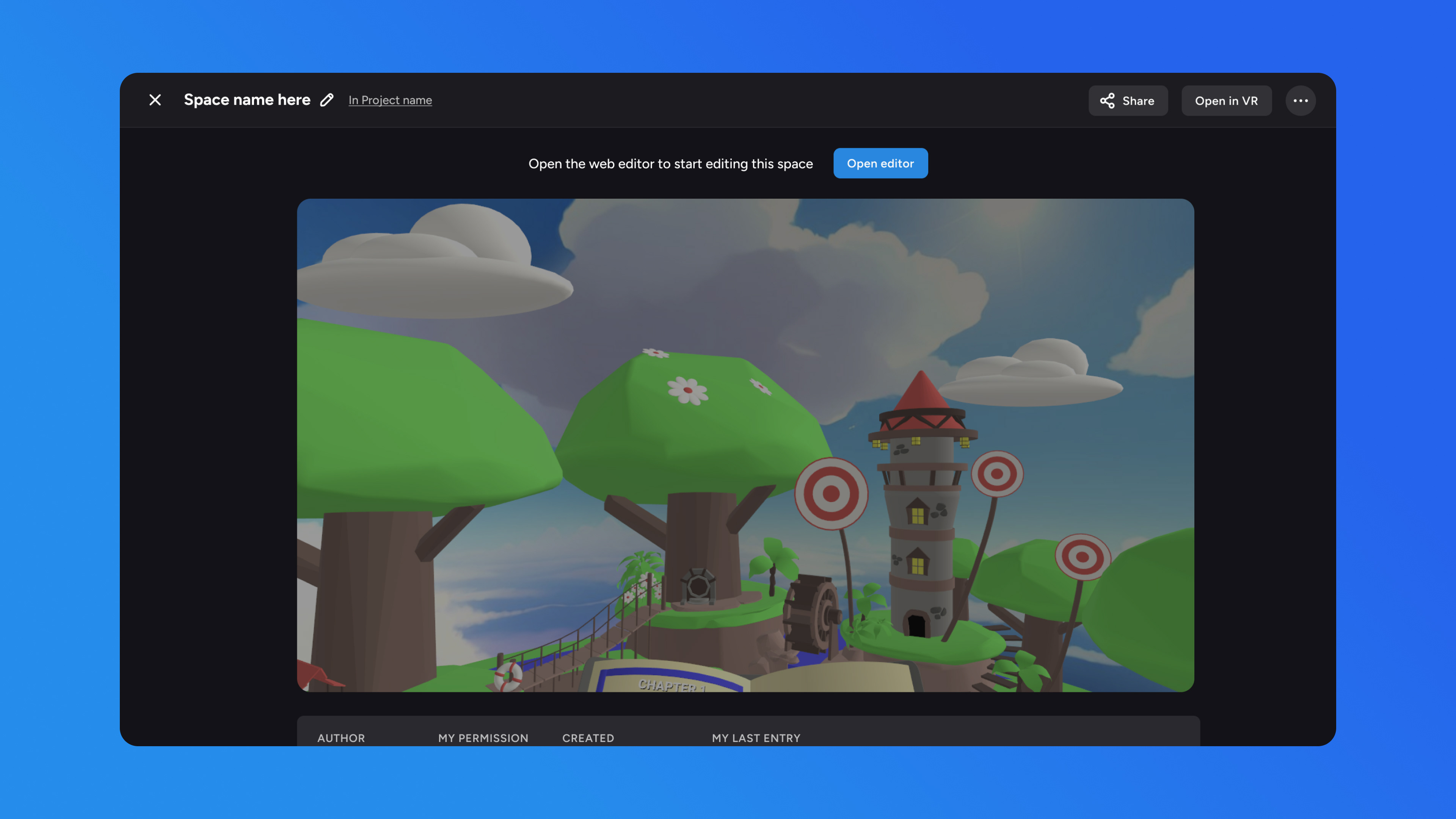
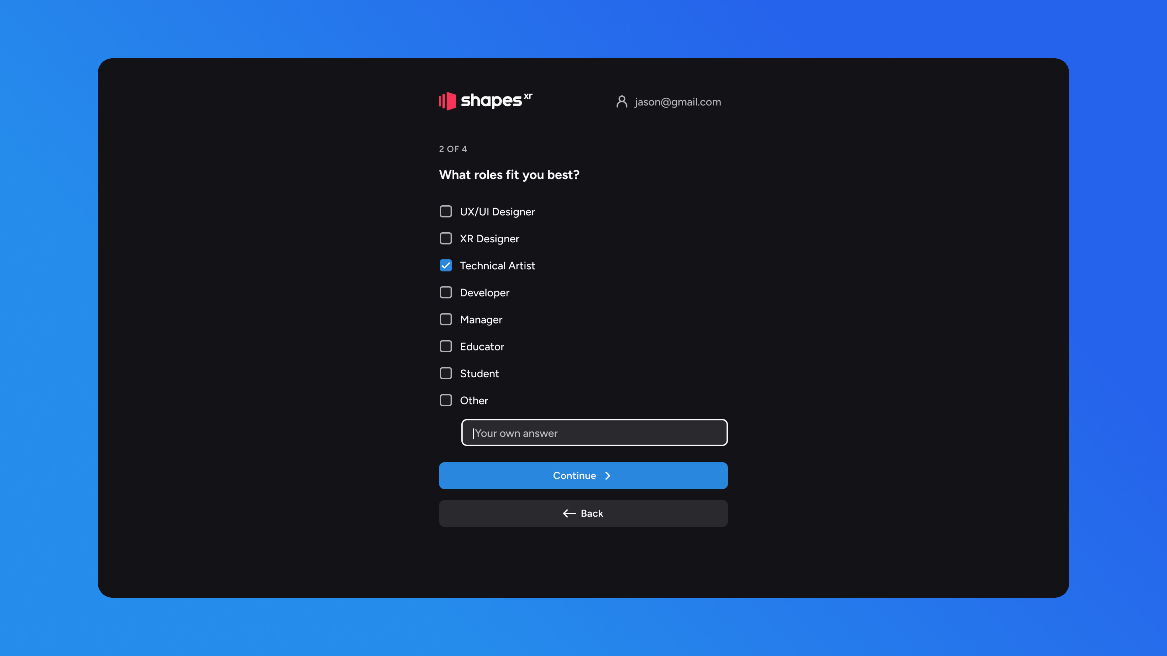
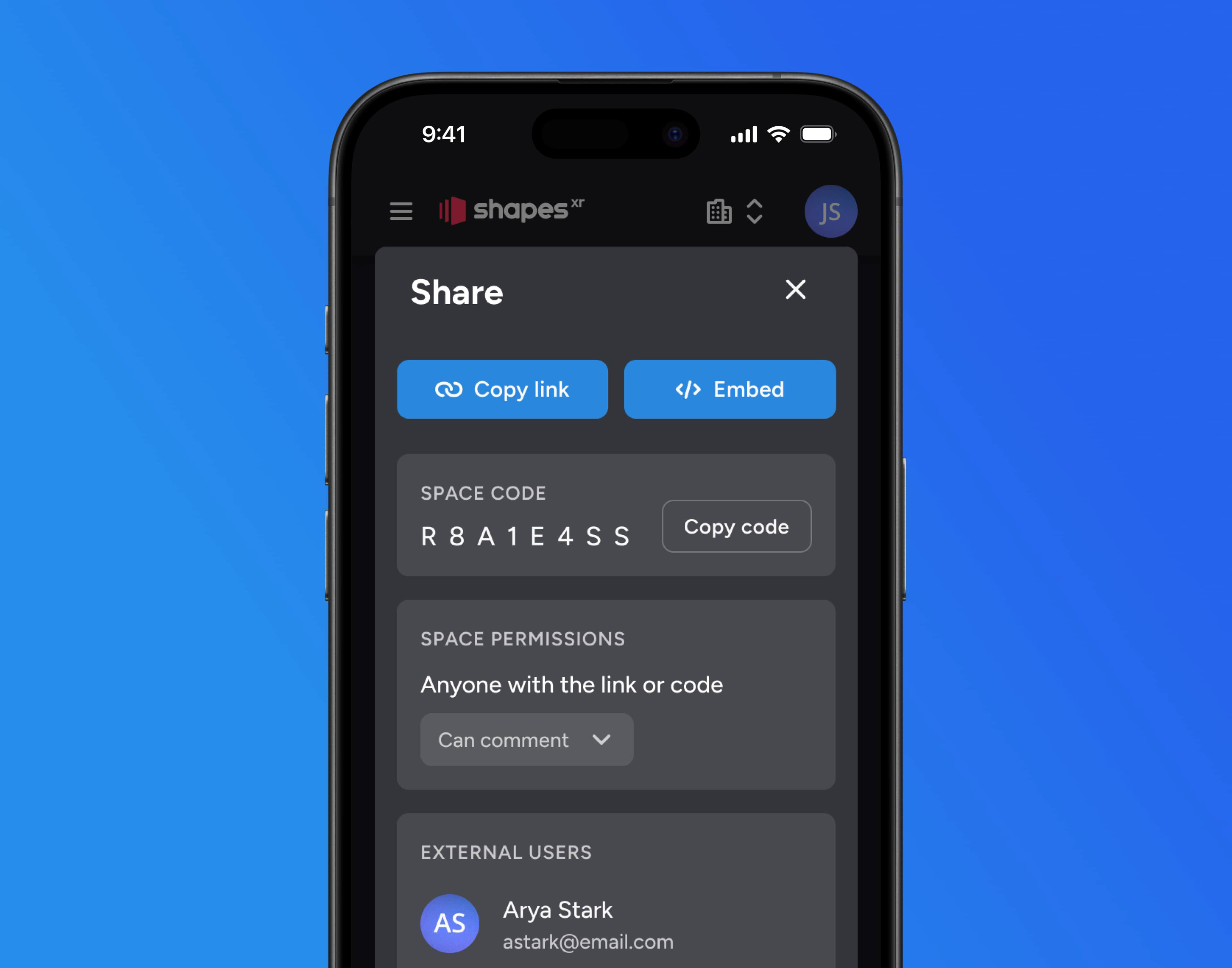
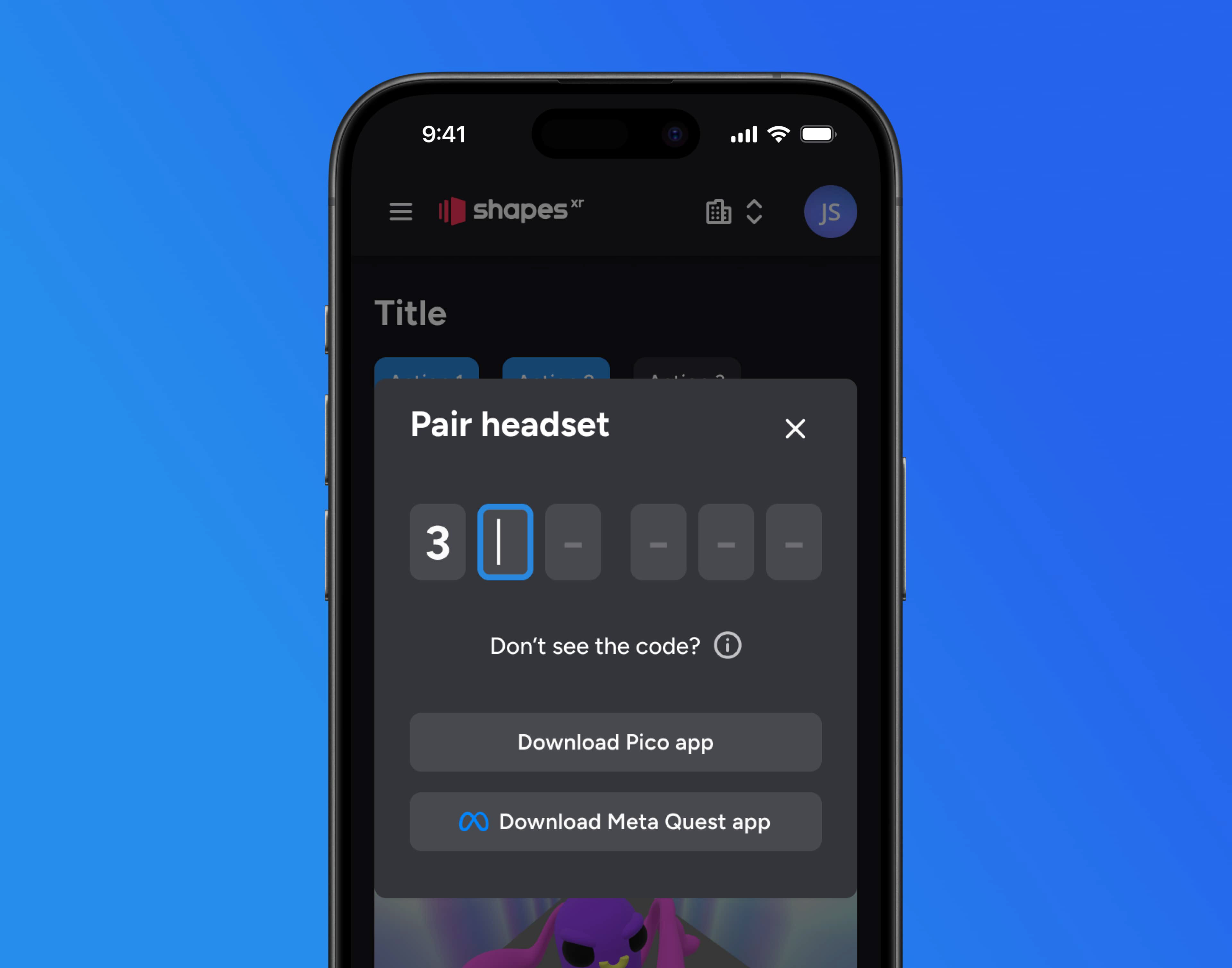
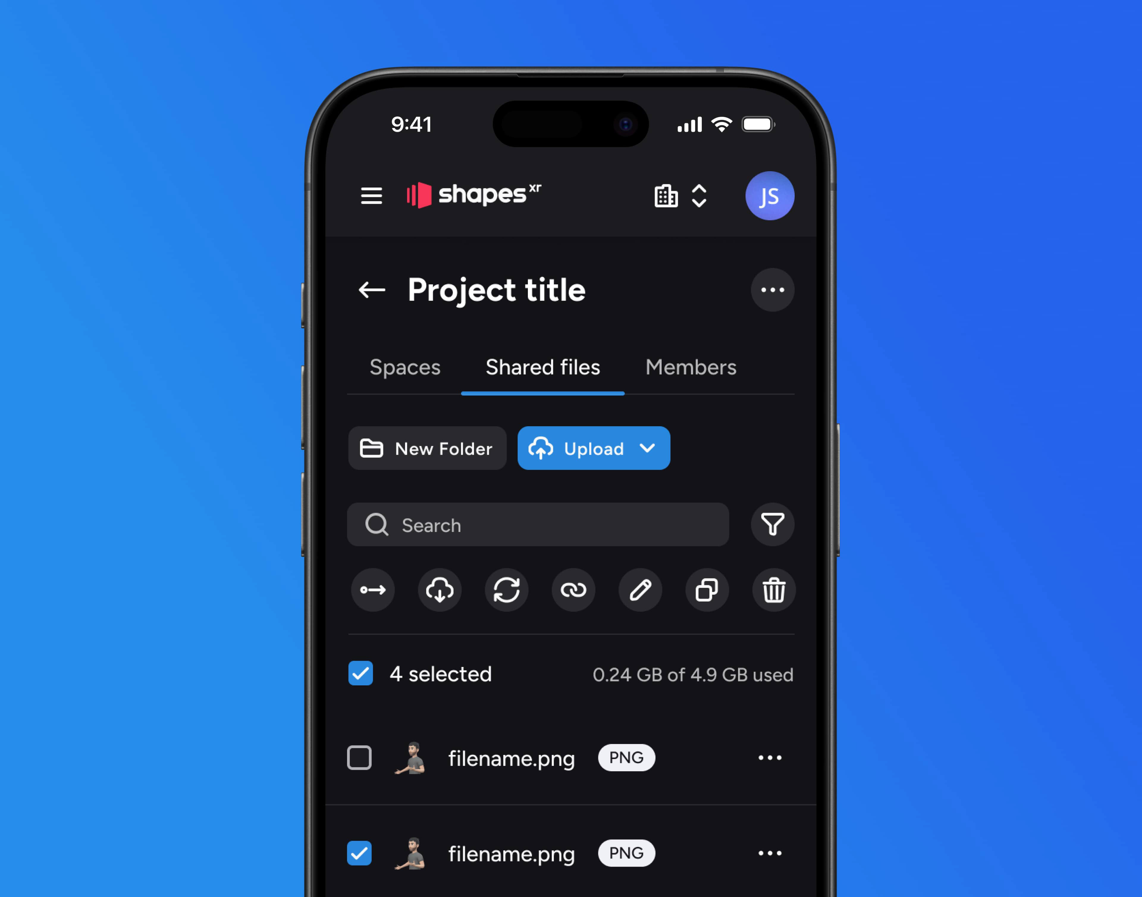
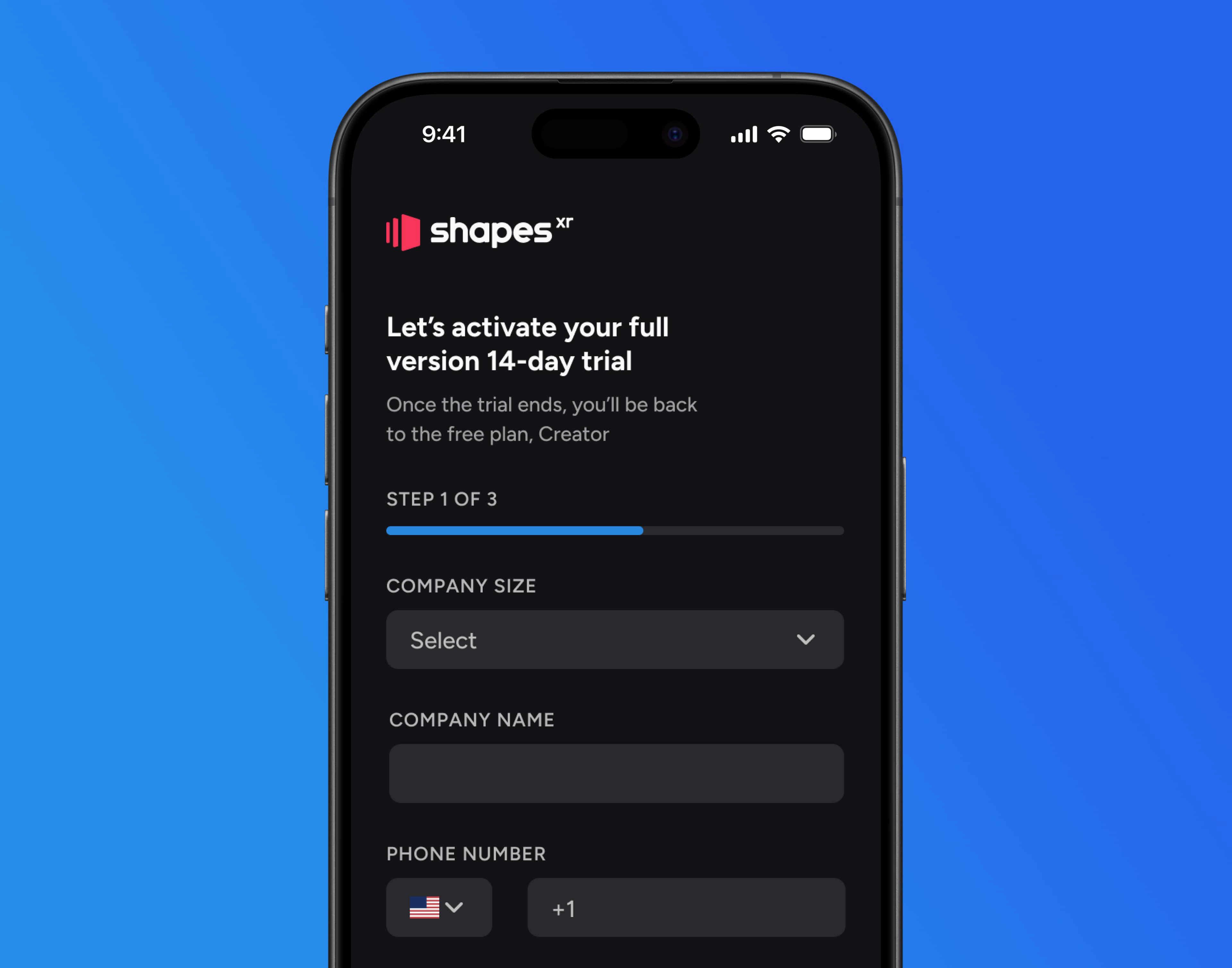
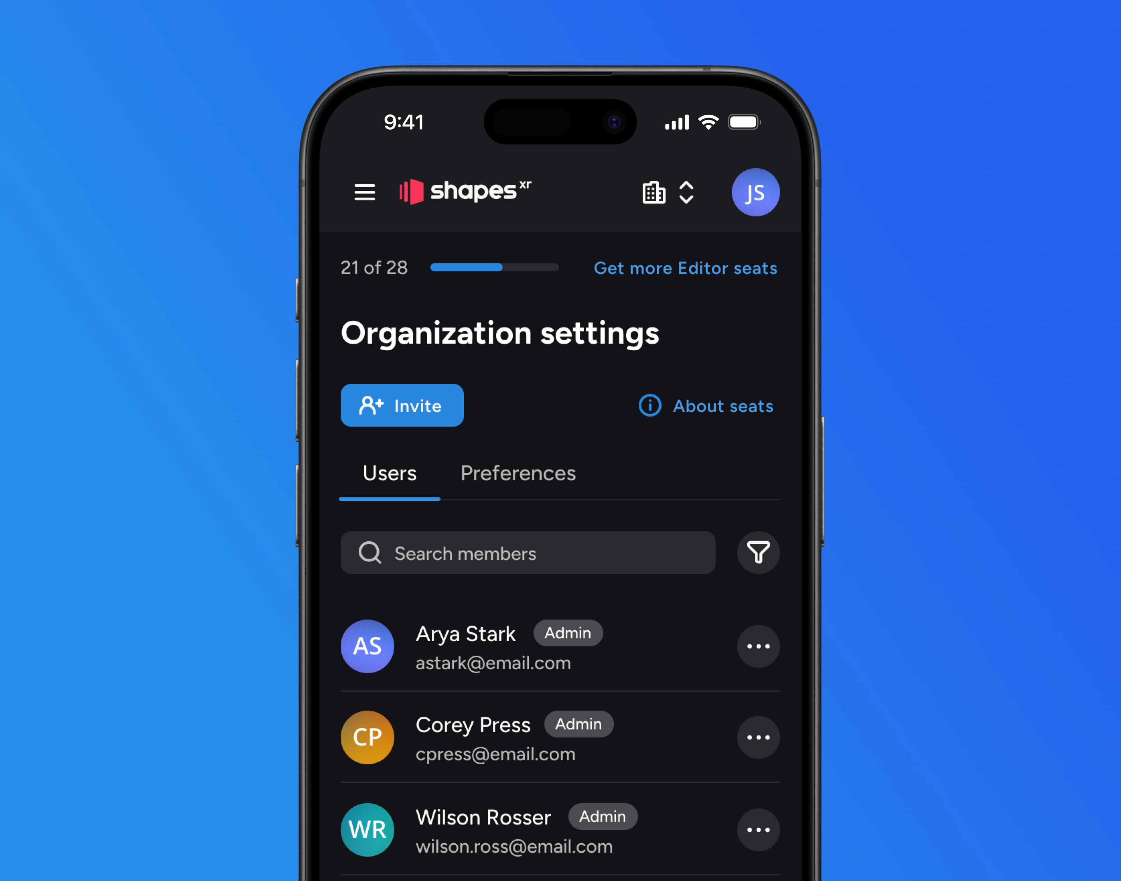
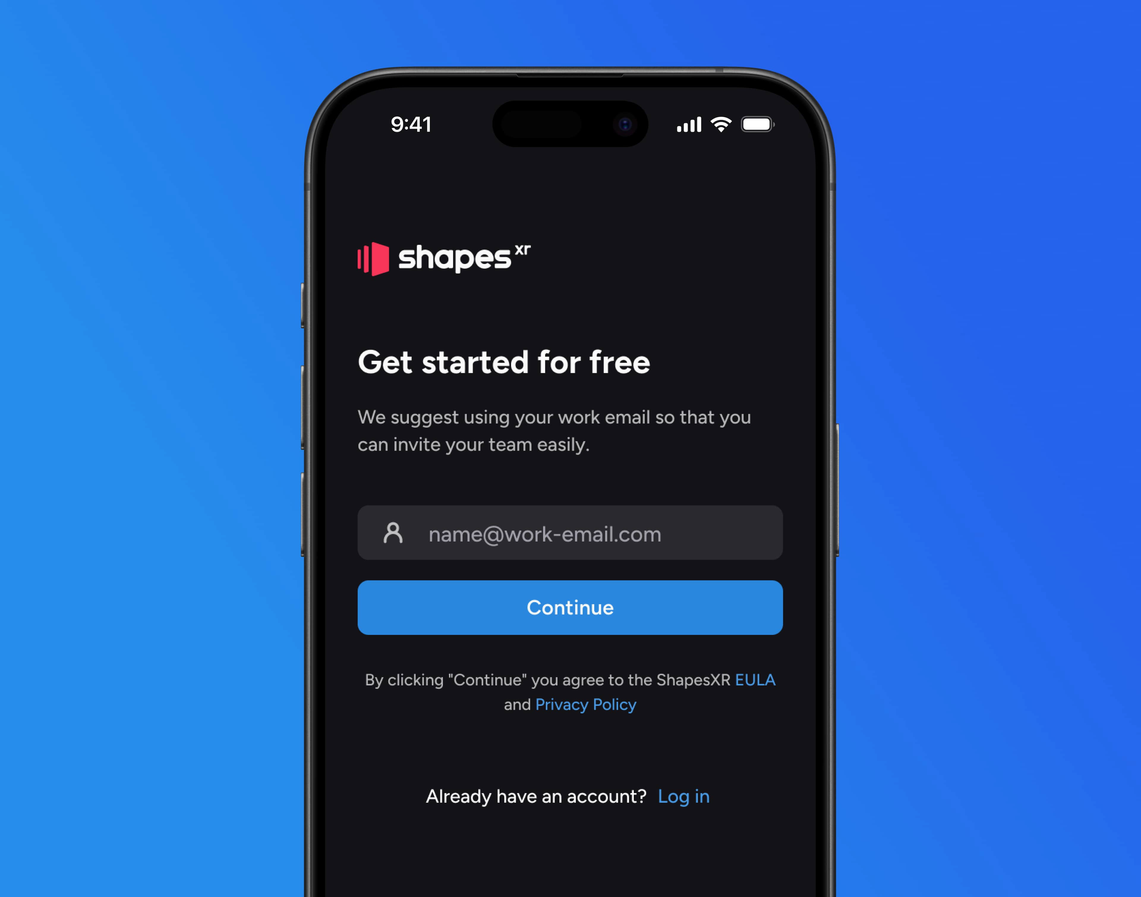
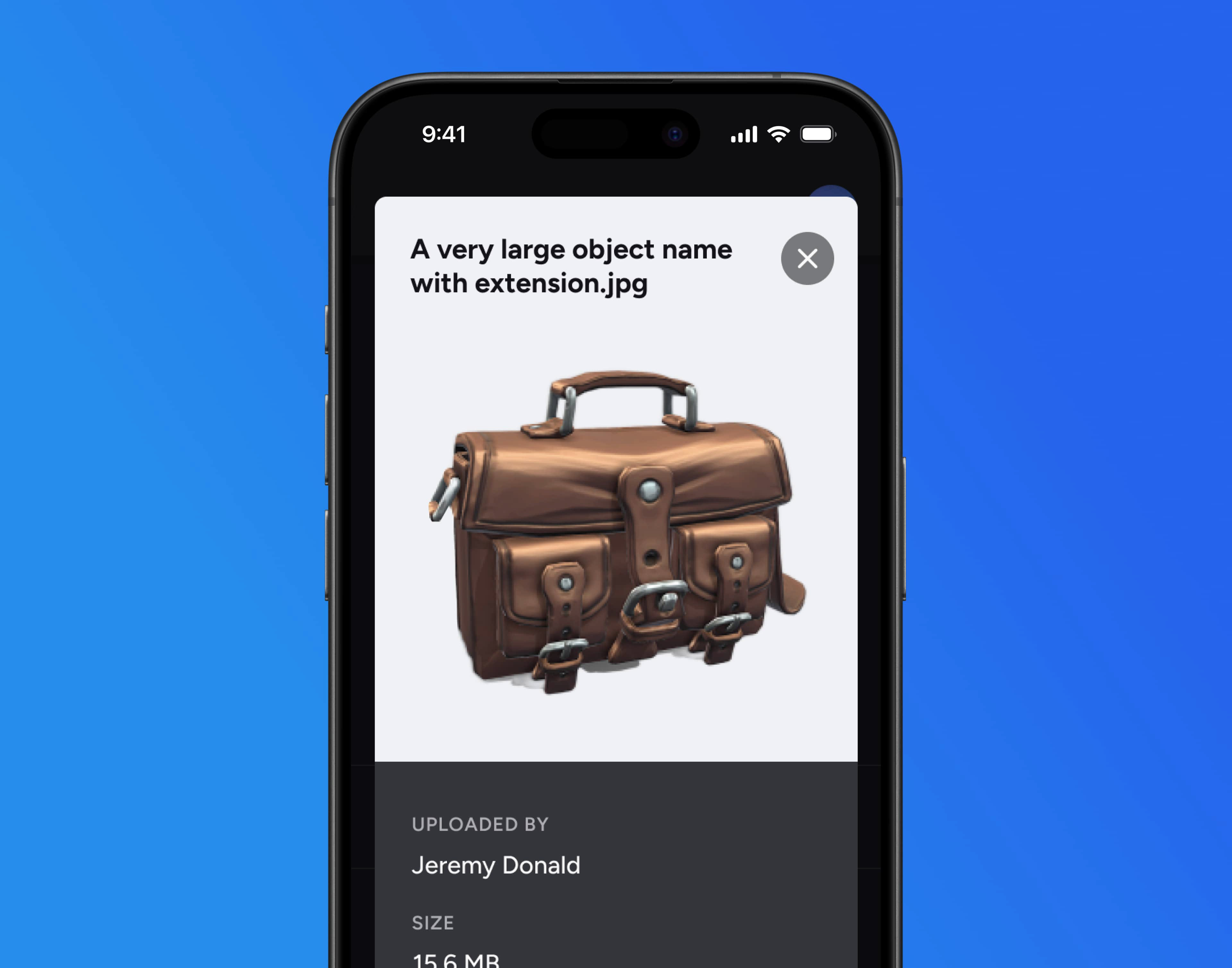
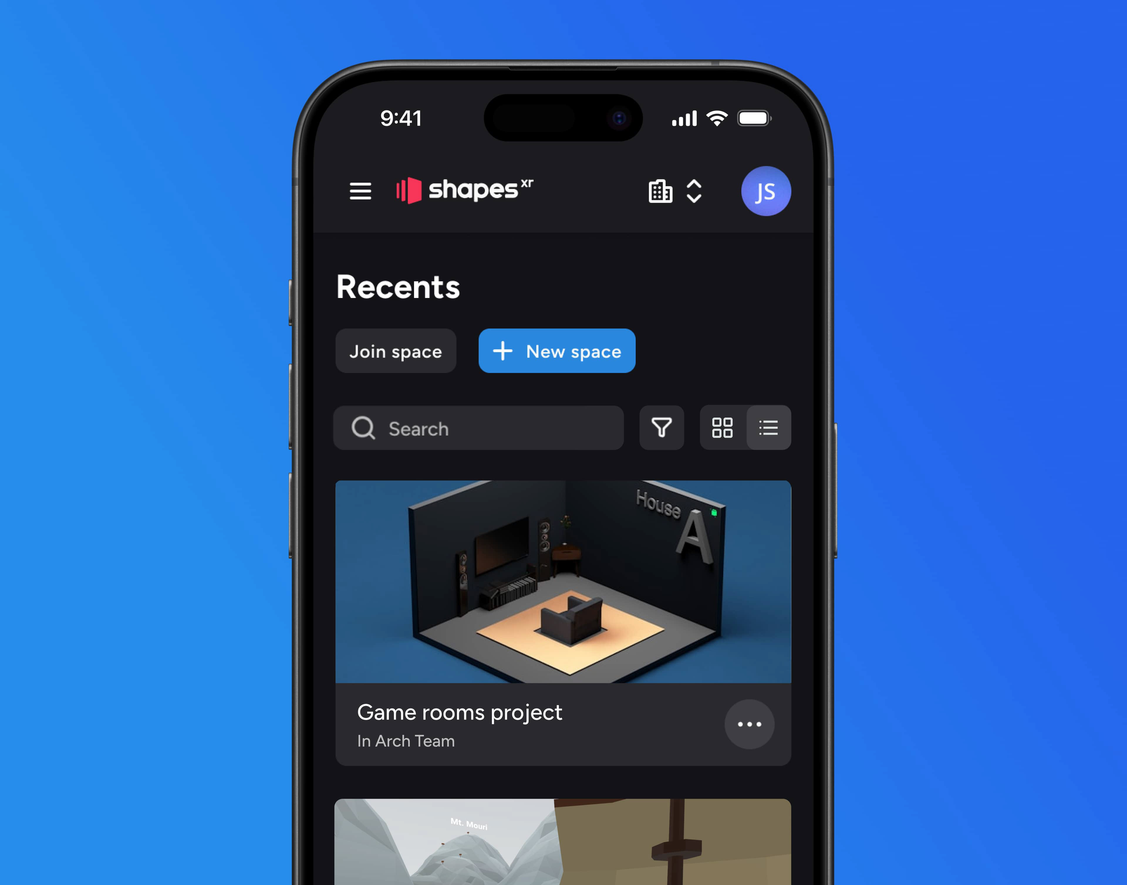
ShapesXR is a VR design tool, often referred to as the Figma for VR apps. As a part of its workflow, ShapesXR allows users to manage their projects on the web. This web application, or Dashboard, also enables users to import 3D models or images into their projects for use in the VR app. Additionally, it provides features for organizing projects, setting roles and permissions, and managing both organizational and personal accounts.
For this project, I was assigned the task of redesigning the web app. The original web app exhibited several UX and UI issues, including a complex flow for updating files, core sections like Projects hidden in the main menu, the absence of a UI kit and design system, and a non optimized mobile experience.
This redesign initiative aimed to address these concerns and enhance the overall usability of the platform.
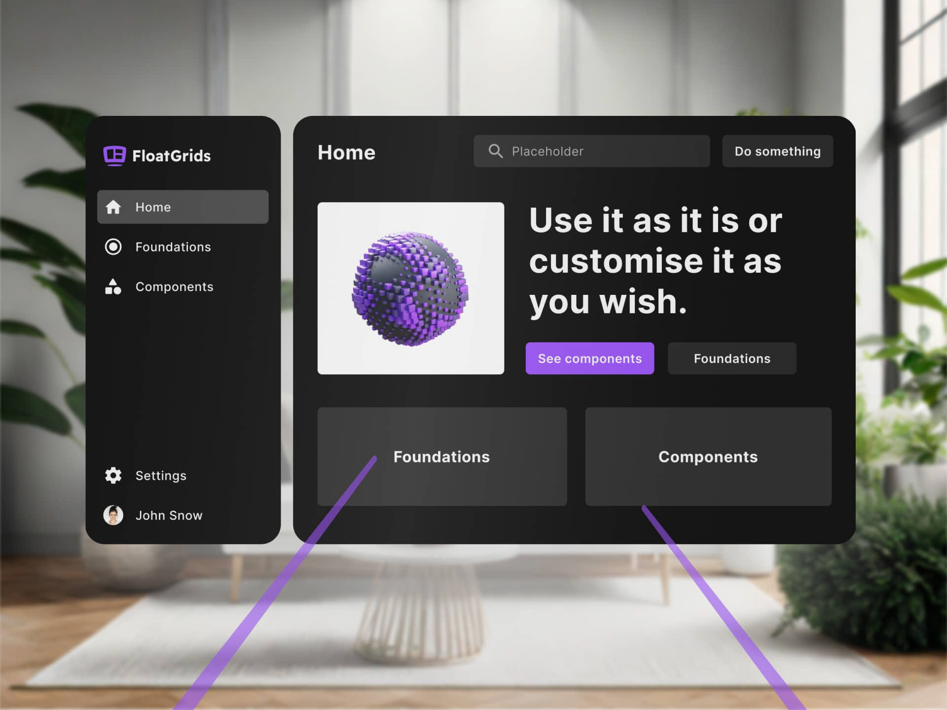
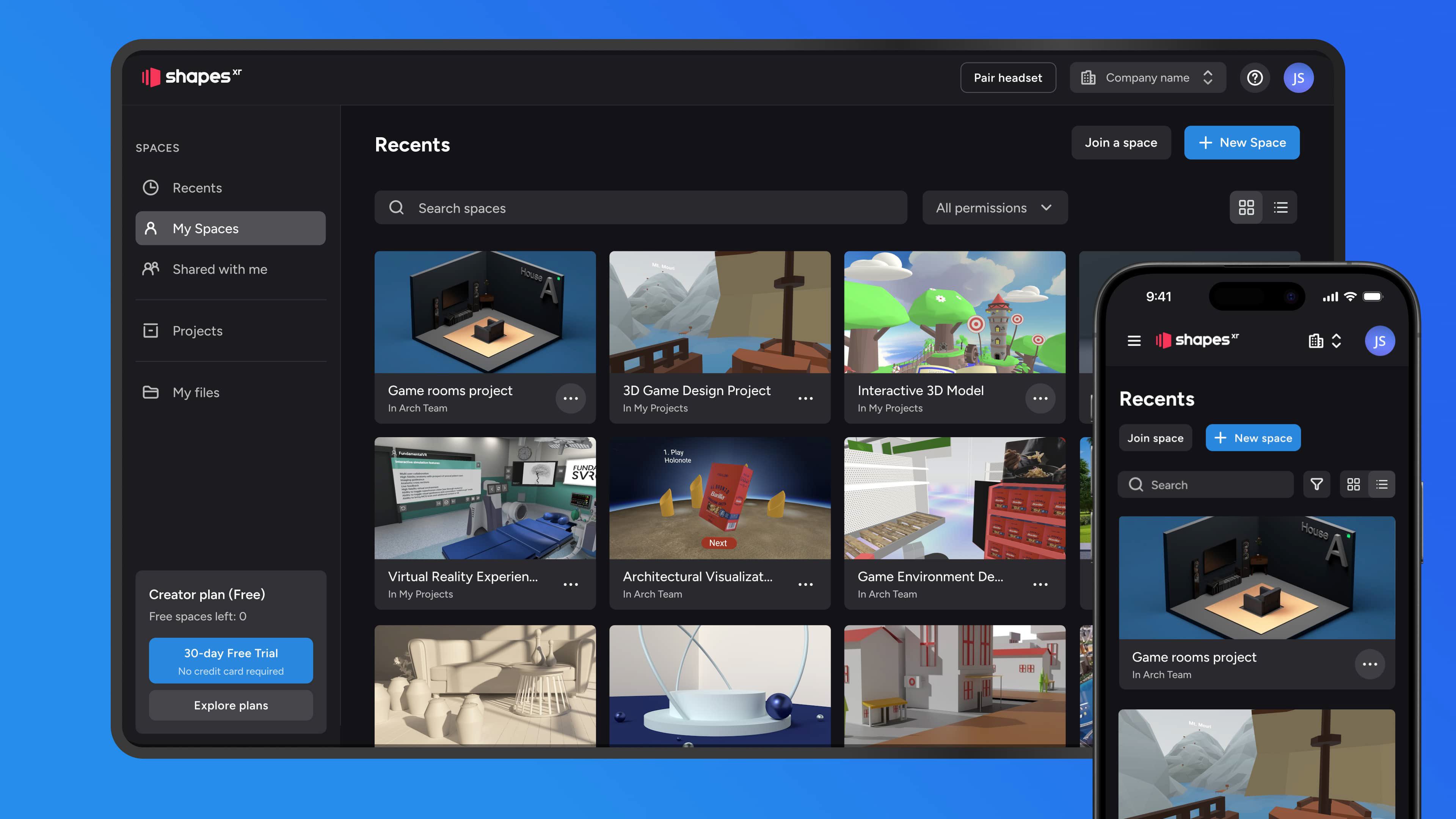
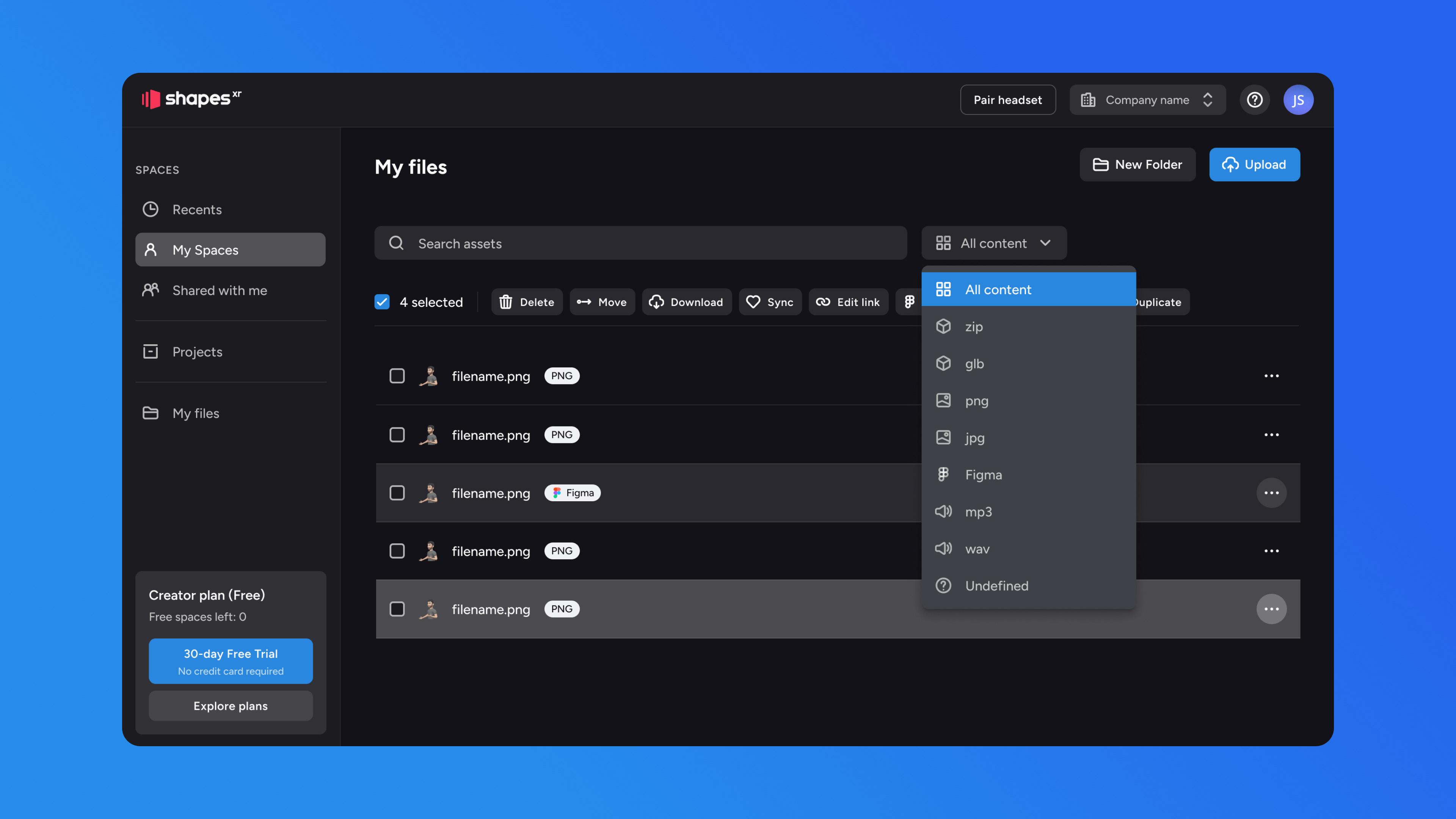
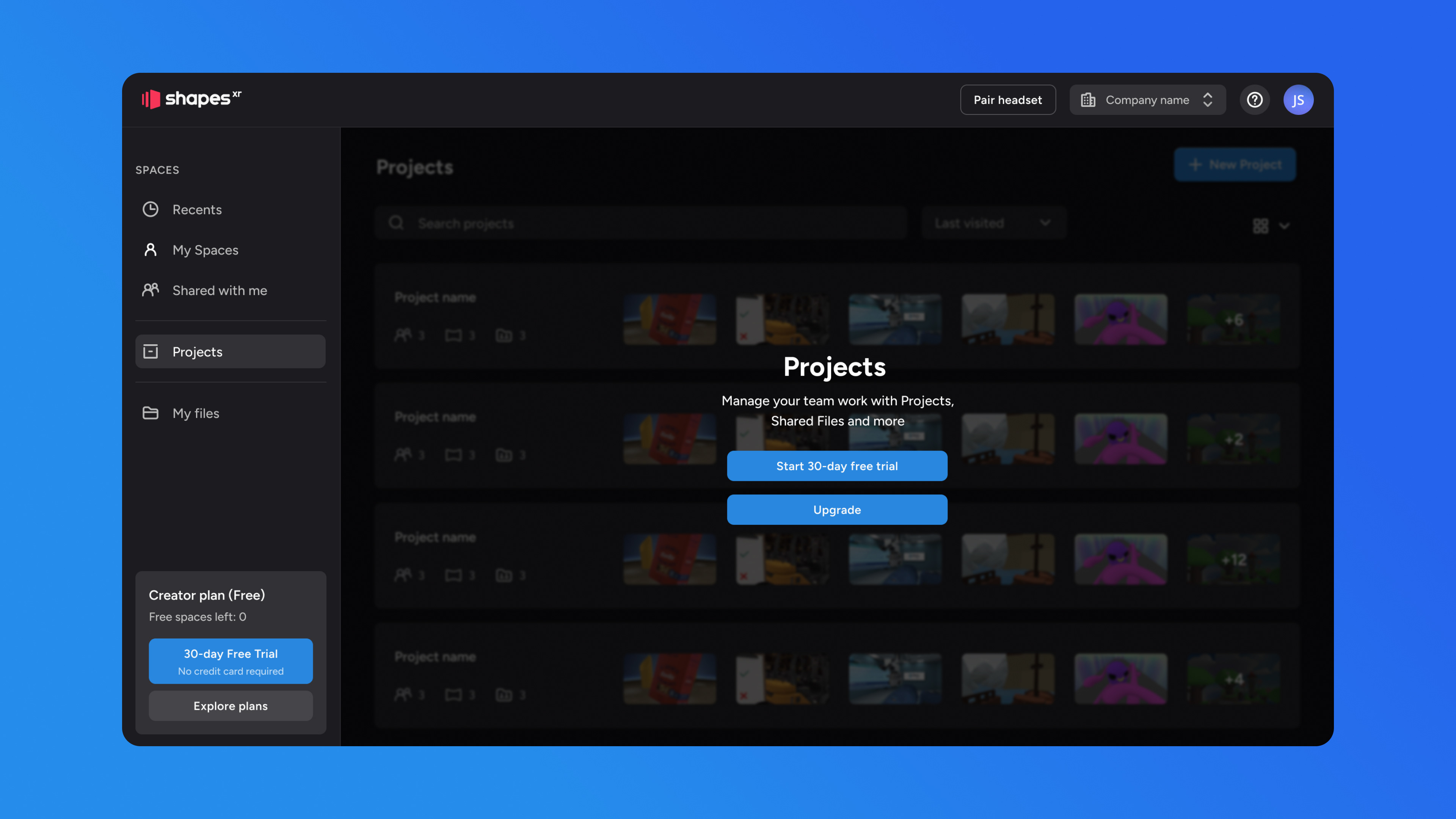
Design Solution
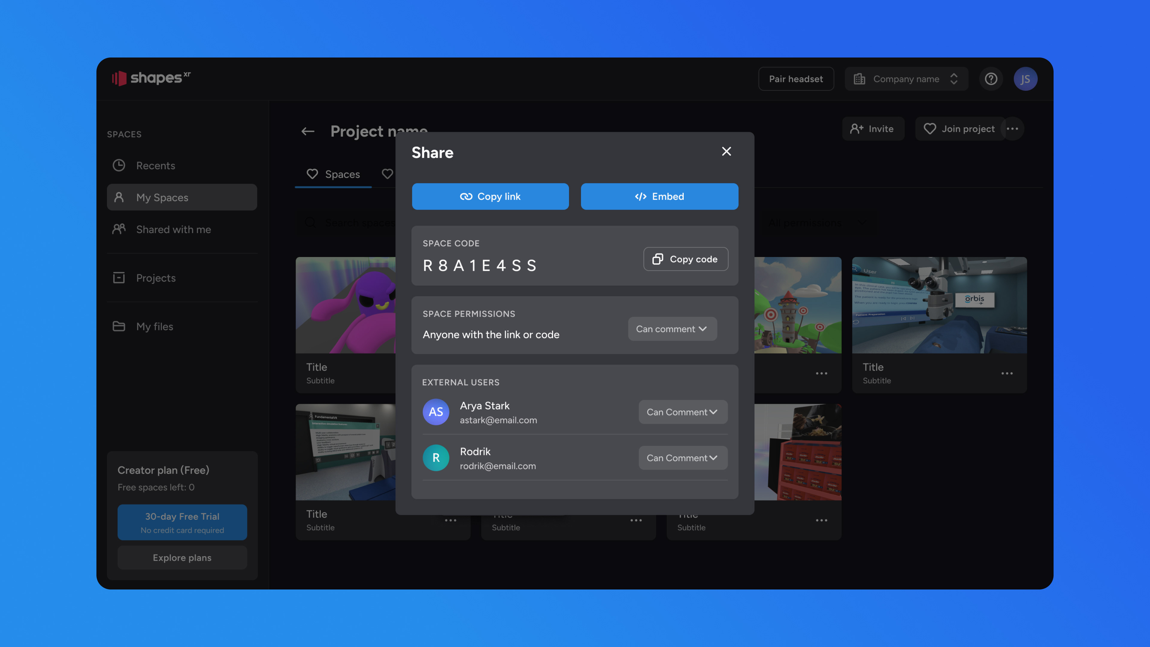
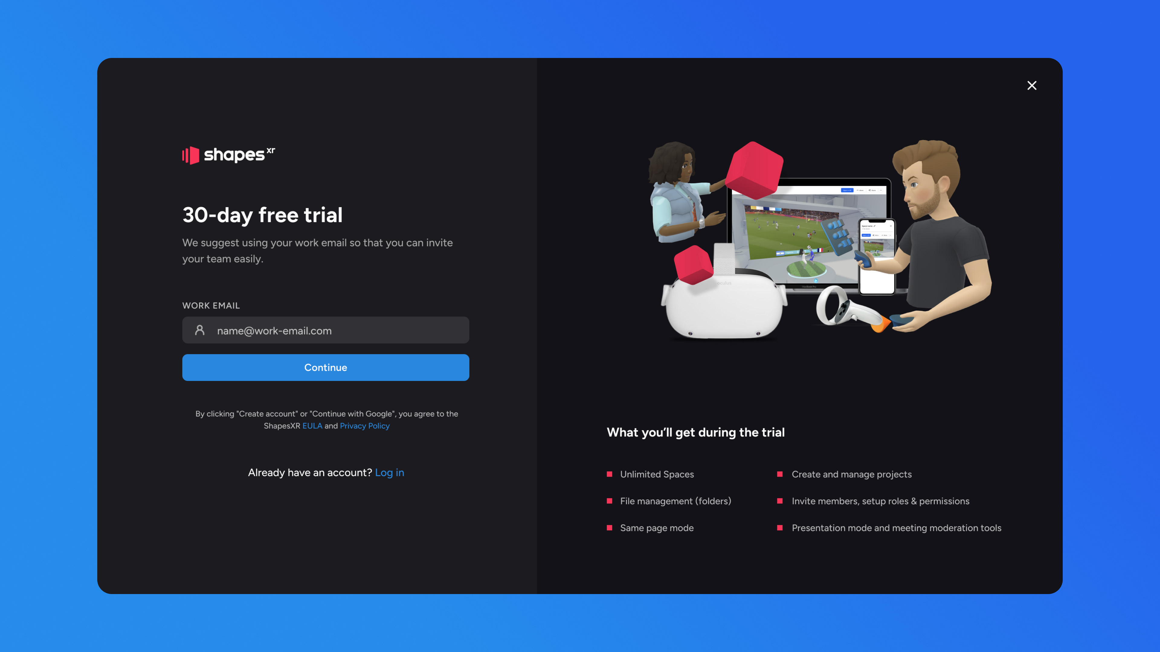
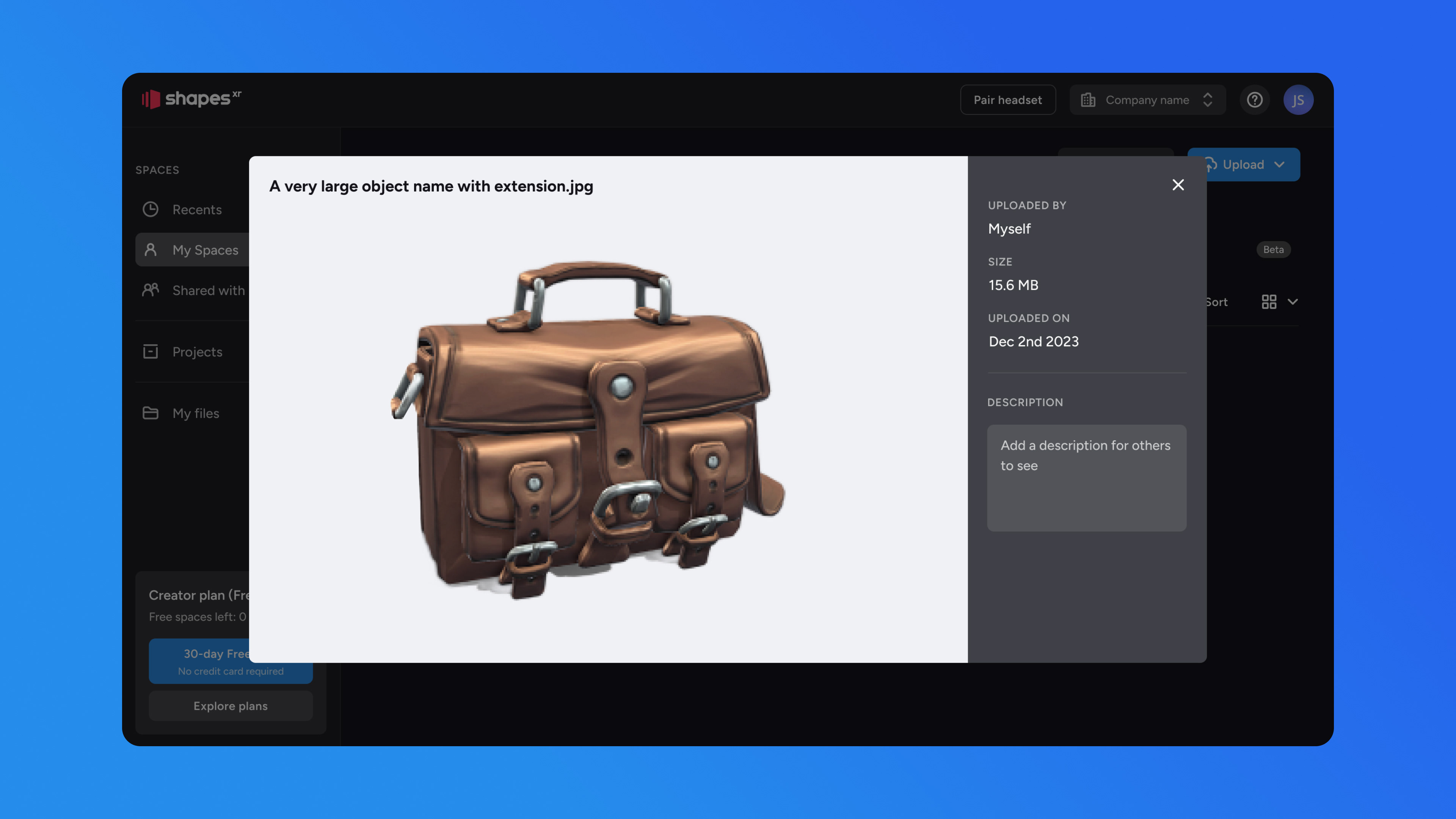
The result was a UI that seamlessly matched the visual style of the other products, despite being built with different technologies. Achieving a modern, refined look and ensuring smooth user flows for key actions—such as space creation and object uploads—were top priorities. The outcome exceeded the 15% increase initial goal, with unique space creation increasing by 19% and unique users uploading files by 22%. The inclusion of additional supported formats, such as MP3, MP4, and WAV, also contributed to the rise in unique users uploading files.
Key Metrics
After the release, the Dashboard became usable on both desktop and mobile devices. The number of imported assets increased by 30%, and there was a 10% weekly increase in retention for mobile users.
On the other hand, as a team, we experienced increased efficiency. The design system, in alignment with the code, enabled us to work faster by utilizing existing components rather than creating them from scratch every time a new feature needed implementation
Design Process
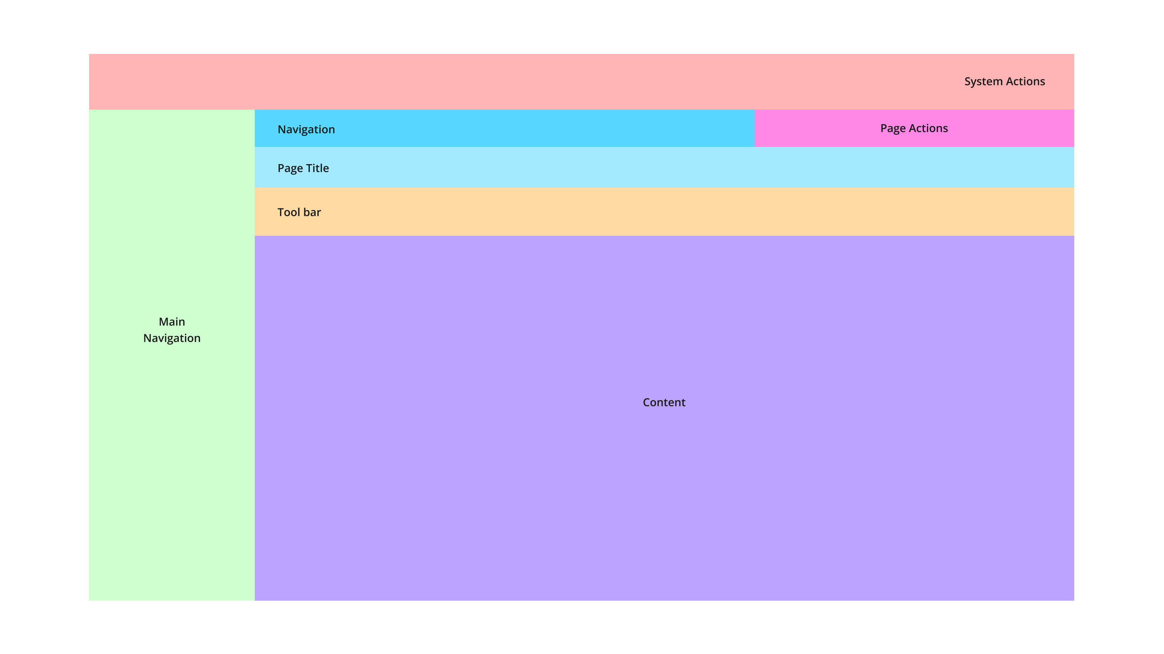
The strategy began with a comprehensive analysis of existing pain points and broken user flows, resulting in a complete restructuring of the information architecture and navigation. This process led to the creation of a new design system featuring consistent navigation patterns, layouts, and a unified UI kit.
Key functionalities such as space creation, project setup, and file management were closely monitored to ensure engagement remained stable or improved. The objective was to achieve a 15% increase in unique space creation and unique file uploads while maintaining steady usage across other core features—ultimately leading to more users successfully completing key tasks. The results exceeded the initial goal, with unique space creation rising by 19% and unique users uploading files increasing by 22%.
The approach involved a full inventory of existing pages, followed by the development of a refined information architecture. A heuristic evaluation was conducted in collaboration with the team to identify and prioritize usability issues.
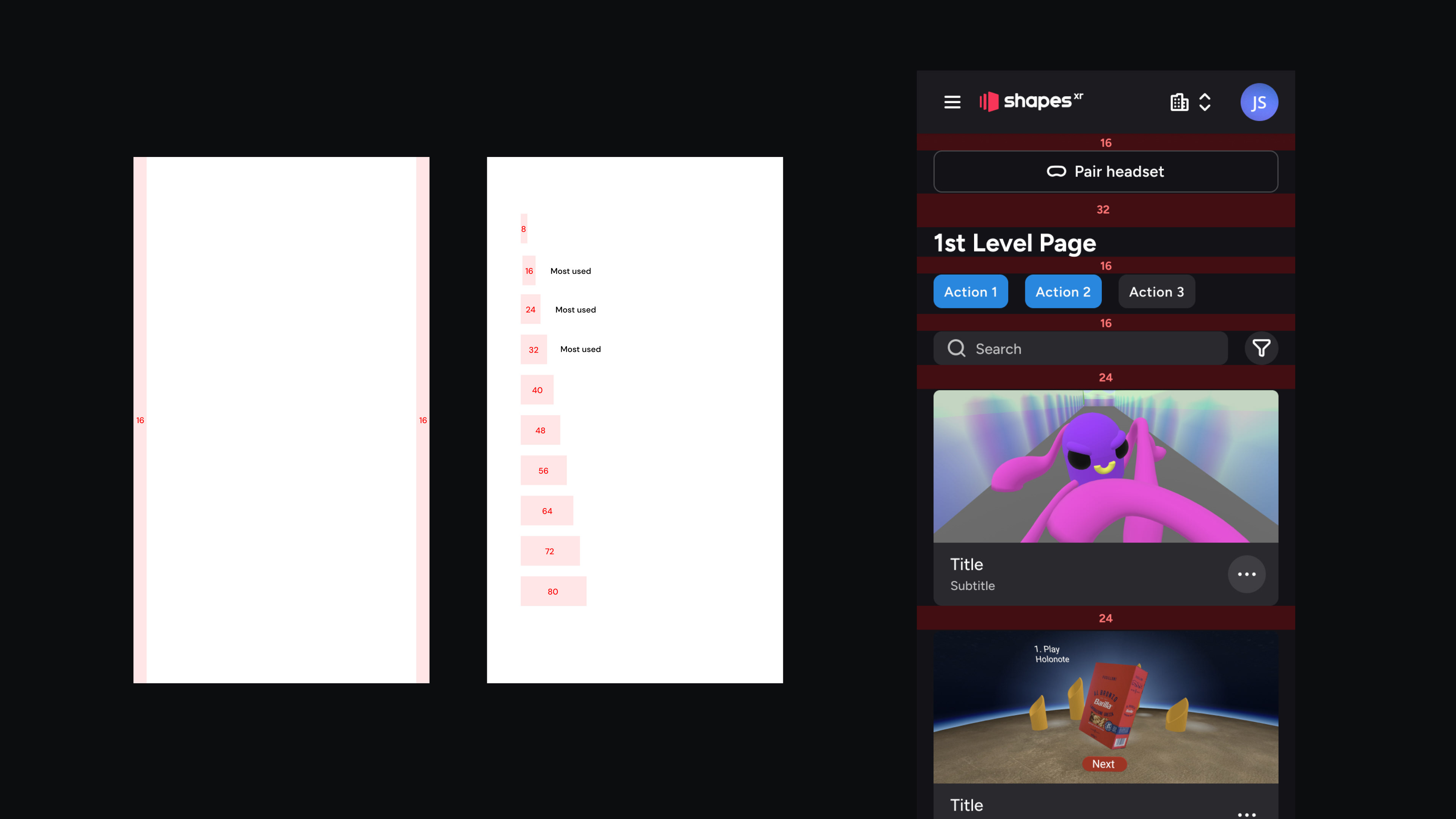
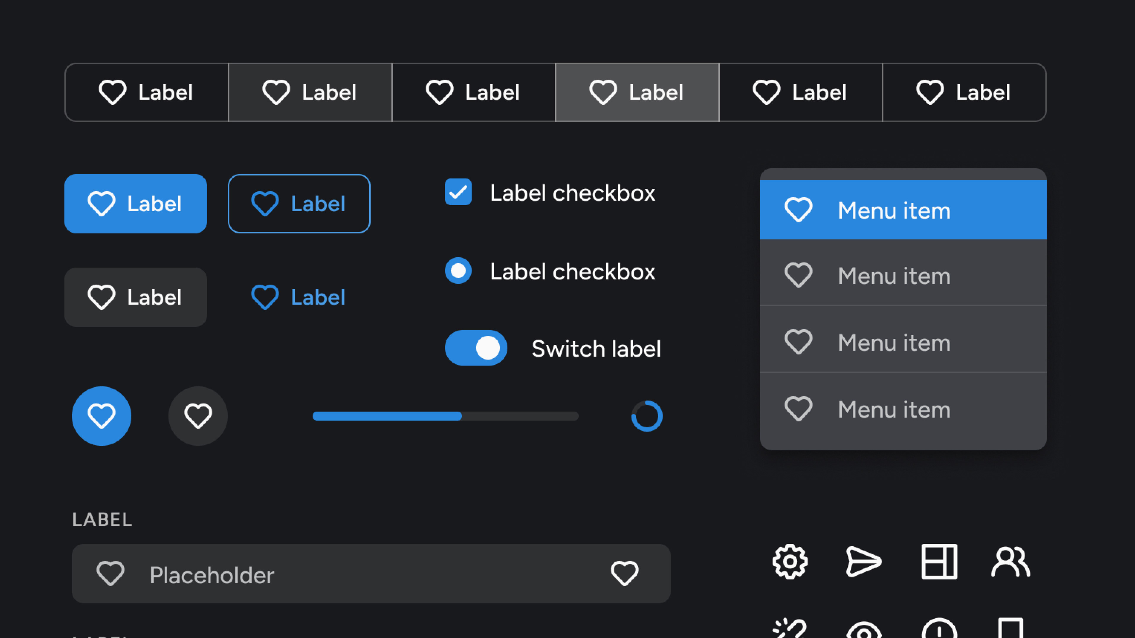
On the visual side, the project included a complete overhaul of all UI components, resulting in a newly developed design system aligned with the XR design framework. To ensure governance and consistency, an internal website was implemented as the single source of truth—listing validated components ready for use and serving as a bridge between design and development.
After establishing the design system, all new screens were designed and validated through user testing, particularly focusing on the file upload experience. In parallel, a fully responsive mobile version of the app was designed and developed. The process concluded with a detailed developer handoff covering all user flows, interactions, and UI specifications.
Product before the redesign
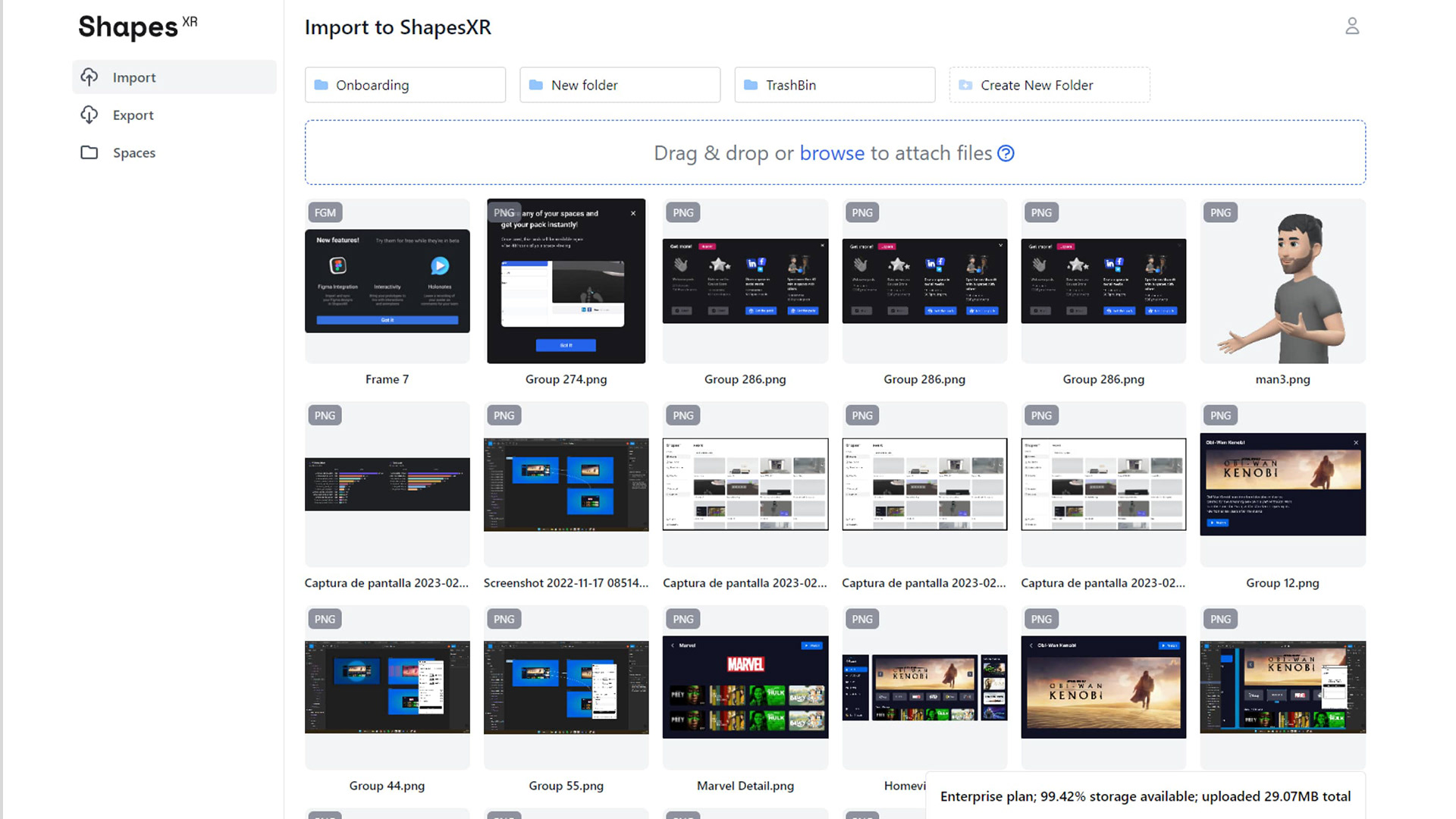
Dashboard before re design: Imported Files page
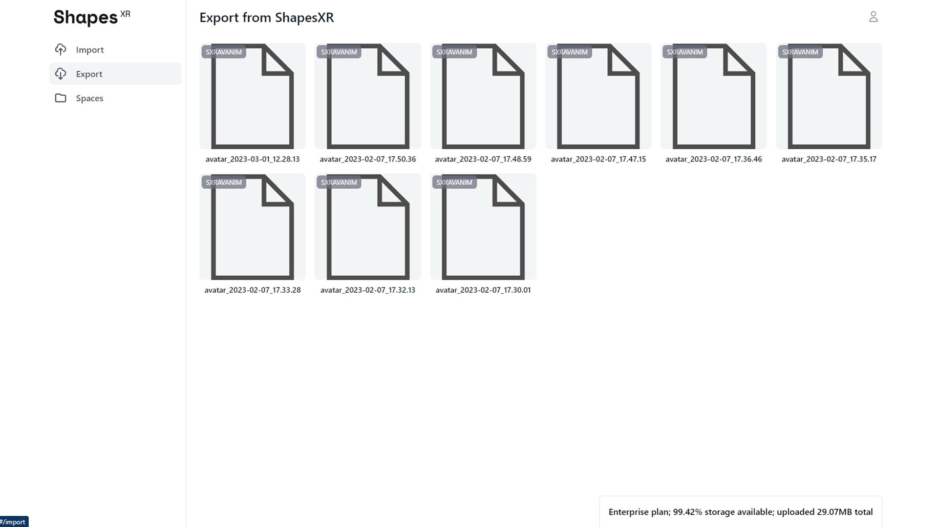
Dashboard before re design: Exported Files page
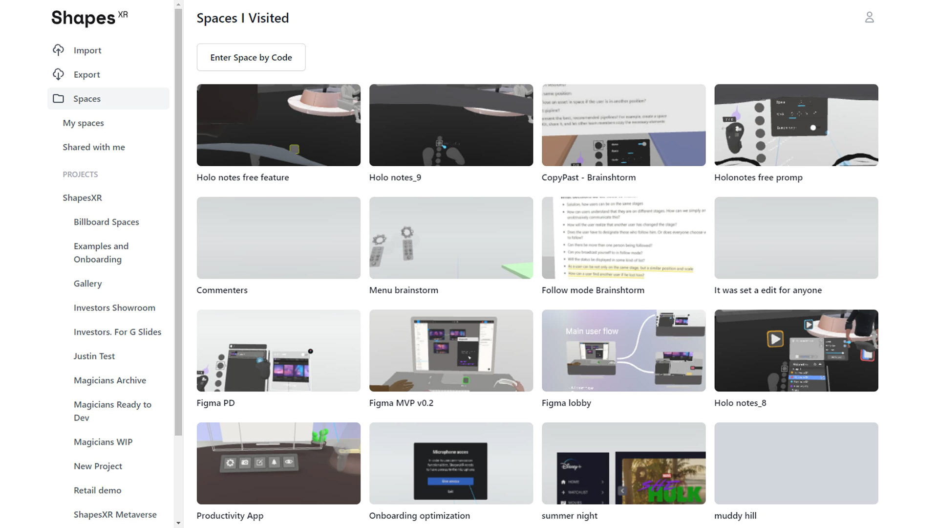
Dashboard before re design: Recent Spaces page
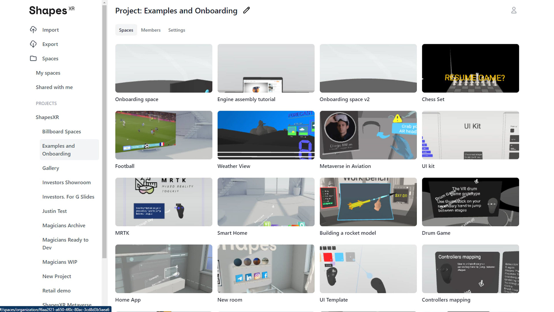
Dashboard before re design: Project page
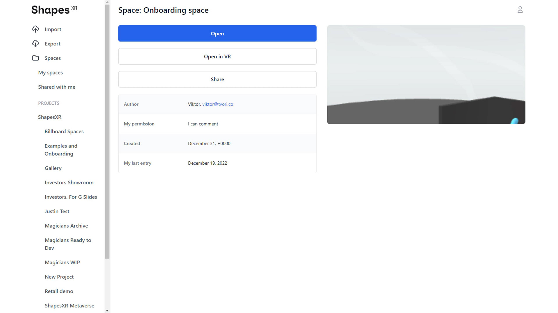
Dashboard before re design: Space page
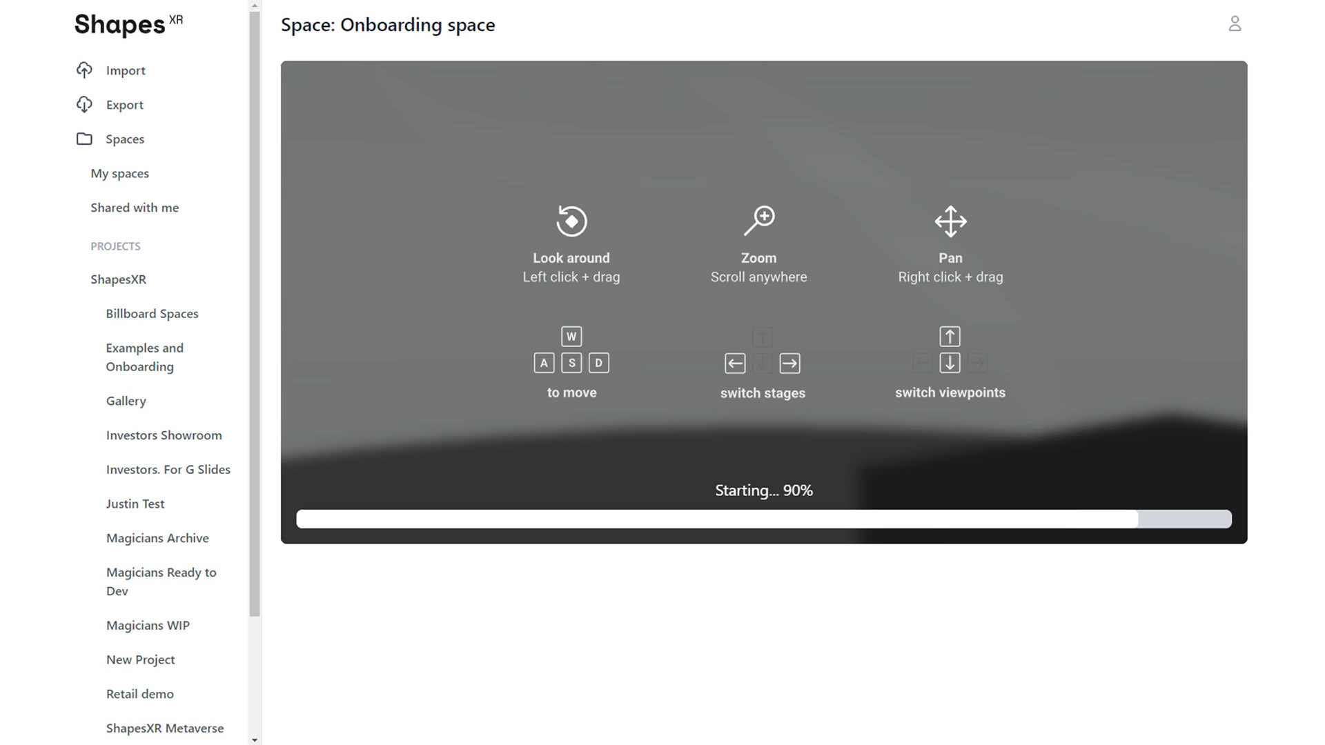
Dashboard before re design: Space viewer
Thank you for reading! 💙