This study intends to identify the UX/UI patterns in VR and how they are related to the traditional UX/UI in 2D apps.
This study focuses on non-diegetic UI which means that it studies 2D elements within a 3D environment. The UX behind physical interactions such as grabbing, releasing or moving around have not been considered in this study.
This study focuses on non-diegetic UI which means that it studies 2D elements within a 3D environment. The UX behind physical interactions such as grabbing, releasing or moving around have not been considered in this study.
Summary
Samples
- Oculus
- Youtube VR
- Firefox Reality
- Horizon Workrooms
- Altspace VR
- Prime Video VR
- Oculus
- Youtube VR
- Firefox Reality
- Horizon Workrooms
- Altspace VR
- Prime Video VR
Observed patterns
- Distances
- Layouts
Take aways
Resources
- Distances
- Layouts
Take aways
Resources
Samples
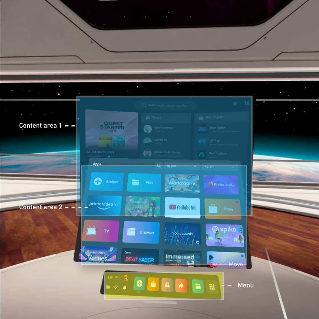
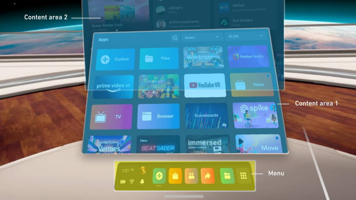
Oculus
Subjects of analysis
Content area
Menu
Content area
Menu
Insights
- One column layout
- Two distances. Main menu is closer than content area
- Surrounding background
- Two distances. Main menu is closer than content area
- Surrounding background
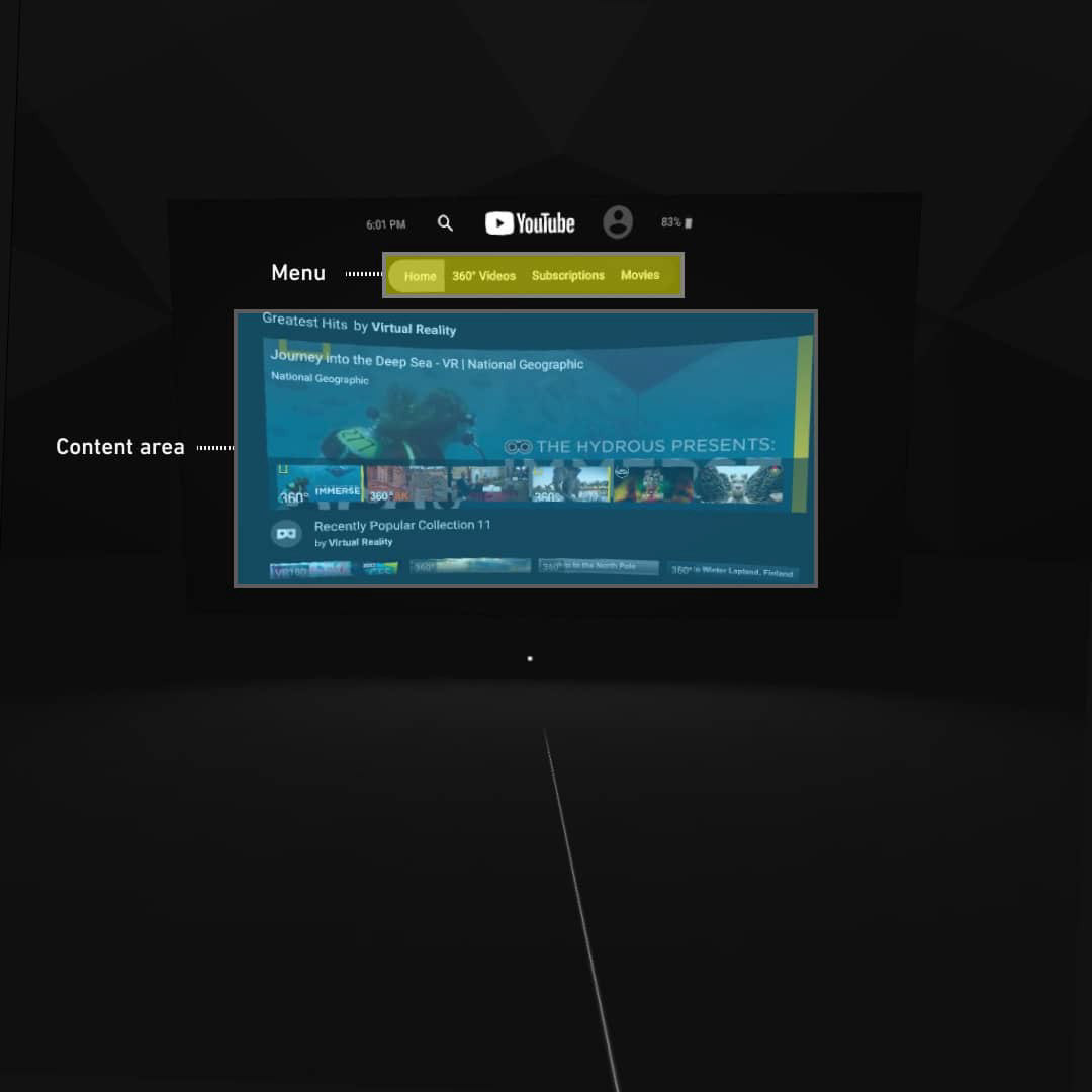
Youtube VR
Subjects of analysis
Content area
Menu
Content area
Menu
Insights
- One column layout
- One distance. Main menu and content area are at the same distance from the user
- Neutral background
- One column layout
- One distance. Main menu and content area are at the same distance from the user
- Neutral background
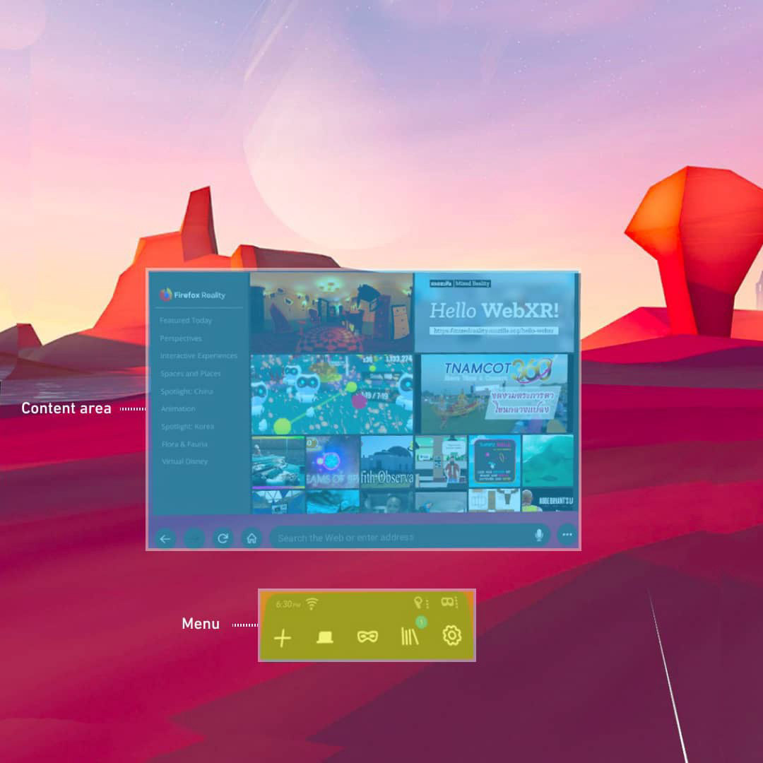
Firefox Reality
Subjects of analysis
Content area
Menu
Content area
Menu
Insights
- One column layout
- Two distances. Main menu is closer than content area
- Surrounding background
- One column layout
- Two distances. Main menu is closer than content area
- Surrounding background
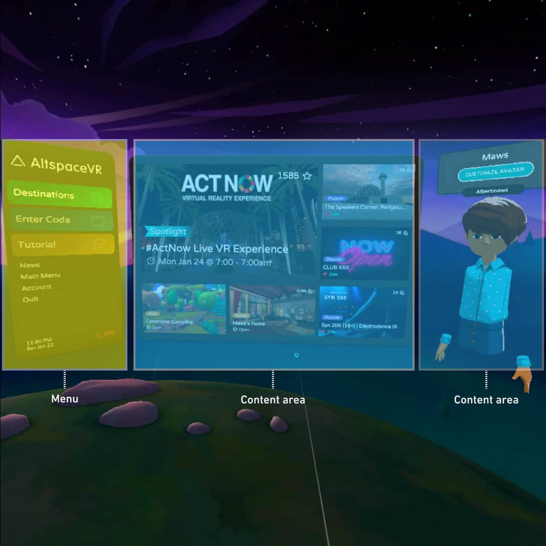
AltspaceVR
Subjects of analysis
Content area
Menu
Content area
Menu
Insights
- Three column layout
- One distance. Main menu and content area are at the same distance from the user
- Surrounding background
- Three column layout
- One distance. Main menu and content area are at the same distance from the user
- Surrounding background
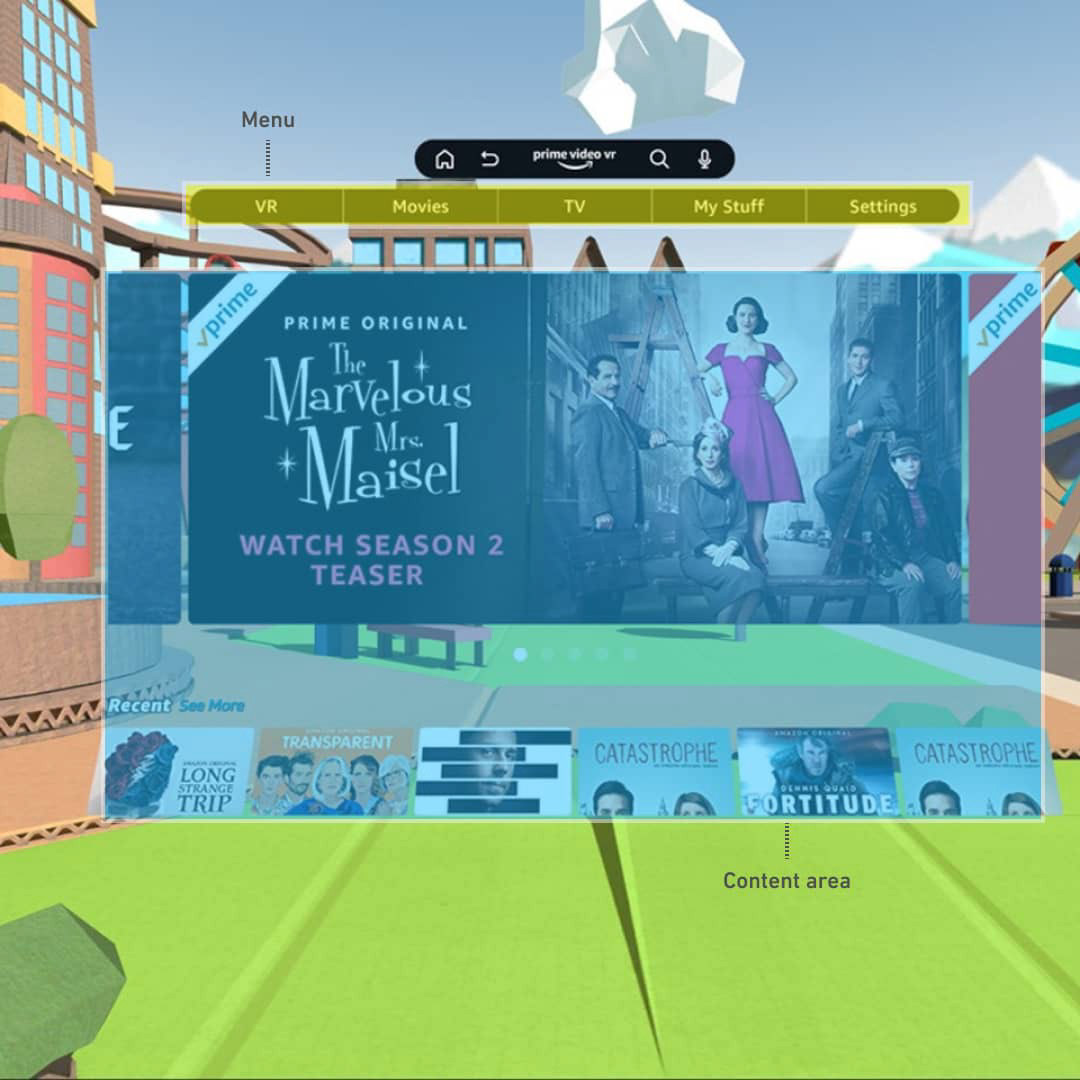
Prime Video VR
Subjects of analysis
Content area
Menu
Content area
Menu
Insights
- One column layout
- One distance. Main menu and content area are at the same distance from the user
- Surrounding background
- One column layout
- One distance. Main menu and content area are at the same distance from the user
- Surrounding background
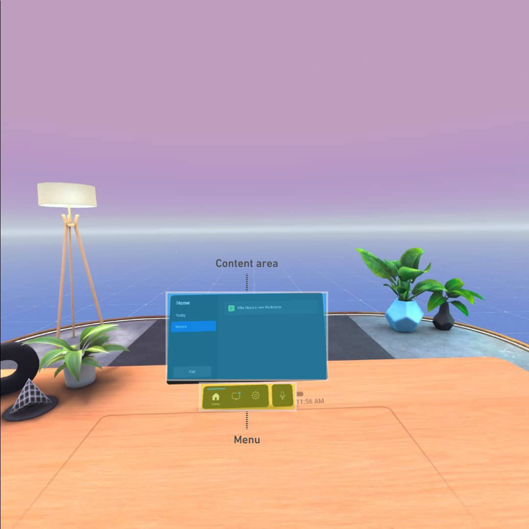
Horizon Workrooms
Subjects of analysis
Content area
Menu
Content area
Menu
Insights
- One column layout
- One distance. Main menu and content area are at the same distance from the user
- Surrounding background
- One column layout
- One distance. Main menu and content area are at the same distance from the user
- Surrounding background
Patterns
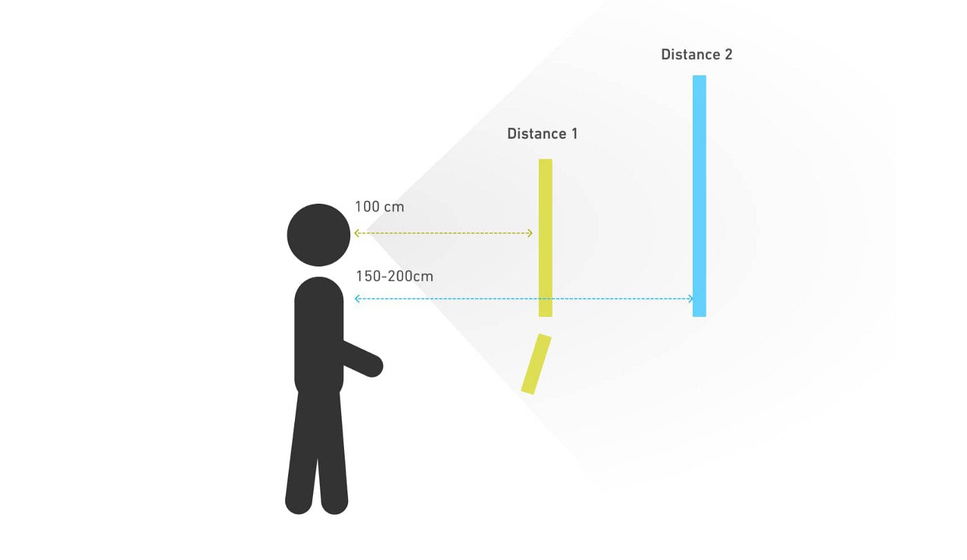
Distances
Two main distances are used in the analysed samples.
Distance 1 (100cm)
Navigation
Content
Panels
Dialogs
Snackbars
Navigation
Content
Panels
Dialogs
Snackbars
Distance 2 (150-200cm)
Navigation
Content
Panels
Navigation
Content
Panels
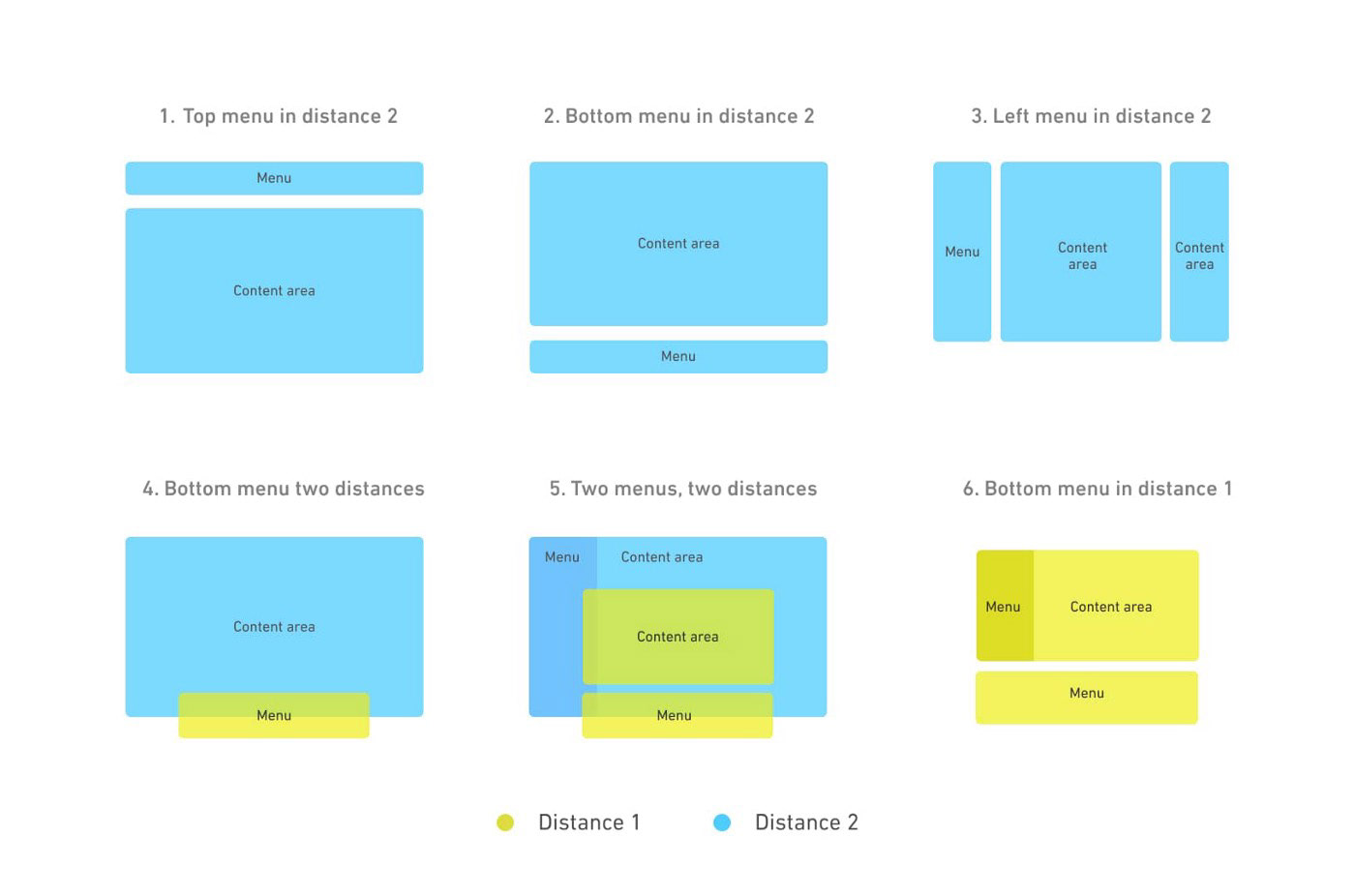
Layouts
From one-distance layouts, where all the navigation occurs in the same distance, to two-distance layouts where the navigation starts in one distance and ends in the other.
Take aways

Dark mode rules
6 out of 6 samples displayed a dark mode by default. However, Oculus for instance allow users to swap to light mode, which by the way doesn’t use pure white

Sound effects and music
Sound effects in the interactions as well as sounds in the background fill out the experience. Unlike in traditional 2D apps, sound in VR doesn’t feel out of place.

Background as a new element
The background plays a role in the experience. It could help the user to focus by being neutral or it could be colorful and noisy to surround the user.

Take care of you users’ necks
Heights are definitely an important point to consider. Placing the UI too high results in a very bad experience for the user since they have to look up all the time.

Cut content if you need
When using the three column layout, the panels on the edges can be cut on purpose. This forces the user to turn their head rather than move their eyes since moving their eyes can be uncomfortable.

Easier to point in closer distances
When it comes to pointing with a laser, it is easier pointing to closer distances.

Jump between distances
Designing throughout different distances could be the biggest challenge for UX/UI designers. However it brings infinite new ways of interacting with UI.

Minimize interruptions using closer distances
The closer distance, aside from being used as a menu, could be used to show content to the user without interrupting the main experience.
Resources
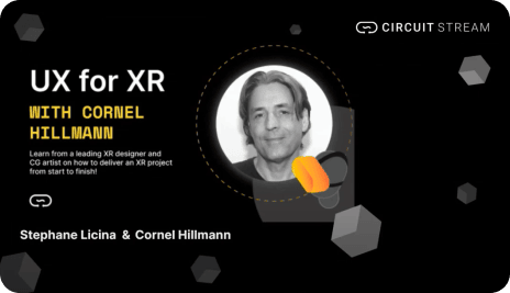
UX for XR with Cornel Hillmann
An interesting workshop about how is the design process in XR nowadays.

Thank you