
FloatGrids is a tool that allows UX/UI designers to design VR/AR UI as they have always done and developers to recreate the designs with accuracy while keeping the consistency and scalability.
FloatGrids achieve this goal by providing a free Figma file and a free Unity Package. Both are aligned in terms of components, styles and nomenclature. Besides, FloatGrids has been built under Atomic Design methodology so that it is completely customizable. And what’s more, it provides guidelines and best practices for designers to understand how UI works in VR/AR environments.
FloatGrids achieve this goal by providing a free Figma file and a free Unity Package. Both are aligned in terms of components, styles and nomenclature. Besides, FloatGrids has been built under Atomic Design methodology so that it is completely customizable. And what’s more, it provides guidelines and best practices for designers to understand how UI works in VR/AR environments.
This is the process I followed to create FloatGrids:
1. Research
2. Designing and testing styles and components
3. Building components in Figma and Unity
4. Final product and results
1. Research
Even though this is a very new field there was some documentation about UI and UX in VR/AR environments. Even though some of them were old (2017), they still were a useful starting point.
Google Stylesheet
Google Stylesheet is a Sketch file announced during the Google I/O 2017. It provides UI components for VR and a very useful guidelines to understand spaces, distances and sizes. In my opinion the most important contribution of this piece is the introduction of the concept DMM, Independent Distance Millimeter. It allows us to scale our UI from Sktech or Figma to Unity or Unreal in an easy and simple way.
Oculus Guidelines

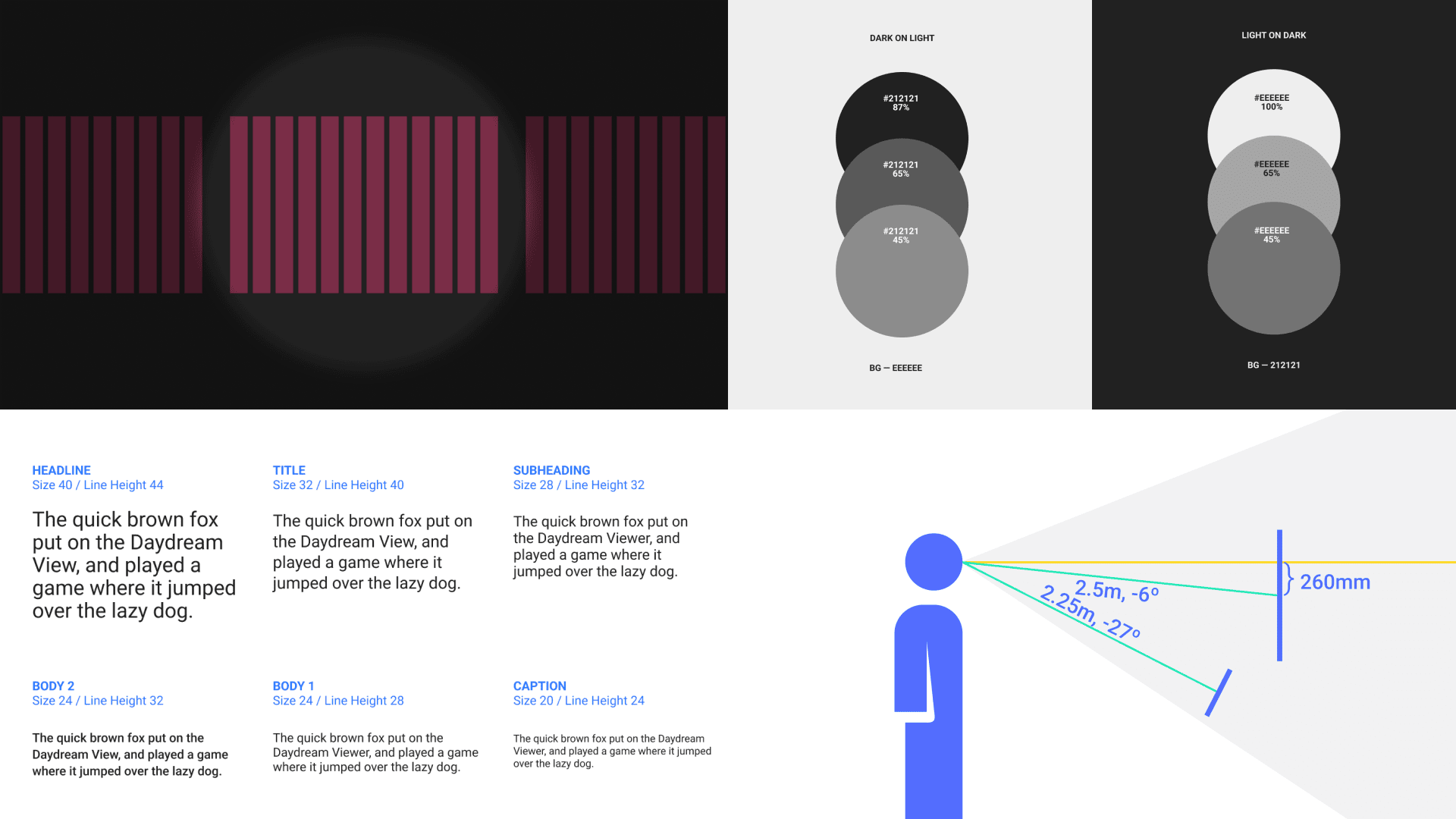
Oculus provides in its website a basic guidelines in terms of components sizes and colors. It also provides great infographics to understand how the user looks at the screen in VR, where it is comfortable to look at and where it is not, as well as the vision degrees of the human eye.
XRTK

XRTK is a framework for XR from Microsoft based in Unity. It is focused on their product Hololens. Even though they provide a Figma file, it is View Only.
UX/UI Layout Patterns Study

After some research I realized that it’d be important to figure out how the main players, such as YouTube, Oculus, Amazon, Meta, etc were actually making their VR experiences so that I started a study to compare them and find patterns. You can read the full study here.
2. Designing and testing Styles and Components
After analyzing several design system such as Bootstrap, Material Design, Human Interface and Carbon Design System I defined the following strategy for creating FloatGrids.
- Defining typography hierarchy
- Defining buttons and iconography sizes
- Defining color logic
- Designing the rest of the components
Defining typography hierarchy
First step
I took Google Stylesheet as a baseline. I decided to use the same structure as Material Design and transform it into the proposed sizes by the Google Stylesheet and see how they work. At the same time, I put the current Material Design font sizes next to the new ones to compare. The typography used was Lato, I chose it since it has a very similar anatomy to Roboto.
Second step
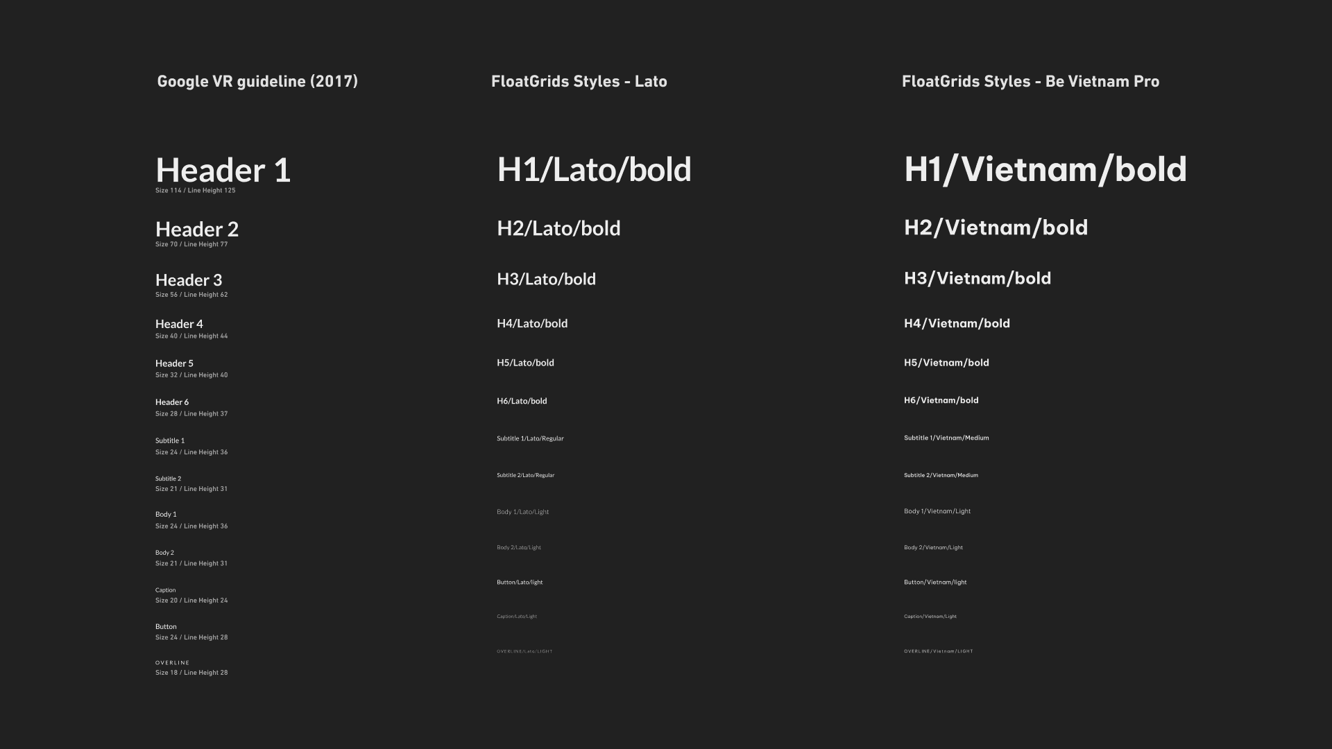
I decided to take as a baseline the Body 1 and Body 2 and scale the other styles from them, if I could find the correct sizes for the bodies then I could scale the rest. However it was important to have in mind that any text smaller than 14px would become not readable.
Third step
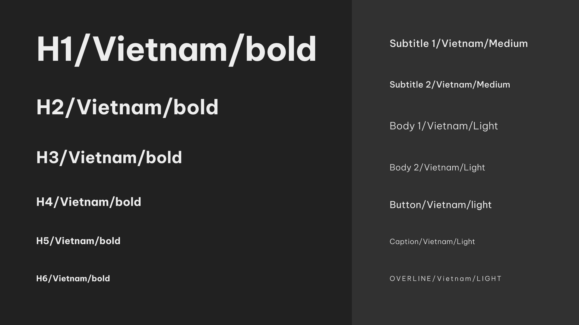
After having the body styles defined and tested I started trying different typographies. I ended up using Be Vietnam Pro since it has a little bigger eye. I checked that the smallest ones were readable and by doing this I had the typography hierarchy completed.
Buttons and iconography
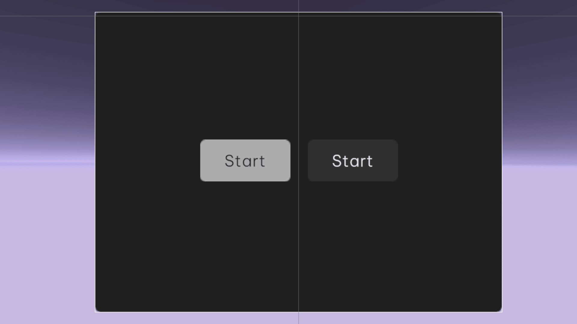
The button size proposed by Google Stylesheet was extremely big (64px height) So, since I already had the body styles defined, I took them as a baseline for the button text style and built the button from there. The Large button with Body 1 and the Medium button with Body 2, then the Small button went with Caption text style.
As for the icons, I tested both Material Icons and Feather Icons. The result was that outlined icons tended to perform worse, the thin lines got faded, especially with Material Icons. On the other hand, the quality of the filled icons was great, so I went with the Material Icons filled version. As for the sizes, I realized that the 24px baseline of Material Design was a little small, so that after trying 26px, 28px, 30px and 34px, I discovered that the 26px baseline was the correct one to use since it had a good readability and it was proportioned with the buttons.
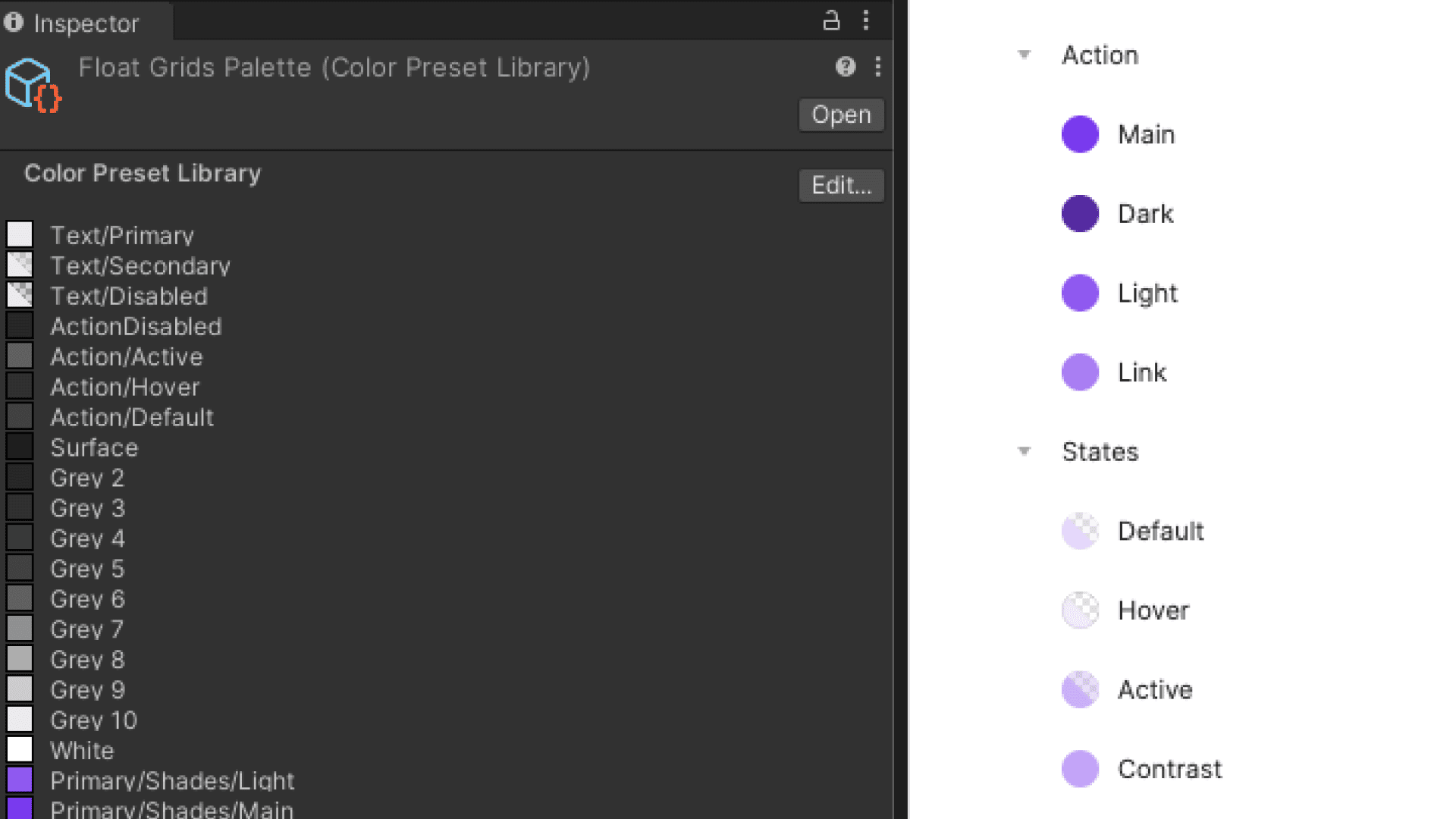
Color logic
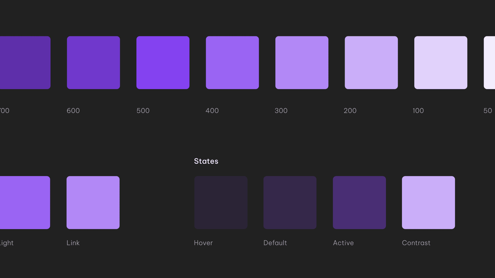
One thing we knew was that at least for the first release, the design system would use a dark theme as default. We decided it based on Oculus and Google recommendations, on our experience using the Oculus OS and on the conclusions from the UX/UI Layout Patterns Study, where all of the apps analyzed used dark mode.
Color logic:
Neutral
10 Neutral shades
4 shades for Action: Default, Hover, Active and Disabled
3 shades for Text: Primary, Secondary and Disabled
Primary
10 Primary shades
4 shades for Action: Main, Dark, Light and Link
3 shades for States: Default, Hover and Active
1 shade for text: Contrast
As for the Neutral, the range was from #212121 as the darker to #EEE as the lighter. As for the Primary, the Main color for components is the one in the middle (500). However, for texts, the color is 300.
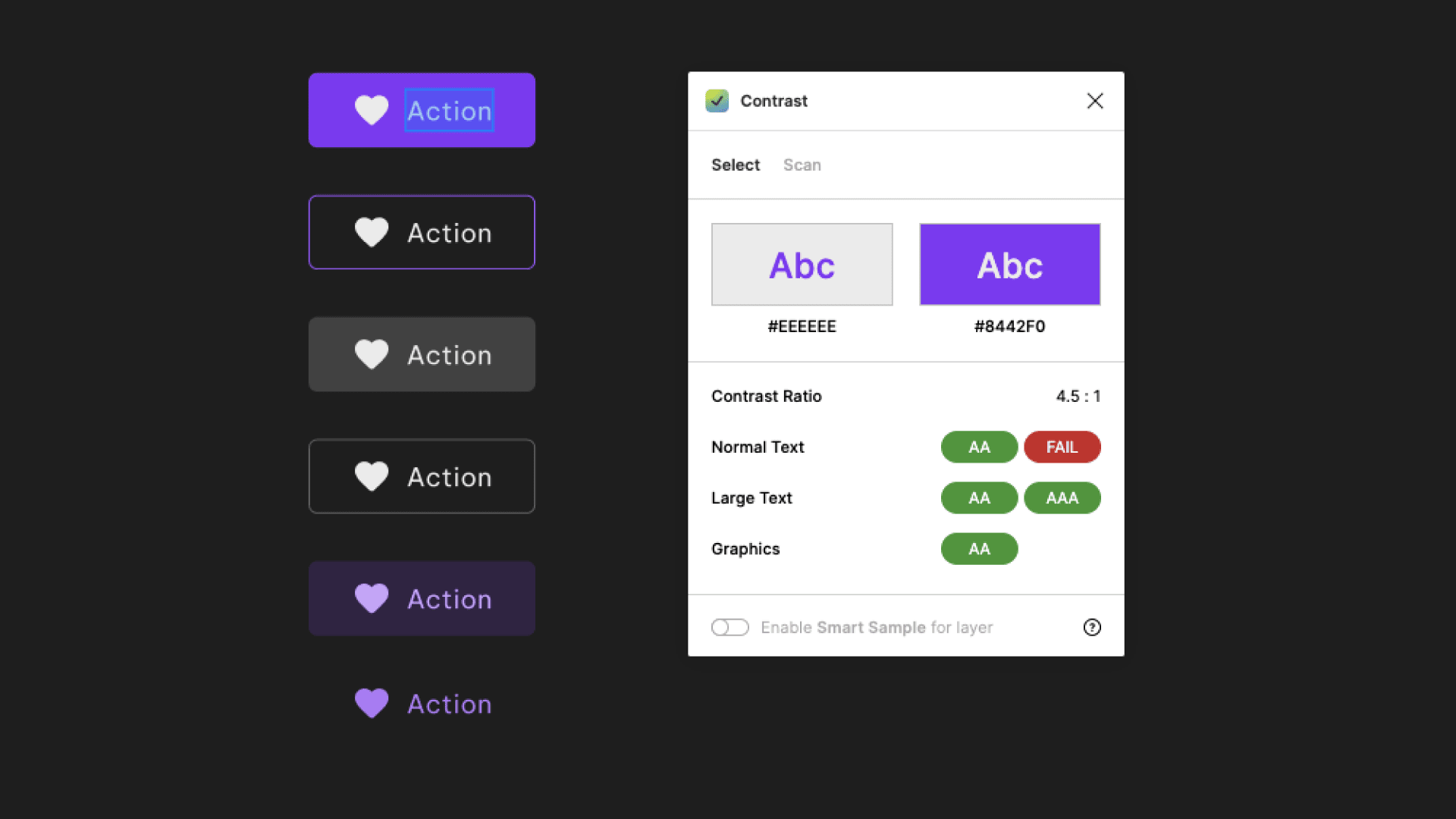
The challenge with the color logic was to avoid using both white and black for text, especially in buttons while keeping it accessible. During the tests we realized that in VR white text over a dark background is perceived bigger and bolder due to the figure-ground relationship. So for example a 24px text in Regular and in white over black, if it is perceived as a Bold, while the same in black over white is perceived as a Regular.
Designing the rest of the components
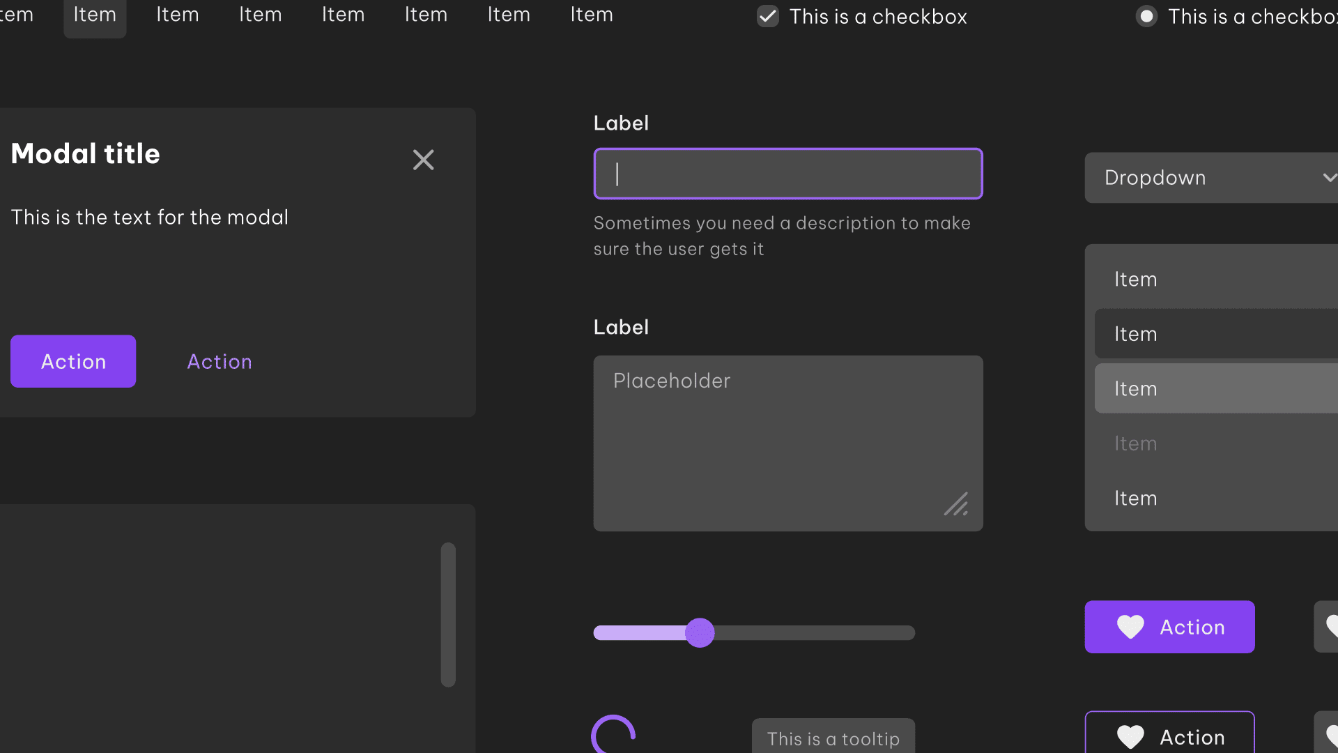
Now, I have the base styles defined. I'm ready to start designing the rest of the components while testing them in VR. These set of components will be part of the MVP, the system will grow over time.
Components in the MVP:
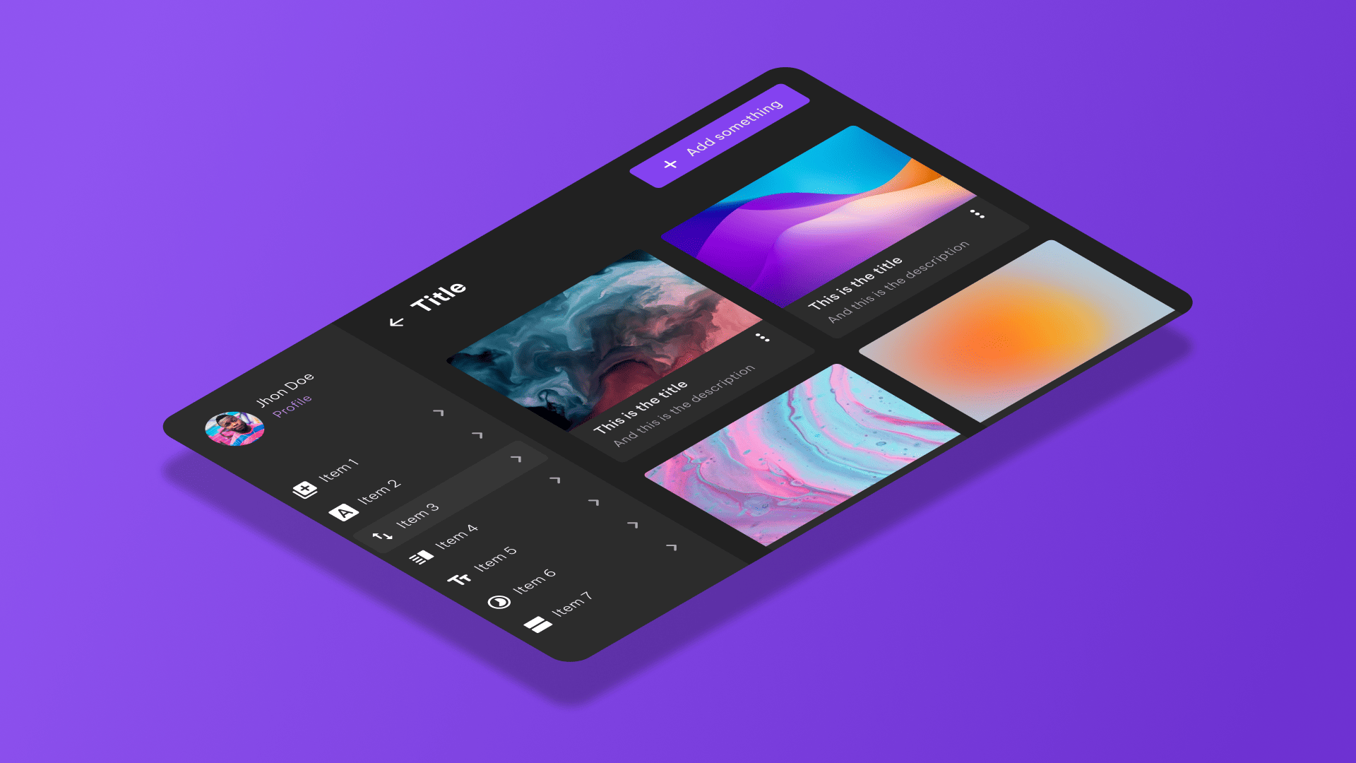
Avatar
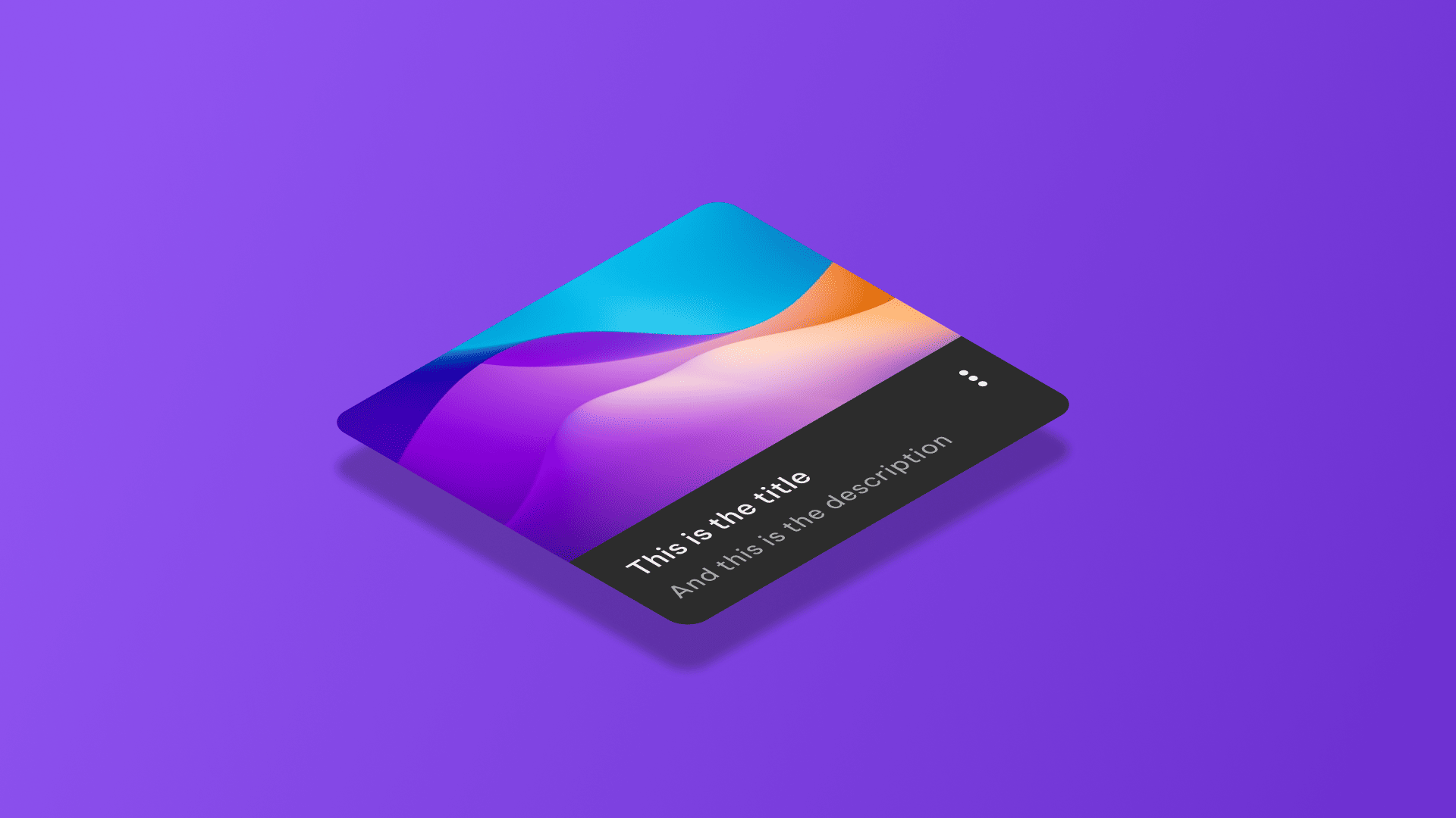
Cards
Divider
Menus
Modal
Spinner
Scroll view
Dropdown
Slider
Tabs
Text fields
Tooltip
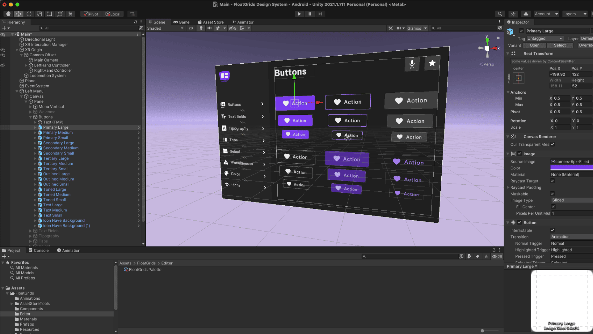
3. Building components in Figma and Unity
Once all the components are designed and tested it is time to build them in both Figma and Unity making them easy to use and customize for the users.
I used Text Mesh Pro in Unity to define the text styles with the exact same nomenclature in Figma. Same for component names. What in Figma is a Component in Unity is a Prefab, and what in Figma is a Variant in Unity is a Variant of a Prefab.
4. Final product and results
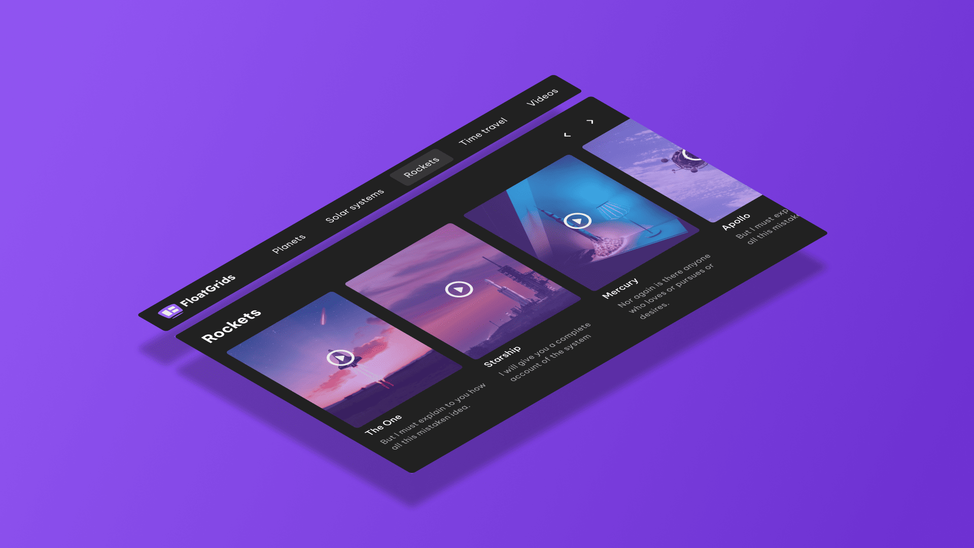
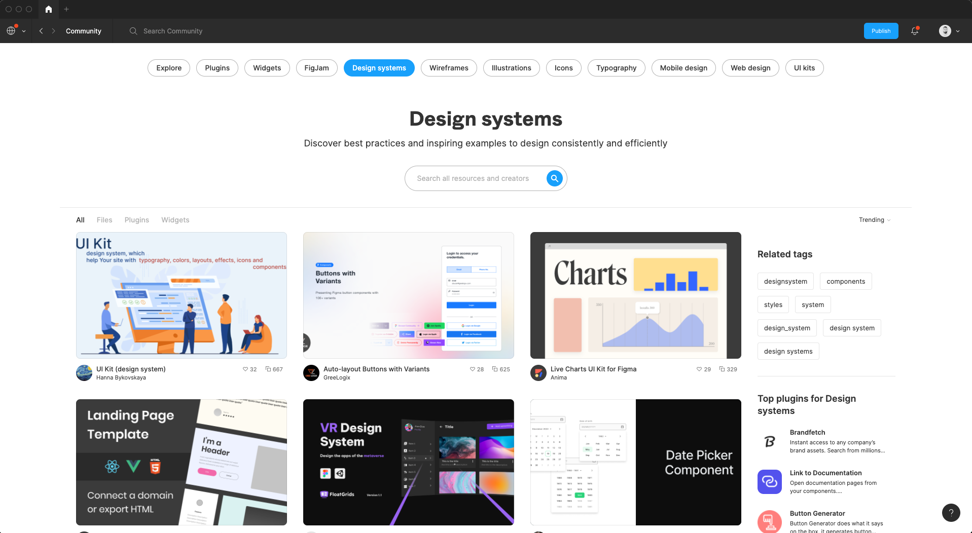
FloatGrids was launched in Figma Community the 20th of March 2022, it was the first VR/AR design system uploaded in Figma. The great reception put FloatGrids in the top 10 files the first week. This was a great success considering that there are millions of files in Figma Community and Figma UI designers represents the 66% of the total UI designers in the world. On the other hand, Figma is used by the biggest companies in the world such as Netflix, Shopify, Microsoft, Uber or Zoom just to mention some of them.
Final product
Results so far
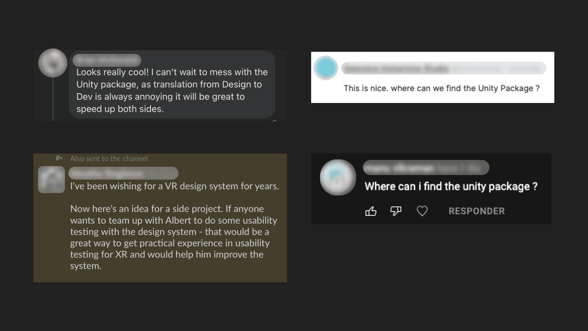
5K downloads
A bunch of nice comments 💜
A bunch of nice comments 💜
Thank you very much for reading 💜