XR App Lobby
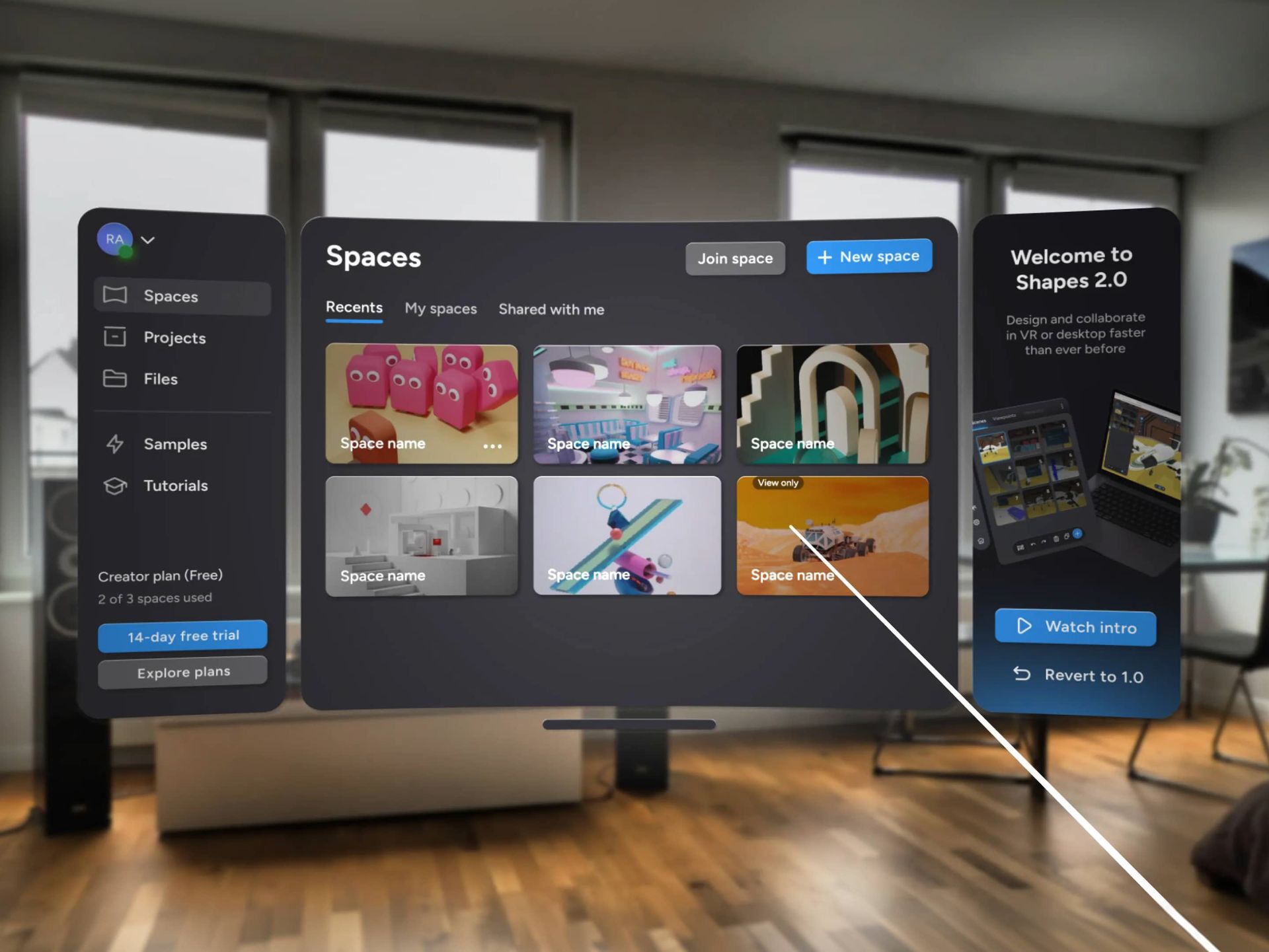
Table of Contents
- Context
- Design Solution
- Key Metrics
- Design process
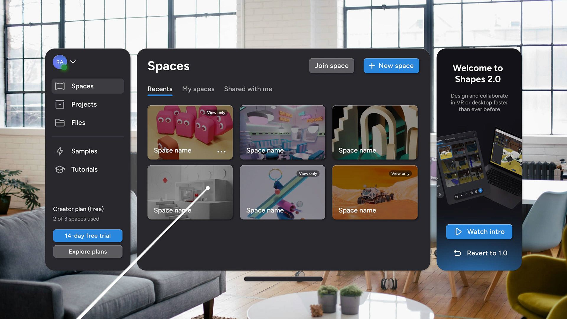
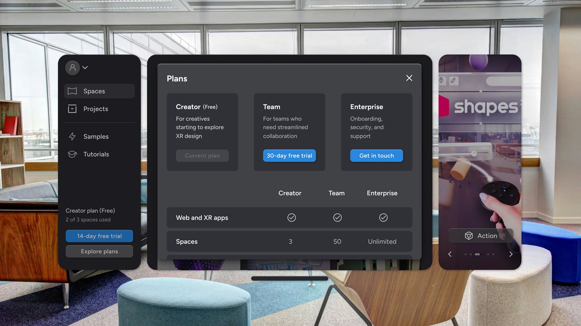
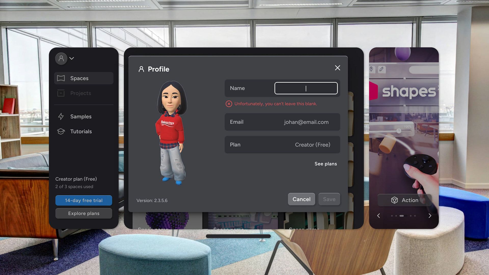
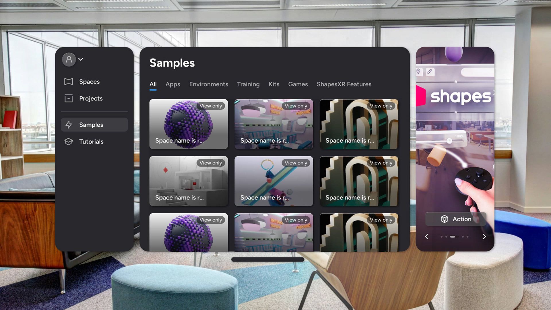
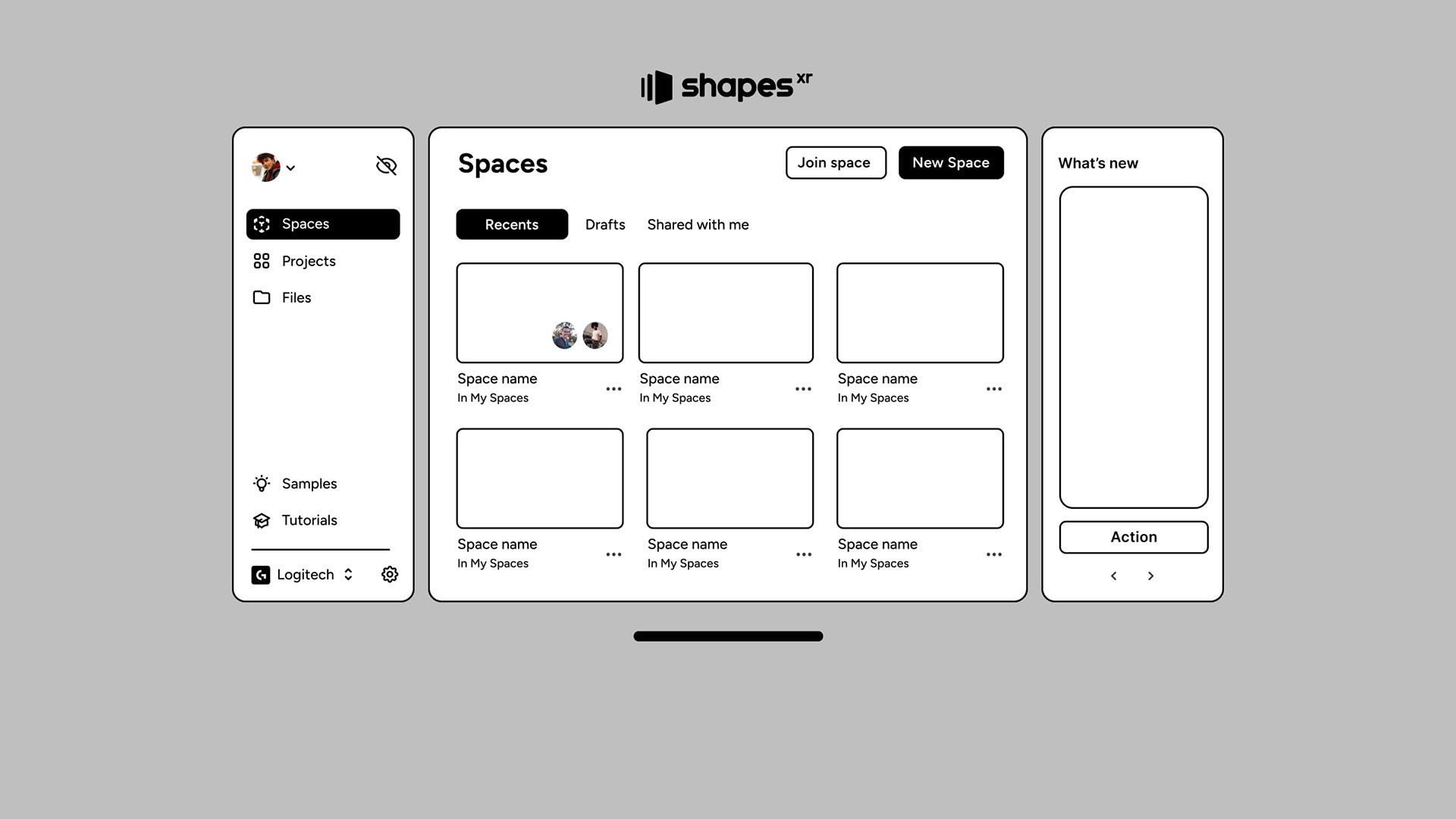
Design Solution
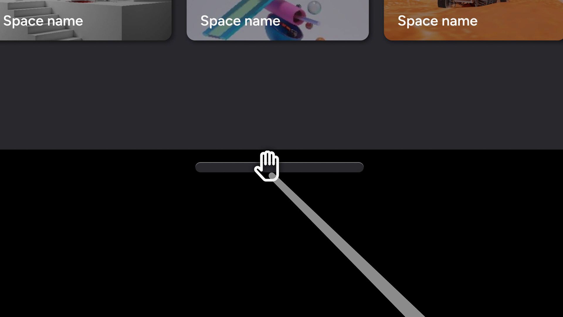
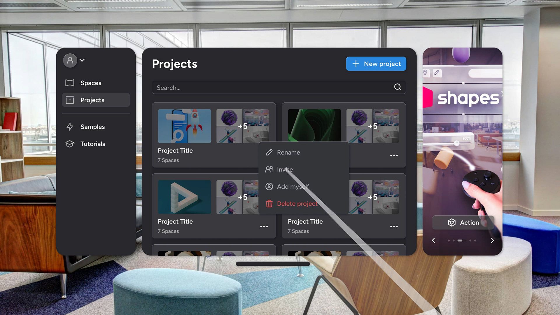
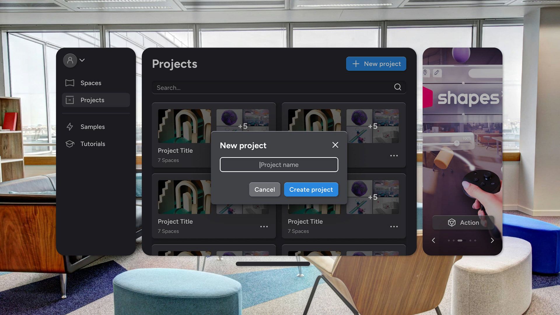
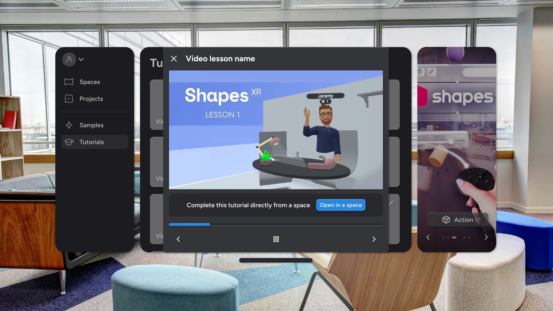
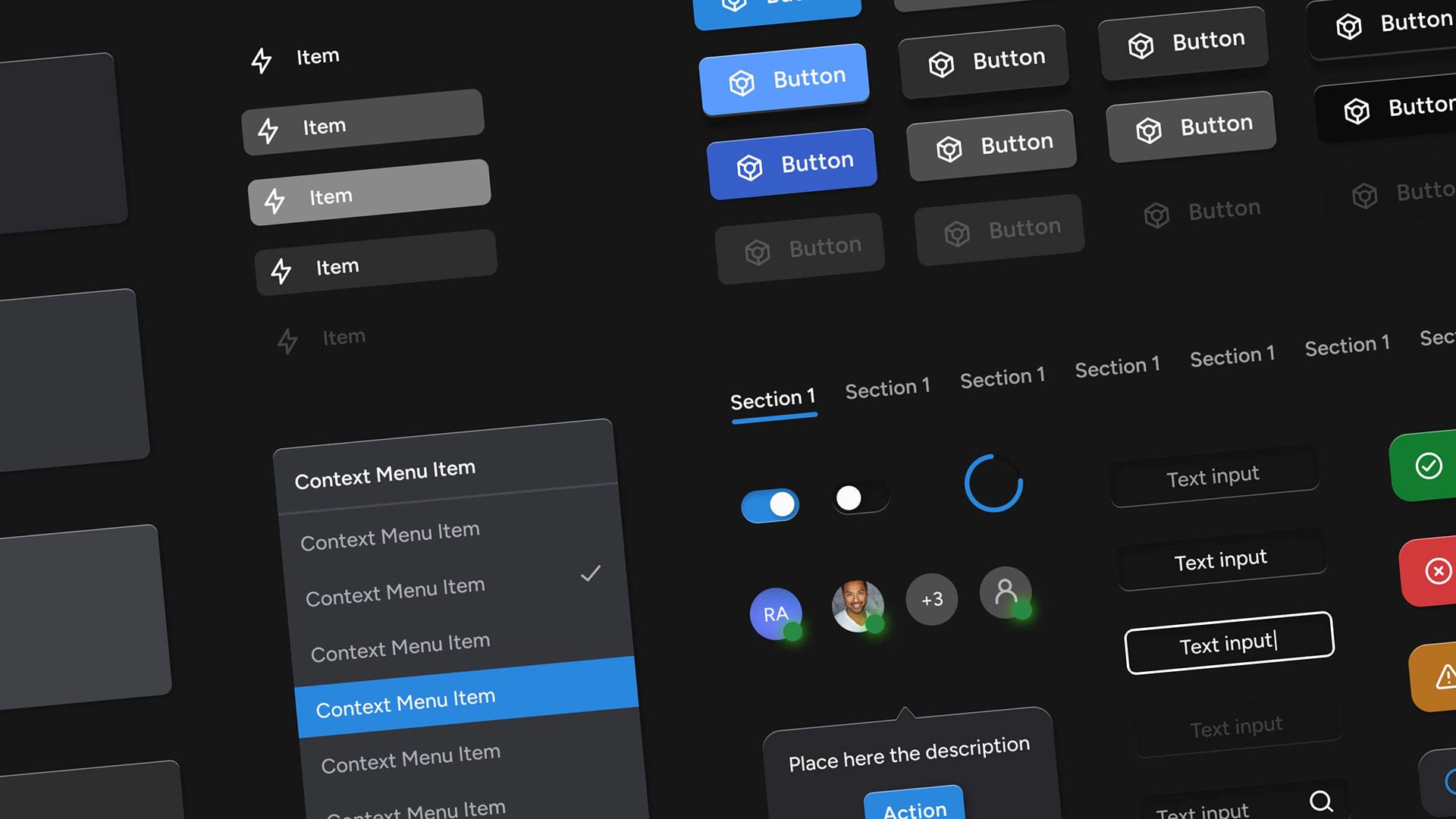
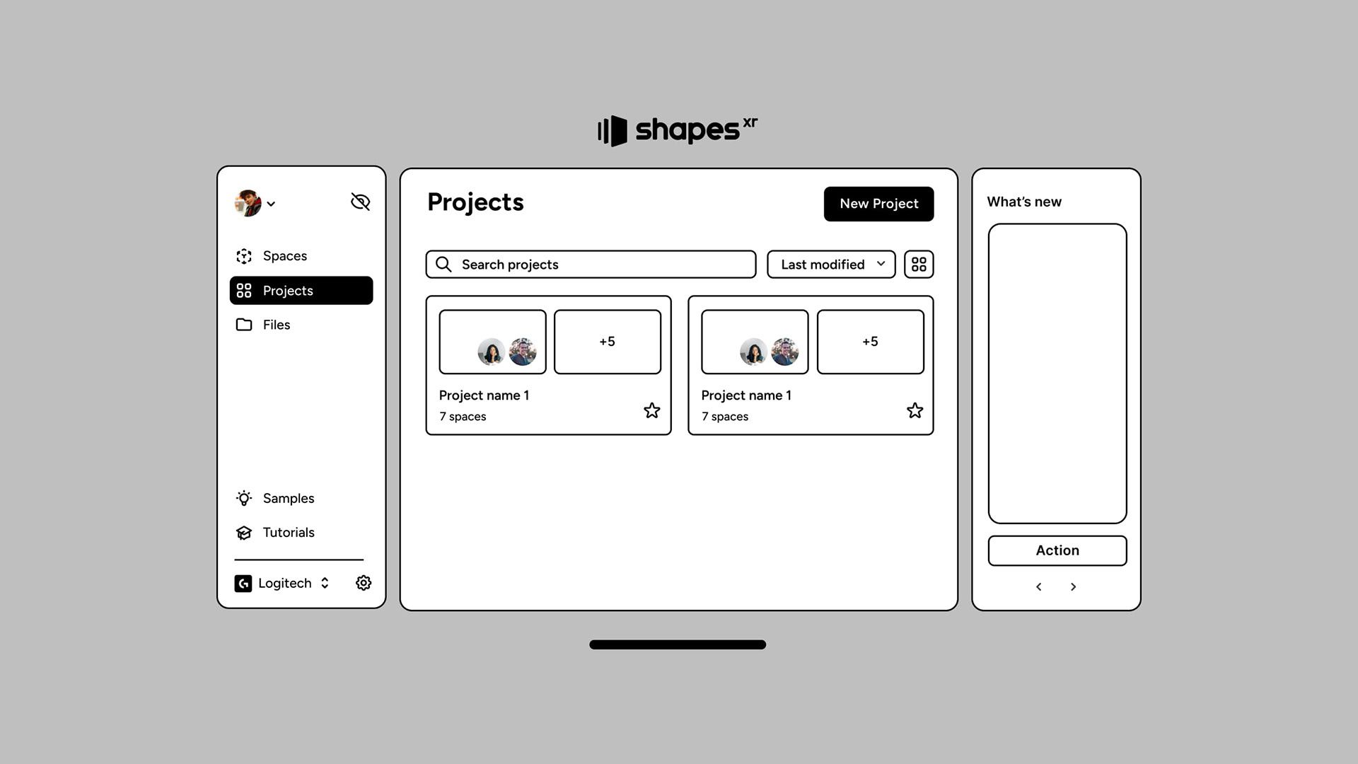
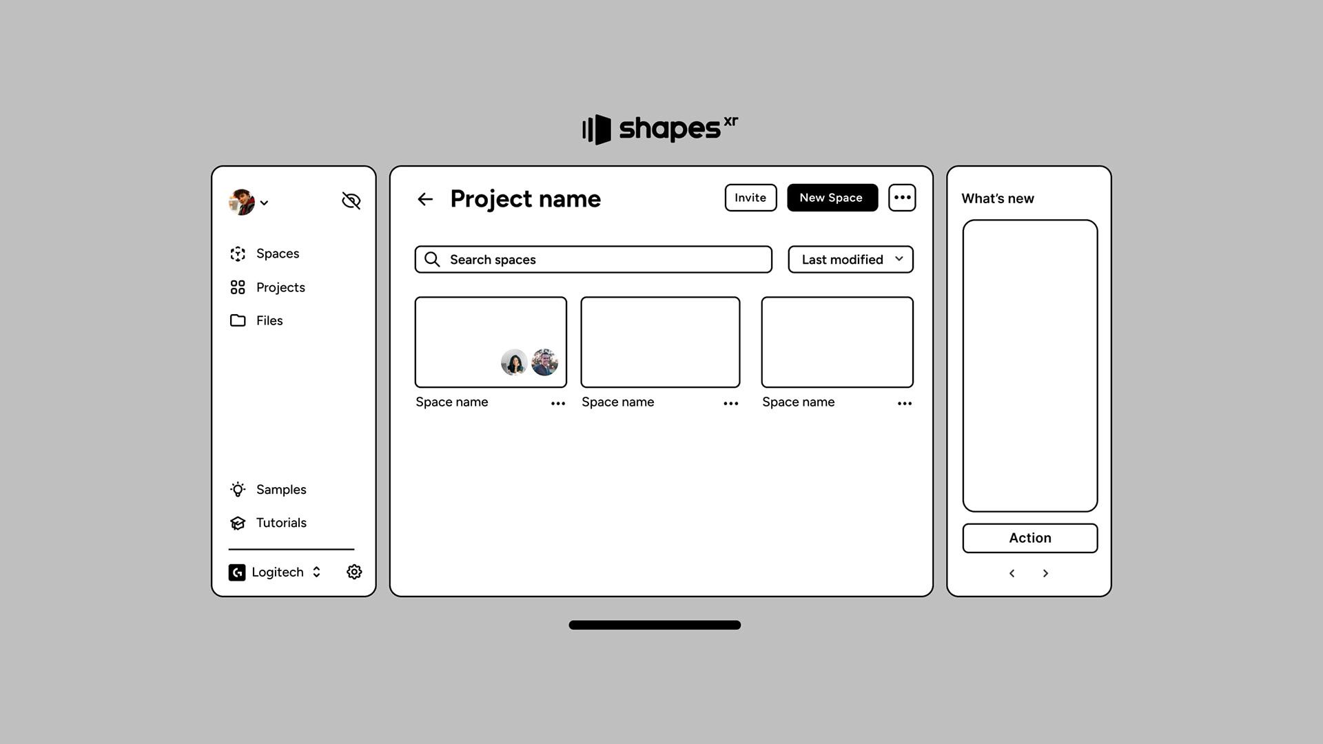
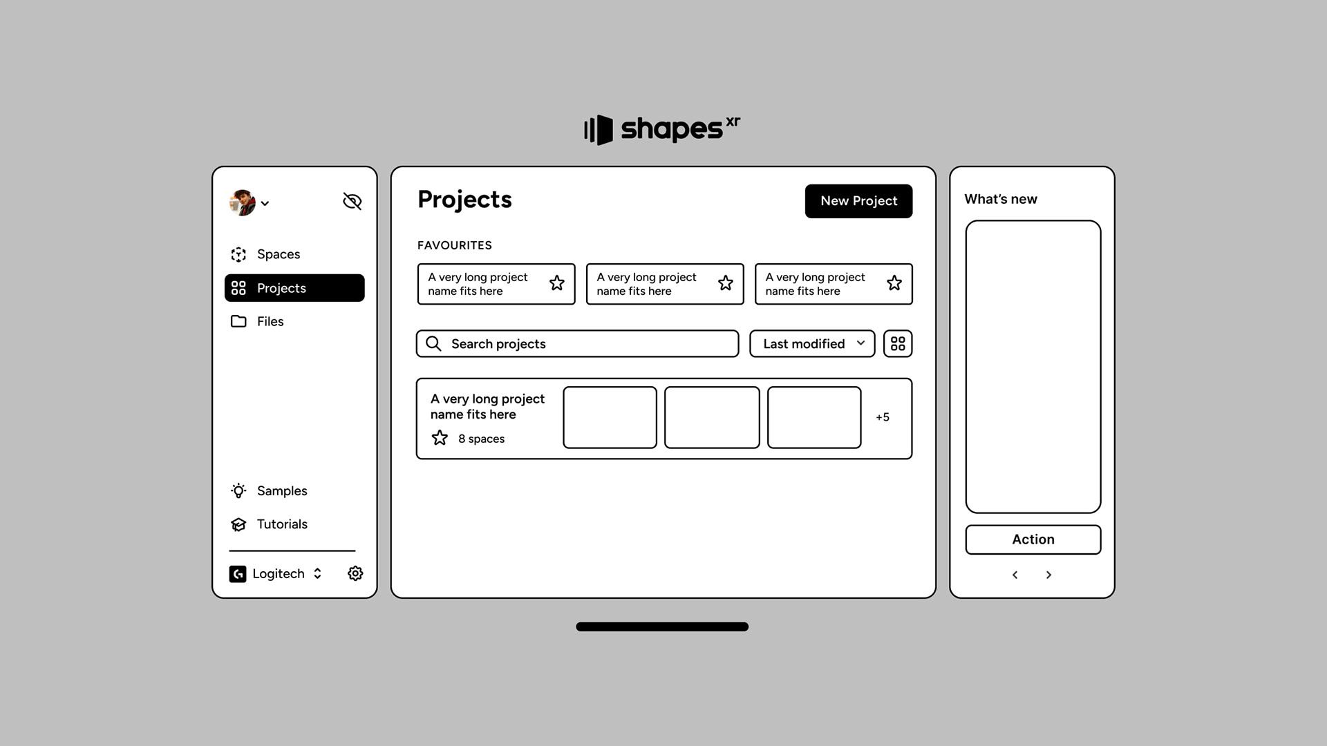
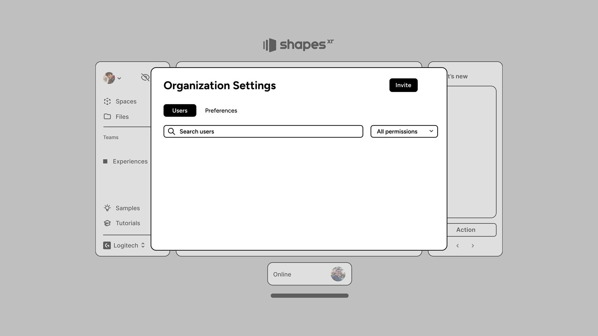
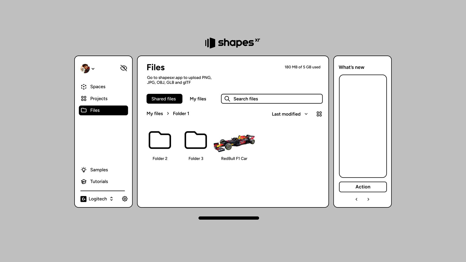
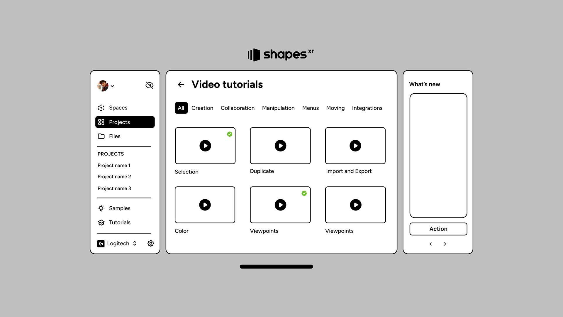
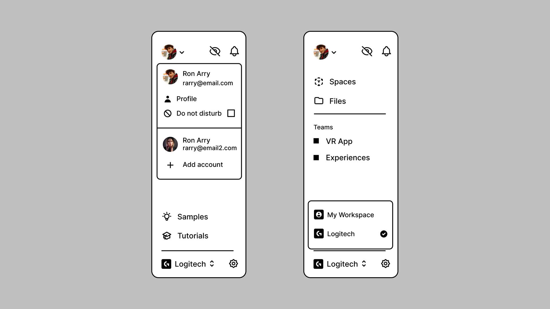
The strategy behind this design was to use a recognizable structure—something familiar to users. Our users, who are highly familiar with desktop and mobile apps, are accustomed to the dashboard paradigm, with left menus, tabs, and dialogs being common navigation methods. This familiarity guided our design, providing an interface that resonates with users so they can navigate it confidently from the start.
Key Metrics
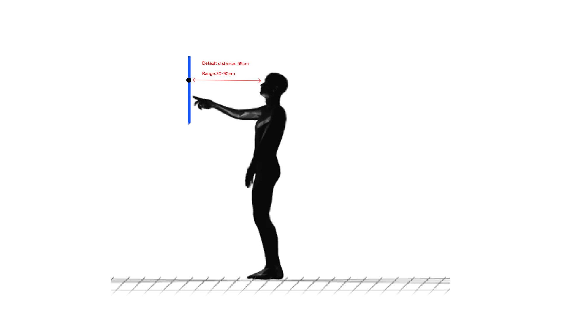
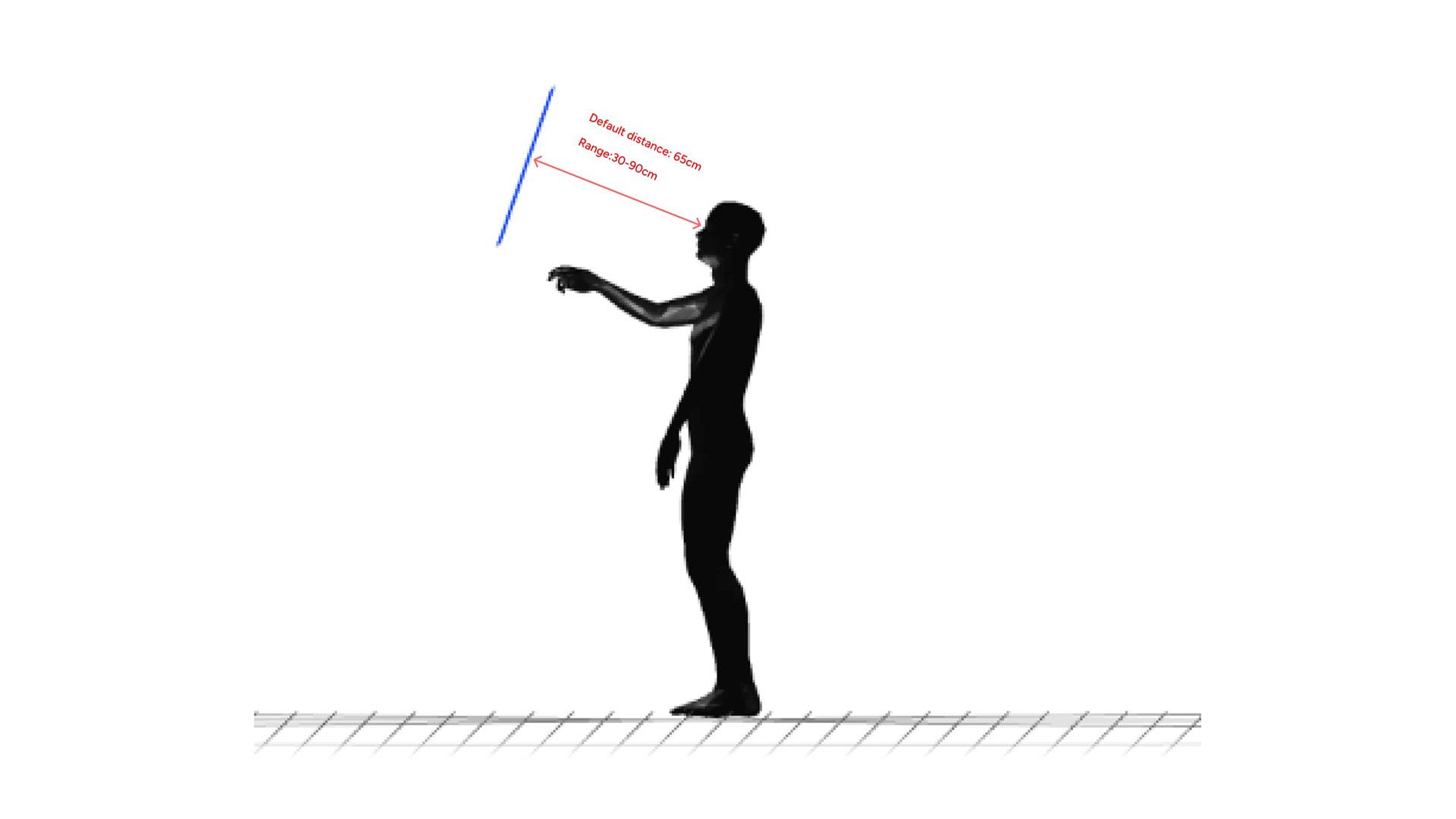
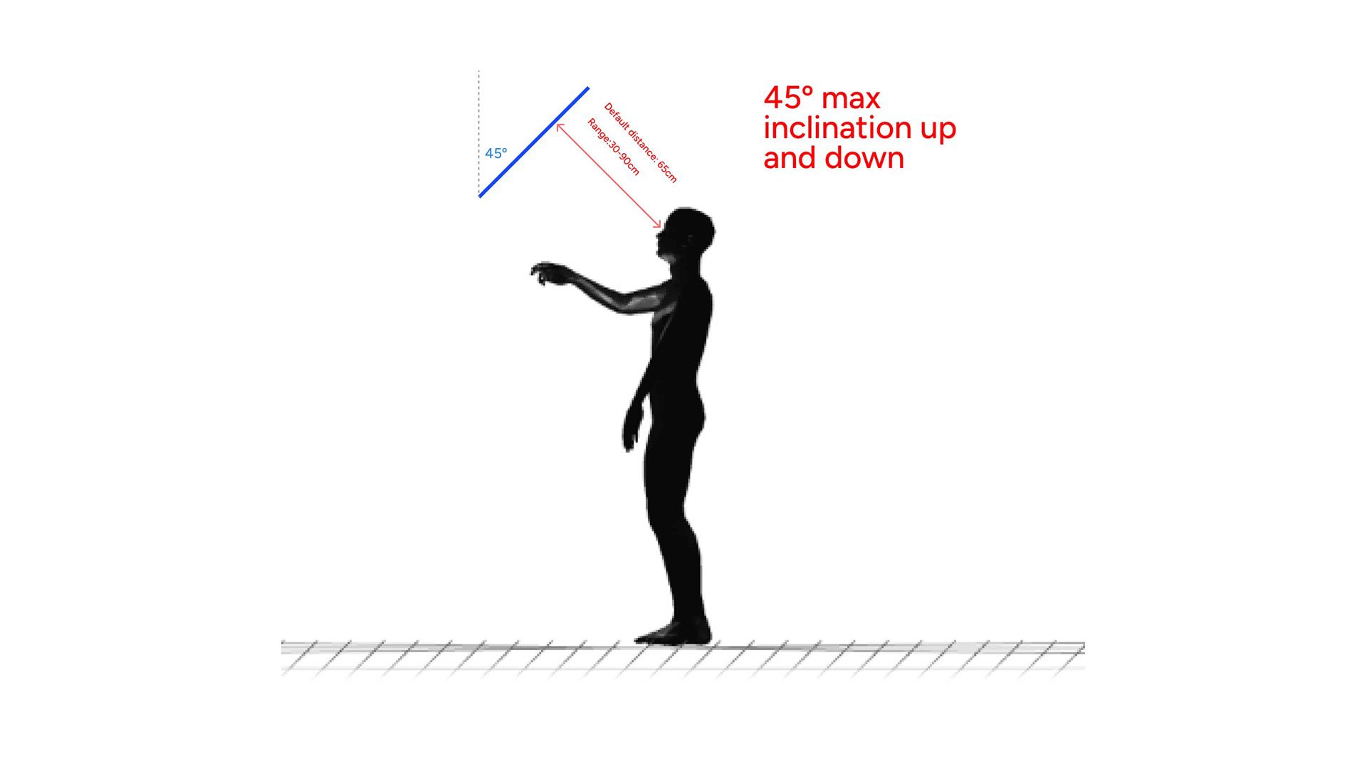
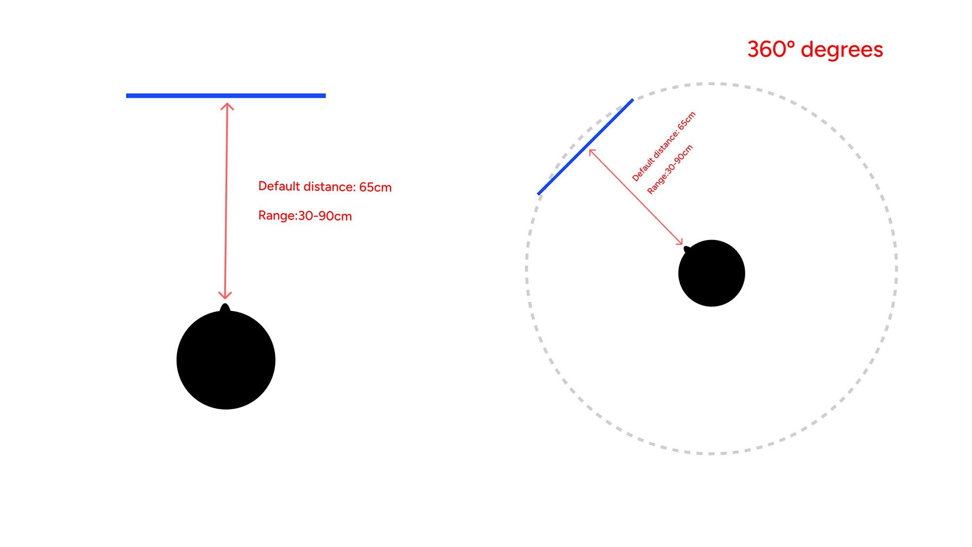
The primary goals of this design were to increase the percentage of users who visit samples and to boost the number of users who access the Lobby within the first 10 minutes of their initial session. Thanks to a clearer and more intuitive architecture, the percentage of users visiting the samples increased by 10%. By aligning the new architecture closer to a typical desktop dashboard structure, we leveraged an existing pattern to help users navigate the Lobby effectively. Regarding users accessing the Lobby within the first 10 minutes, the passthrough experience allowed them to view both their computer and the virtual panel simultaneously, resulting in a 15% increase in this metric.
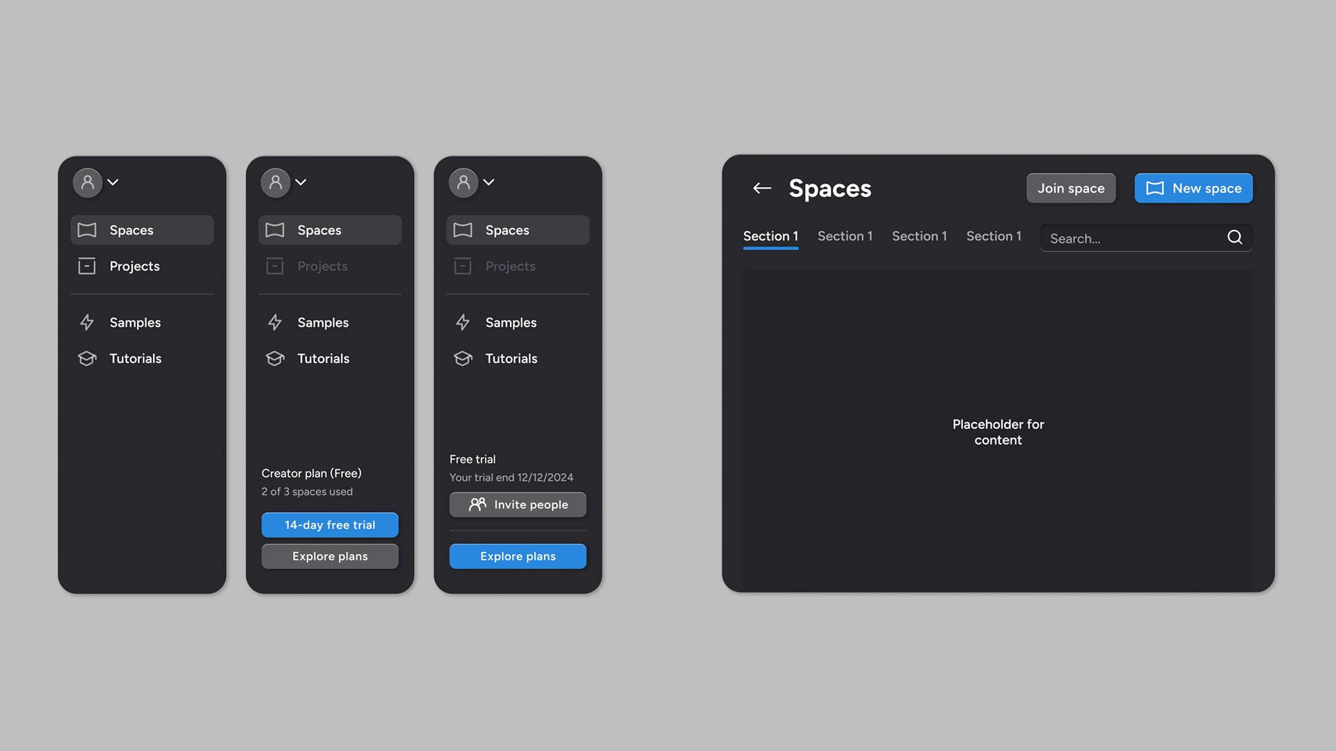
Design Process
I addressed the problem by creating an inventory of all the pages, accompanied by a new information architecture. Following that, I conducted a heuristic evaluation to identify and prioritize issues in collaboration with the team. Concerning the UI, I compiled an inventory of all existing components. Aligned with the front-end team, we opted not to change the UI framework but instead improve the current one. Once the design system was established, I began designing all the new screens and conducted user testing on features such as the file uploading system. Simultaneously, I worked on designing the mobile version of the entire app. Finally, I prepared the handoff for developers, encompassing all user flows and UI specifications.
Thank you for reading! 💙